Visual Structure
This section defines terms and concepts used in the scope of RadTreeView you have to get familiar with prior to continue reading this help.
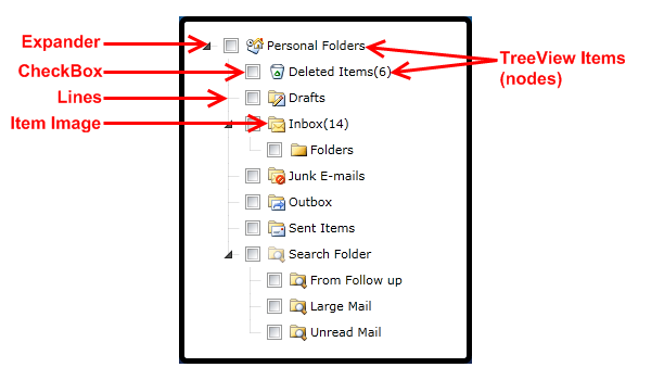
RadTreeView is a powerful control which lets you create complicated navigation systems and display hierarchical structures, such as directories and relational data. Below you can see a snapshot and explanation of the main visual elements of the standard RadTreeView control.
The structure of a RadTreeView is pretty simple. It consists of the following main elements:
TreeView Items (Nodes) - RadTreeView control provides a way to display information in a hierarchical structure by using collapsible items (nodes). Each TreeView item is an instance of the RadTreeViewItem class. You can navigate between these items using either your mouse device or your keyboard. Read more
Expander - the expander is used to expand or collapse the TreeView items. You can easily style it to provide better user experience. Read more
Check Boxes (Radio Buttons) - check Boxes (Radio Buttons) are displayed in front of the nodes' text. To show them you should set the ItemsOptionsListType to CheckList (or OptionList for Radio Buttons). The TreeView nodes support "tri-state" checkboxes. Read more
Lines - connecting lines between the nodes. You can easily show/hide the connecting lines. You should use a single property to do so - IsLineEnabled. Read more
Item Images - item images are displayed in front of the nodes' text (check boxes - if they are shown). RadTreeView gives you the ability to define images for each item state. Read more