Modify foreground color of Selected/Hovered row
This help article explains how to change the foreground color of the TreeListViewRow upon selecting it or hovering over it.
Creating a Style Targeting TreeListViewRow
In order to achieve this you can create a style targeting TreeListViewRow and add triggers that change its Foreground as demonstrated in Example 1.
Example 1 uses the WarehouseViewModel and its dependencies defined in the Getting Started article of the RadTreeListView.
Example 1: Custom style targeting TreeListViewRow
<Window.DataContext>
    <my:WarehouseViewModel />
</Window.DataContext>
<Window.Resources>
    <!-- If you are using the NoXaml binaries, you should base the style on the default one for the theme like so-->
    <!-- <Style TargetType="telerik:TreeListViewRow" BasedOn="{StaticResource TreeListViewRowStyle}"> -->
    <Style TargetType="telerik:TreeListViewRow" >
        <Style.Triggers>
            <Trigger Property="IsSelected" Value="True">
                <Setter Property="Foreground" Value="Red" />
            </Trigger>
            <MultiTrigger >
                <MultiTrigger.Conditions>
                    <Condition Property="IsMouseOver" Value="True"/>
                    <Condition Property="IsSelected" Value="False"/>
                </MultiTrigger.Conditions>
                <Setter Property="Foreground" Value="Green" />
            </MultiTrigger>
        </Style.Triggers>
    </Style>
</Window.Resources>
<telerik:RadTreeListView x:Name="radTreeListView"
                        ItemsSource="{Binding WarehouseItems}">
    <telerik:RadTreeListView.ChildTableDefinitions>
        <telerik:TreeListViewTableDefinition ItemsSource="{Binding Items}" />
    </telerik:RadTreeListView.ChildTableDefinitions>
</telerik:RadTreeListView>
The demonstrated approach may not be relevant for all UI for WPF themes.
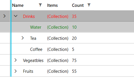
Figure 1: Result from Example 1 in the Fluent theme