Getting Started with Silverlight ToolTip
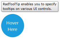
In order to use RadToolTip you should take advantage of the RadToolTipService. You can set the attached property RadToolTipService.TooltipContent on some element in XAML in order to show tooltip over it.
Example 1
<Grid x:Name="LayoutRoot" Background="White">
<Ellipse x:Name="ellipse"
Width="80"
Height="80"
Fill="#FF1B9DDE"
Stroke="#FF1B9DDE"
StrokeThickness="2"
Visibility="Visible"
telerik:RadToolTipService.VerticalOffset="-5"
telerik:RadToolTipService.Placement="Top"
telerik:RadToolTipService.ToolTipContent="RadToolTip enables you to specify
tooltips on various UI controls.">
<telerik:RadToolTipService.ToolTipContentTemplate>
<DataTemplate>
<telerik:RadToolTipContentView>
<TextBlock Text="{Binding}" />
</telerik:RadToolTipContentView>
</DataTemplate>
</telerik:RadToolTipService.ToolTipContentTemplate>
</Ellipse>
<TextBlock Name="tBlock"
HorizontalAlignment="Center"
VerticalAlignment="Center"
FontFamily="Segoe UI"
FontSize="16"
Foreground="White"
IsHitTestVisible="False">
<Run Text="Hover"/>
<LineBreak />
<Run Text=" Here" />
</TextBlock>
</Grid>

The same configuration can be achieved from code like this:
Example 2
RadToolTipService.SetToolTipContent(this.ellipse, "RadToolTip enables you to specify
tooltips on various UI controls.");
RadToolTipService.SetPlacement(this.ellipse, System.Windows.Controls.Primitives.PlacementMode.Center);
RadToolTipService.SetToolTipContent(Me.ellipse, "RadToolTip enables you to specify
tooltips on various UI controls.")
RadToolTipService.SetPlacement(Me.ellipse, System.Windows.Controls.Primitives.PlacementMode.Center)
The RadToolTipService controls the open/close functionality as well as the visual appearance of a RadToolTip object. Also, the service provides a rich set of properties customizing the visualization of the RadToolTip object.
For example you can change the element next to which a tooltip will be opened. This can be achieved by setting the RadToolTipService.PlacementTarget property
Example 3
<StackPanel Orientation="Horizontal">
    <Rectangle Width="30"
               Height="30"
               Margin="20 0"
               Fill="Red"
               telerik:RadToolTipService.Placement="Top"
               telerik:RadToolTipService.PlacementTarget="{Binding ElementName=rect}"
               telerik:RadToolTipService.ToolTipContent="ToolTip on foreign element"
               telerik:RadToolTipService.VerticalOffset="-5" />
    <Rectangle x:Name="rect"
               Width="30"
               Height="30"
               VerticalAlignment="Center"
               Fill="Blue" />
</StackPanel>
Figure 2 shows how the ToolTip will be visualized with the above defined settings

Properties
Below are listed all properties exposed by the RadToolTipService along with short description.
- BetweenShowDelay: A property of type int and gets or sets the maximum time between the display of two tooltips where the second tooltip appears without a delay.
- HorizontalOffset: A property of type double which gets or sets the offset from the left of the area that is specified for the tooltip by the PlacementRectangle and PlacementTarget properties.
- InitialShowDelay: A property of type int and gets or sets the time in miliseconds before a tooltip opens.
- IsEnabled: A property of type bool which gets or sets a value controlling wheter the tooltip should appear.
- Placement: A property of type PlacementMode and gets or sets orientation of the tooltip when it opens and specifies how the tooltip behaves when it overlaps screen boundaries.
- PlacementRectangle: A property of of type Rect and gets or sets the rectangular area relative to which the tooltip is positioned.
- PlacementTarget: A property of of type UIElement and gets or sets the object relative to which the tooltip is positioned.
- ShowDuration: A property of type int and gets or sets the time in miliseconds that a tooltip remains visible.
- ToolTipContent: A property of type object and gets or sets the content of the ToolTip.
- ToolTipContentTemplate: A property of of type DataTemplate and gets or sets the content template of the ToolTip.
Events
The RadToolTipService exposes the following events:
ToolTipOpening - occures when a tooltip is in process of opening.
ToolTipClosing - occures when a tooltip is in process of closing.
Setting a Theme
Telerik themes are not turned on by default in RadToolTip. To use predefined Telerik styles you can check the Theming help article.
The controls from our suite support different themes. You can see how to apply a theme different than the default one in the Setting a Theme help article.
Changing the theme using implicit styles will affect all controls that have styles defined in the merged resource dictionaries. This is applicable only for the controls in the scope in which the resources are merged.
To change the theme, you can follow the steps below:
Choose between the themes and add reference to the corresponding theme assembly (ex: Telerik.Windows.Themes.Windows8.dll). You can see the different themes applied in the Theming examples from our Silverlight Controls Examples application.
-
Merge the ResourceDictionaries with the namespace required for the controls that you are using from the theme assembly. For the RadToolTip, you will need to merge the following resources:
- Telerik.Windows.Controls
Example 4 demonstrates how to merge the ResourceDictionaries so that they are applied globally for the entire application.
Example 4: Merge the ResourceDictionaries
<Application.Resources>
    <ResourceDictionary>
        <ResourceDictionary.MergedDictionaries>
            <ResourceDictionary Source="/Telerik.Windows.Themes.Windows8;component/Themes/System.Windows.xaml"/>
            <ResourceDictionary Source="/Telerik.Windows.Themes.Windows8;component/Themes/Telerik.Windows.Controls.xaml"/>
        </ResourceDictionary.MergedDictionaries>
    </ResourceDictionary>
</Application.Resources>
Alternatively, you can use the theme of the control via the StyleManager.
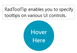
Figure 3 shows a RadToolTip with the Windows8 theme applied.
Figure 3: RadToolTip with the Windows8 theme
