Use Custom Items with Selection and Mouse Over Visual States
This article shows how to customize the timeline items and keep their visual states using TimelineItemTemplate and TimelineInstantItemTemplate.
If you want to simply change the appearance of the items and don't mind losing their highlighting (like mouse-over color, selected color, pressed color, etc.), follow the steps in the Customizing Items article.
Setting up the Models
This section shows how to set up a very basic model that can be used to populate the RadTimeline control's ItemsSource.
Example 1: Item model definition
public class ItemModel
{
    public DateTime Start { get; set; }
    public TimeSpan Duration { get; set; }
    public string Title { get; set; }
}
Start and Duration properties define the length of the item in the timeline and Title holds text information about the item.
Setting up the Data
This section shows how to populate a collection of ItemModel objects and assign it as the source of the RadTimeline control. This is done via the ItemsSource property.
Example 2: Setting up the data
public MainWindow()
{
    InitializeComponent();

    var startDate = new DateTime(2019, 6, 5);
    var source = new ObservableCollection<ItemModel>();
    source.Add(new ItemModel() { Title = "Item 1", Start = startDate.AddDays(3), Duration = TimeSpan.FromDays(5) });
    source.Add(new ItemModel() { Title = "Item 2", Start = startDate.AddDays(14), Duration = TimeSpan.FromDays(3) });
    source.Add(new ItemModel() { Title = "Instant Item", Start = startDate.AddDays(23) });
    this.timeline.ItemsSource = source;
}
Modifying the Item Template
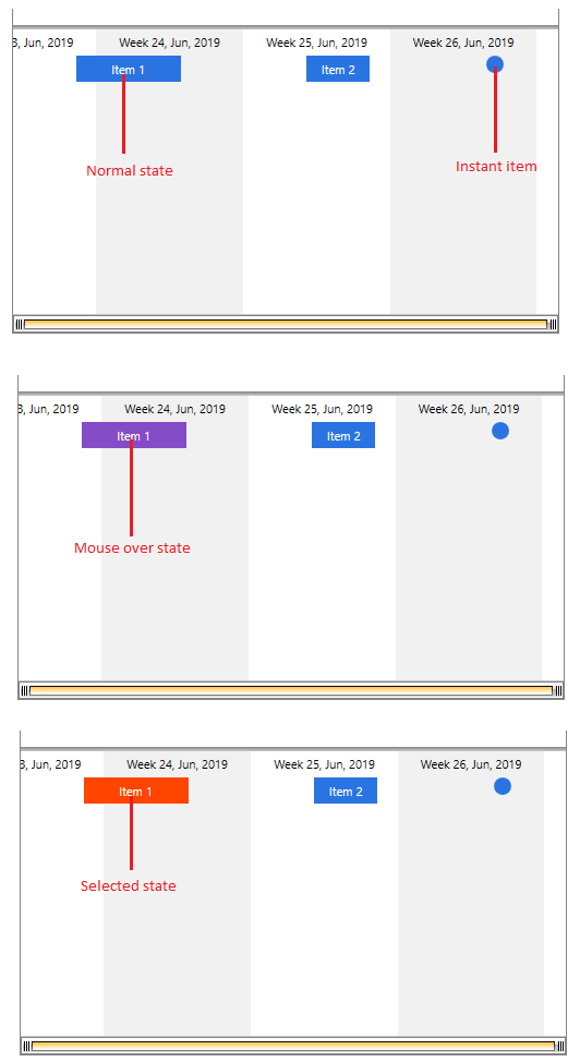
This section shows how to create a custom item template and apply it to the control using the TimelineItemTemplate property. Then you can add triggers to animate the background of the custom element when the mouse is over and when the item is selected.
Example 3: Defining timeline control and an item template
<telerik:RadTimeline x:Name="timeline"
                     IsSelectionEnabled="True"
                     StartPath="Start"
                     DurationPath="Duration"
                     PeriodStart="2019-6-5"
                     PeriodEnd="2019-7-1">
        <telerik:RadTimeline.Intervals>
            <telerik:MonthInterval/>
            <telerik:WeekInterval/>
            <telerik:DayInterval />
            <telerik:HourInterval />
        </telerik:RadTimeline.Intervals>
        <telerik:RadTimeline.TimelineItemTemplate>
            <DataTemplate>
                <Border x:Name="border" Background="#2A74E2" Height="24">
                    <TextBlock Text="{Binding DataItem.Title}" TextAlignment="Center"
                               VerticalAlignment="Center" Foreground="White" />
                </Border>
                <DataTemplate.Triggers>
                    <Trigger Property="IsMouseOver" Value="True">
                        <Setter Property="Background" Value="#854CC7" TargetName="border"/>
                    </Trigger>
                    <DataTrigger Binding="{Binding IsSelected}" Value="True">
                        <Setter Property="Background" Value="OrangeRed" TargetName="border"/>
                    </DataTrigger>
                </DataTemplate.Triggers>
            </DataTemplate>
        </telerik:RadTimeline.TimelineItemTemplate>
    </telerik:RadTimeline>
Triggers collection of the DataTemplate in order to animate the background of the element in the template.
Modifying the Instant Item Template
This section shows how to create a custom instant item template and apply it to the control using the TimelineInstantItemTemplate property. Then you can add triggers to animate the background of the custom element when the mouse is over and when the item is selected.
Example 4: Defining timeline control and an instant item template
<telerik:RadTimeline x:Name="timeline"
                     IsSelectionEnabled="True"
                     StartPath="Start"
                     DurationPath="Duration"
                     PeriodStart="2019-6-5"
                     PeriodEnd="2019-7-1">
        <telerik:RadTimeline.Intervals>
            <telerik:MonthInterval/>
            <telerik:WeekInterval/>
            <telerik:DayInterval />
            <telerik:HourInterval />
        </telerik:RadTimeline.Intervals>
        <telerik:RadTimeline.TimelineInstantItemTemplate>
            <DataTemplate>
                 <Ellipse x:Name="ellipse" Fill="#2A74E2" Width="16" Height="16"
                         telerik:RadToolTipService.ToolTipContent="{Binding DataItem.Title}" />
                <DataTemplate.Triggers>
                    <Trigger Property="IsMouseOver" Value="True">
                        <Setter Property="Fill" Value="#854CC7" TargetName="ellipse"/>
                    </Trigger>
                    <DataTrigger Binding="{Binding IsSelected}" Value="True">
                        <Setter Property="Fill" Value="OrangeRed" TargetName="ellipse"/>
                    </DataTrigger>
                </DataTemplate.Triggers>
            </DataTemplate>
        </telerik:RadTimeline.TimelineInstantItemTemplate>
    </telerik:RadTimeline>
Triggers collection of the DataTemplate in order to animate the elements in the template.
Figure 1: Customize item and instant item templates