Use RadRibbonView with Other controls
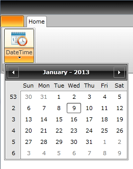
Use RadRibbonView with RadCalendar
The purpose of this tutorial is to show you how to integrate a RadCalendar with a RadRibbonView. The solution is to set the RadCalendar as a drop down content of a RadRibbonSplitButton. The next example demonstrates how to do that.
<telerik:RadRibbonView Name="xRibbonView">
    <telerik:RadRibbonTab Header="Home">
        <telerik:RadRibbonGroup>
            <telerik:RadRibbonSplitButton LargeImage="Images/CalendarIcon.png"
                                            Size="Large"
                                            Text="DateTime">
                <telerik:RadRibbonSplitButton.DropDownContent>
                    <telerik:RadCalendar />
                </telerik:RadRibbonSplitButton.DropDownContent>
            </telerik:RadRibbonSplitButton>
        </telerik:RadRibbonGroup>
    </telerik:RadRibbonTab>
</telerik:RadRibbonView>
Here is the result:
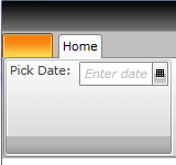
Use RadRibbonView with DataPicker
Except the controls associated with the RadRibbonView, like RadRibbonButton, RadRibbonGallery, RadRibbonComboBox, you can place other controls in the RadRibbonGroups. Here is an example of adding a RadDatePicker control inside a RadRibbonGroup.
<telerik:RadRibbonView Name="xRibbonView">
    <telerik:RadRibbonTab Header="Home">
        <telerik:RadRibbonGroup>
            <TextBlock Text="Pick Date: " />
            <telerik:RadDatePicker HorizontalAlignment="Right" VerticalAlignment="Top" />
        </telerik:RadRibbonGroup>
    </telerik:RadRibbonTab>
</telerik:RadRibbonView>
The result is the following:
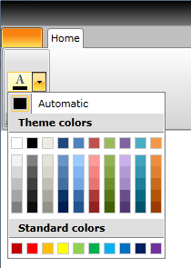
Integrate a RadColorPicker Directly Into a Ribbon Group
The next example demonstrates how to integrate a RadColorPicker directly into a Ribbon Group.
<telerik:RadRibbonView Name="xRibbonView">
    <telerik:RadRibbonTab Header="Home">
        <telerik:RadRibbonGroup>
            <telerik:RadColorPicker Name="xColorPicker" />
        </telerik:RadRibbonGroup>
    </telerik:RadRibbonTab>
</telerik:RadRibbonView>
And the result is:
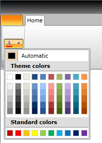
Integrate a RadColorSelector as a Part of a RadRibbonDropDownButton
Integrating a RadColorSelector with a RadRibbonDropDownButton is a simple task. See the next code-snippet.
<telerik:RadRibbonView Name="xRibbonView">
    <telerik:RadRibbonTab Header="Home">
        <telerik:RadRibbonGroup>
            <telerik:RadRibbonDropDownButton SmallImage="Images/ColorPickerIcon.png" Height="20" Width="40">
                <telerik:RadRibbonDropDownButton.DropDownContent>
                    <telerik:RadColorSelector />
                </telerik:RadRibbonDropDownButton.DropDownContent>
            </telerik:RadRibbonDropDownButton>
        </telerik:RadRibbonGroup>
    </telerik:RadRibbonTab>
</telerik:RadRibbonView>
The RadColorSelector is set as a DropDownContent of the RadRibbonDropDownButton.