Ribbon Window
The RadRibbonWindow control is used to define a specialized window that is pre-configured with a__RadRibbonView__ to emulate MS Office UI in Silverlight.
An application that will use the new RadRibbonWindow should be configured to run in out-of-browser mode and also to require elevated trust permissions with one of these options: No Border or Borderless Round Corners (the preferred one). This tutorial will walk you through the task of defining a RadRibbonWindow in your application.
Configuration
First you need to configure your Silverlight project. Right click on it and choose Properties. Then you should enable the out of browser option:

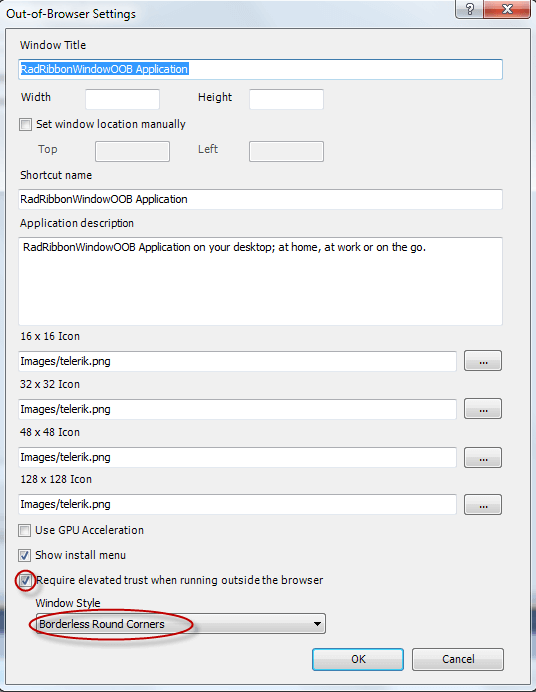
Then you need to click on the Out-of-Browser Settings… button and check the Require Elevated Trust. Also, make sure that the WindowStyle is Borderless Round Corners:
Define the RadRibbonWindow in the application
<UserControl x:Class="SampleApplication.RibbonWindowPage"
             xmlns="http://schemas.microsoft.com/winfx/2006/xaml/presentation"
             xmlns:x="http://schemas.microsoft.com/winfx/2006/xaml"
             xmlns:mc="http://schemas.openxmlformats.org/markup-compatibility/2006"
             xmlns:telerik="http://schemas.telerik.com/2008/xaml/presentation">
    <telerik:RadRibbonWindow>
        <Grid>
            <Grid.RowDefinitions>
                <RowDefinition Height="Auto" />
                <RowDefinition Height="*" />
            </Grid.RowDefinitions>
            <telerik:RadRibbonView x:Name="radRibbonView1"
                                   Title="Document1"
                                   ApplicationButtonImageSource="Images/IconMSOffice/AppIcon.png"
                                   ApplicationName="Telerik Word"
                                   HelpButtonVisibility="Visible"
                                   MinimizeButtonVisibility="Visible"
                                   telerik:KeyTipService.IsKeyTipsEnabled="True">
                <telerik:RadRibbonView.Backstage>
                    <telerik:RadRibbonBackstage />
                </telerik:RadRibbonView.Backstage>
                <telerik:RadRibbonView.QuickAccessToolBar>
                    <telerik:QuickAccessToolBar />
                </telerik:RadRibbonView.QuickAccessToolBar>
                <telerik:RadRibbonTab Header="Home" telerik:KeyTipService.AccessText="H" />
                <telerik:RadRibbonTab Header="Page Layout" telerik:KeyTipService.AccessText="P" />
                <telerik:RadRibbonTab Header="References" telerik:KeyTipService.AccessText="S" />
                <telerik:RadRibbonTab Header="Mailings" telerik:KeyTipService.AccessText="M" />
                <telerik:RadRibbonTab Header="Review" telerik:KeyTipService.AccessText="R" />
                <telerik:RadRibbonTab Header="View" telerik:KeyTipService.AccessText="W" />
            </telerik:RadRibbonView>
            <Grid Grid.Row="1" />
        </Grid>
    </telerik:RadRibbonWindow>
</UserControl>
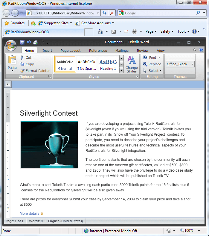
Now, when you hit F5 you should get the following result:
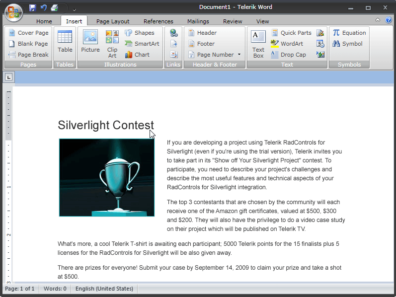
In order to run the project in OOB you need to install it:

Then you should get the final result:
Icon
In order to provide a custom icon for the RadRibbonWindow, you have to set its Icon property as demonstrated in the following code snippet.
<telerik:RadRibbonWindow Icon="Images/application-icon.ico">
Themes
RadRibbonWindow comes with full support for all our predefined Telerik themes and you can choose the most suitable for your needs.
In order to apply a Telerik style on the RadRibbonWindow, it is best to use the implicit styling mechanism further described in the Setting a Theme (Using Implicit Styles) tutorial.
Please note that the default RadRibbonWindow implicit style cannot be applied on derived controls as their Type is different than the one defined as a TargetType in the implicit style. This is why in order to apply a Telerik predefined style on a UserControl deriving from RadRibbonWindow you need to define a Style targeting the UserControl type in the Resources of the application. Make sure to define that style after merging the Telerik ResourseDictionaries so that you can base it on the predefined "RadRibbonWindowStyle".
<!-- In App.xaml -->
<ResourceDictionary xmlns="http://schemas.microsoft.com/winfx/2006/xaml/presentation"
                    xmlns:x="http://schemas.microsoft.com/winfx/2006/xaml"
                    xmlns:local="clr-namespace:RibbonWindow_ImplicitStylesDemo">
    <Style TargetType="local:MainWindow" BasedOn="{StaticResource RadRibbonWindowStyle}" />
</ResourceDictionary>

More information and a sample project using the RadRibbonWindow for Silverlight, can be found here.