Orientation and DropDownPlacement
The RadMenu exposes a set of properties, which allow you to specify its orientation and placement of the drop-down sub-menus. They are as follows:
Orientation
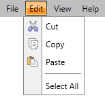
The RadMenu control can have its layout oriented in two directions - horizontal and vertical (similar to the StackPanel). By default the top-level items of the RadMenu are ordered horizontally.

Note that the sub menu items are not connected to the orientation of the RadMenu control.
To modify the orientation you just have to set the Orientation property to one of the following values:
Horizontal (default)
Vertical
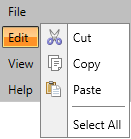
Here is an example of a vertically oriented RadMenu.
<telerik:RadMenu Orientation="Vertical">
    ...
</telerik:RadMenu>

DropDownPlacement
If there are any sub-menus in the RadMenu their dropdown position can be specified through the DropDownPlacement property of the RadMenuItem. It has the following values:
Auto - positions the dropdown of the sub-menu automatically.
Bottom - displays the nested RadMenuItems below the parent RadMenuItem.
Left - displays the nested RadMenuItems on the left of the parent RadMenuItem.
Right - displays the nested RadMenuItems on the right of the parent RadMenuItem.
Top - displays the nested RadMenuItems above the parent RadMenuItem.
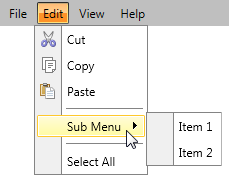
Here is an example:
<telerik:RadMenu>
    ...
    <telerik:RadMenuItem Header="Edit" DropDownPlacement="Bottom">
        ...
        <telerik:RadMenuItem Header="Sub Menu" DropDownPlacement="Right">
            <telerik:RadMenuItem Header="Item 1" />
            <telerik:RadMenuItem Header="Item 2" />
        </telerik:RadMenuItem>
        ...
    </telerik:RadMenuItem>
    ...
</telerik:RadMenu>
