Lightweight Templates
With 2013 Q2 SP we have introduced lightweight templates for RadGridView and RadTreeListView. This article will walk you through the following sections:
- Core Styles
- Core Styles Including Validation
- Remove the Border of the Current Cell
- Remove the Border of the Current Cell With Validation
They are represented by several additional simplified styles, which you can merge in your project. The main idea of simplifying templates of different parts of RadGridView is to limit the number of visual elements within the templates in order to speed up the performance of RadGridView/RadTreeListView.
The Lightweight Templates can only be applied with NoXaml binaries and Implicit Themes. You can find more information on them here.
The performance on loading the visual elements will be increased up to 25% when the lightweight templates are applied.
Please note that the row details and hierarchy features are not supported for rows which use lightweight templates as the PART_HierarchyChildPresenter and PART_DetailsPresenter elements which are responsible for displaying the hierarchcal data are not defined in these templates. They can, however, still be used for the bottom-level RadGridView instances of the hierarchy (those which do not have any children).
Core Styles
The CoreStyles are a basic alternative of the standard GridViewCell, GridViewRow, TreeListViewRow including basic еffects and funcionalities such as hover, selection, currency, grouping for these elements. These core styles are included within the themes of RadGridView and you may reference them in your project as shown below:
Example 1: Applying the Lightweight Templates
<Grid.Resources>
    <ResourceDictionary>
        <ResourceDictionary.MergedDictionaries>
            <ResourceDictionary Source="/Telerik.Windows.Themes.Office_Black;component/Themes/System.Windows.xaml"/>
            <ResourceDictionary Source="/Telerik.Windows.Themes.Office_Black;component/Themes/Telerik.Windows.Controls.xaml"/>
            <ResourceDictionary Source="/Telerik.Windows.Themes.Office_Black;component/Themes/Telerik.Windows.Controls.Input.xaml"/>
            <ResourceDictionary Source="/Telerik.Windows.Themes.Office_Black;component/Themes/Telerik.Windows.Controls.GridView.xaml"/>
        </ResourceDictionary.MergedDictionaries>
        <Style TargetType="telerik:GridViewRow" BasedOn="{StaticResource GridViewRowCoreStyle}"/>
        <Style TargetType="telerik:GridViewCell" BasedOn="{StaticResource GridViewCellCoreStyle}"/>
        <Style TargetType="telerik:TreeListViewRow" BasedOn="{StaticResource TreeListViewRowCoreStyle}"/>
    </ResourceDictionary>
</Grid.Resources>
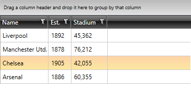
Figure 1: RadGridView with Lightweight templates applied

For RadGridView you need to merge only the CoreStyles for GridViewCell and GridViewRow. For RadTreeListView you need to merge the styles for GridViewCell and TreeListViewRow.
GridViewRowCoreStyle does not contain a row indicator. Please set the RowIndicatorVisibility property of the RadGridView to Collapsed to avoid any visual differences between the row's headers and cells.
Core Styles with Validation
The CoreValidationStyles are an alternative of the standard GridViewCell, GridViewRow, TreeListViewRow. They include basic еffects and funcionalities such as hover, selection, currency, grouping, validation for these elements. These core styles are included within the themes of RadGridView and you may reference it in your project as shown below.
Example 2: Applying Lightweight Templates with Validation
<Grid.Resources>
    <ResourceDictionary>
        <ResourceDictionary.MergedDictionaries>
            <ResourceDictionary Source="/Telerik.Windows.Themes.Office_Black;component/Themes/System.Windows.xaml"/>
            <ResourceDictionary Source="/Telerik.Windows.Themes.Office_Black;component/Themes/Telerik.Windows.Controls.xaml"/>
            <ResourceDictionary Source="/Telerik.Windows.Themes.Office_Black;component/Themes/Telerik.Windows.Controls.Input.xaml"/>
            <ResourceDictionary Source="/Telerik.Windows.Themes.Office_Black;component/Themes/Telerik.Windows.Controls.GridView.xaml"/>
        </ResourceDictionary.MergedDictionaries>
        <Style TargetType="telerik:GridViewRow" BasedOn="{StaticResource GridViewRowCoreValidationStyle}"/>
        <Style TargetType="telerik:GridViewCell" BasedOn="{StaticResource GridViewCellCoreValidationStyle}"/>
        <Style TargetType="telerik:TreeListViewRow" BasedOn="{StaticResource TreeListViewRowCoreValidationStyle}"/>
    </ResourceDictionary>
</Grid.Resources>
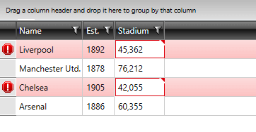
Figure 2: RadGridView with Lightweight templates with validation applied

GridViewRowCoreValidationStyle contains a row indicator, which you can use to perform validation.
For RadGridView you need to merge only the CoreStyles for GridViewCell and GridViewRow. For RadTreeListView you need to merge the styles for GridViewCell and TreeListViewRow.
Remove the Border of the Current Cell
For such requirement, you need to predefine the ControlTemplate applied to GridViewCell when Lightweight templates are used. Within the ControlTemplate you need to search for the IsCurrent Property Trigger and delete it.
Example 3: Deleting the IsCurrent Property Trigger
<ControlTemplate x:Key="GridViewCellCoreTemplate" TargetType="grid:GridViewCell">
    <Grid>
        ...
    </Grid>
    <ControlTemplate.Triggers>
        ...
        <Trigger Property="IsCurrent" Value="True">
            <Setter TargetName="PART_CellBorder" Property="BorderBrush" Value="{StaticResource GridViewCell_CurrentBorder}"/>
            <Setter TargetName="PART_CellBorder" Property="BorderThickness" Value="1"/>
        </Trigger>
    </ControlTemplate.Triggers>
</ControlTemplate>
Figure 3: RadGridView with Lightweight templates and removed Current Cell Border

Remove the Border of the Current Cell With Validation
A similar approach as from the previous section needs to be used. The difference is that the same Property Trigger has to be deleted from the ControlTemplate applied to GridViewCell when Lightweight templates with validation are used.
Example 4: Deleting the IsCurrent Property Trigger when Lightweight Templates with Validation are applied
<ControlTemplate x:Key="GridViewCellCoreValidationTemplate" TargetType="grid:GridViewCell">
    <Grid>
        ...
    </Grid>
    <ControlTemplate.Triggers>
       ...
        <Trigger Property="IsCurrent" Value="True">
            <Setter TargetName="PART_CellBorder" Property="BorderBrush" Value="{StaticResource GridViewCell_CurrentBorder}"/>
            <Setter TargetName="PART_CellBorder" Property="BorderThickness" Value="1"/>
            <Setter TargetName="PART_CellBorder" Property="Margin" Value="0,0,1,1"/>
        </Trigger>
        ...
    </ControlTemplate.Triggers>
</ControlTemplate>
Figure 4: RadGridView with Lightweight templates including validation and removed Current Cell Border

You can download a runnable solution from our online SDK repository here.
You can also find the blog post on How To Boost RadGridView Performance for WPF and Silverlight Using Lightweight templates.