Basics
You are able to configure the displaying of the different tick types on the scale. For each of the Ticks - Minor, Middle or Major you can configure the following:
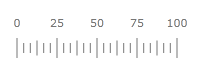
Size
To specify the size of all major ticks you should use the MajorTickRelativeWidth and MajorTickRelativeHeight properties of the respective Scale object. You can use the MinorTickRelativeWidth and MinorTickRelativeHeight properties to change the size of the minor ticks or the MiddleTickRelativeWidth and MiddleTickRelativeHeight properties to change the size of the middle ticks respectively. The tick's size is relative to the cell size of the scale.
To learn more about the cell size term, read the Relative Measurements topic.
Here is an example:
<telerik:RadHorizontalLinearGauge Width="200" Height="100" telerik:StyleManager.Theme="Windows8">
    <telerik:HorizontalLinearScale Min="0" Max="100"
                         MajorTickRelativeWidth="0.003"
                         MajorTickRelativeHeight="0.12"/>
</telerik:RadHorizontalLinearGauge>
Here is a snapshot of the result.
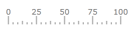
Location
The TickProperties class exposes a Location property, which allows you to specify the location of the ticks towards the scale.
Here is an example:
<telerik:RadHorizontalLinearGauge Width="200" Height="100" telerik:StyleManager.Theme="Windows8">
    <telerik:HorizontalLinearScale Min="0" Max="100"
                         MajorTickRelativeHeight="0.2"
                         MiddleTickRelativeHeight="0.15"
                         MinorTickRelativeHeight="0.1*"
                         MajorTickLocation="OverCenter"
                         MiddleTickLocation="OverCenter"
                         MinorTickLocation="OverCenter" />
</telerik:RadHorizontalLinearGauge>
Here is a snapshot of the result:
Appearance
The TickProperties objects provide you with two ways of modifying the ticks' appearance:
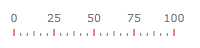
Modifying Tick's Background
To modify the ticks' background, simply set the MajorTickBackground, MiddleTickBackground or the MinorTickBackground property of the respective Scale object to the desired color. Here is an example:
<telerik:RadHorizontalLinearGauge Width="200" Height="100" telerik:StyleManager.Theme="Windows8">
    <telerik:HorizontalLinearScale Min="0" Max="100"
                         MajorTickBackground="#FFE50000"/>
</telerik:RadHorizontalLinearGauge>
Here is a snapshot of the result:
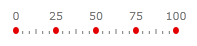
Specifying a DataTemplate
The other way of specifying the appearance of the tick is by defining an entire DataTemplate for it, which will get applied to each of the ticks of the respective type. There you can define the visual appearance of the tick as you desire and bind the used elements to the data context of the template where needed.
<telerik:RadHorizontalLinearGauge Width="200" Height="100" telerik:StyleManager.Theme="Windows8">
    <telerik:RadHorizontalLinearGauge.Resources>
        <DataTemplate x:Key="CustomTemplate">
            <Ellipse Fill="#FFE50000"
                     HorizontalAlignment="Stretch"
                     VerticalAlignment="Stretch" />
        </DataTemplate>
    </telerik:RadHorizontalLinearGauge.Resources>
    <telerik:HorizontalLinearScale Min="0" Max="100"
                         MajorTickTemplate="{StaticResource CustomTemplate}"
                         MajorTickRelativeWidth="0.03*"/>
</telerik:RadHorizontalLinearGauge>
Here is a snapshot of the result: