Basics
The indicator controls, except the NumericIndicator, derive from the IndicatorBase class. Because of that they provide some common functionality. This topic will focus on the common features between the available indicators.
For the examples in this article a Marker indicator will be used, but the examples can be applied to any other indicator that derives from the IndicatorBase class, as well.
It will explain the following:
To learn more about the Numeric Indicator, read this topic.
Animating the Indicator
When the value of the indicator gets changed, it will get positioned on the appropriate place on the scale. By default the indicator will directly go to the respective position, but you are able to make this transition smoother by animating it. To do it, just enable the indicators animation by setting the IsAnimated property to True and set the Duration property to the desired value. Here is an example.
<telerik:RadVerticalLinearGauge telerik:StyleManager.Theme="Windows8">
    <telerik:VerticalLinearScale  Min="1" Max="12"
                                  IsInteractive="True">
        <telerik:VerticalLinearScale.Indicators>
            <telerik:Marker IsAnimated="True" Duration="0:0:0.5"
                            telerik:ScaleObject.RelativeHeight="0.05*" />
        </telerik:VerticalLinearScale.Indicators>
    </telerik:VerticalLinearScale>
</telerik:RadVerticalLinearGauge>
Refreshing the Indicator
In a scenario where the gauge is used to visualize the changing of a particular value, the indicator should get updated whenever the value changes. This can be done by simply setting the Value property of the indicator to the new value. However in some scenarios you may have multiple value changes in a very short period of time. This would make the indicator go through several values very fast and make the gauge harder for observing. In this case you can use the Refresh feature of the indicator. It consists in updating the indicator position only at a specific interval of time and displaying a value calculated on the basis of all the values that have occurred in the interval.
To implement this feature you have to use the RefreshRate and RefreshMode properties. The first one represents the interval of time between two updates. It is of type TimeSpan. Here you can read about the format, that TimeSpan.Parse() uses. The second one specifies the way the final value gets calculated. You can choose between the following:
None (default) - disables refreshing.
Average - displays the average of the values, that occurred in the interval.
Max - displays the greatest from the values, that occured in the interval.
Min - display the smallest of the values, that occured in the interval.
Here is an example:
<telerik:RadVerticalLinearGauge telerik:StyleManager.Theme="Windows8">
    <telerik:VerticalLinearScale Min="1" Max="12">
        <telerik:VerticalLinearScale.Indicators>
            <telerik:Marker RefreshMode="Min"
                            RefreshRate="0:0:5"
                            telerik:ScaleObject.RelativeHeight="0.05*" />
        </telerik:VerticalLinearScale.Indicators>
    </telerik:VerticalLinearScale>
</telerik:RadVerticalLinearGauge>
Snapping the Indicator
The Snapping feature allows the gauge to display values only for a fixed positions or values which match a specific interval. An example for snapping is the following scenario - you are interested to point values 5 and 10 on the gauge, and want all the values between 5 and 10 to be shown as the closest from these two (i.e. 6 will be shown as 5 and 9 will be shown as 10).
When using a scale that has its Interactivity feature enabled, the snapping will configure the movement of the indicator along the scale.
In order to enable and configure the Snapping you have to use the SnapType property, which can be set to the following values:
None - specifies that the indicator can be moved freely along the scale and positioned anywhere on it.
ToGrid - specifies that the indicator would snap to the scale's ticks.
ToInterval - specifies that the indicator would snap to values of the scale, that belong to a specific interval. For this purpose you have to use the SnapInterval property too. For example, an initial value of the indicator of 1 and an interval of 2 will make the indicator snap only to the values 1, 3, 5, 7, etc.
Here is an example:
<telerik:RadVerticalLinearGauge telerik:StyleManager.Theme="Windows8">
    <telerik:VerticalLinearScale Min="0" Max="20"
                         IsInteractive="True">
        <telerik:VerticalLinearScale.Indicators>
            <telerik:Marker SnapType="ToInterval"
                            SnapInterval="5"
                            telerik:ScaleObject.RelativeHeight="0.05*" />
        </telerik:VerticalLinearScale.Indicators>
    </telerik:VerticalLinearScale>
</telerik:RadVerticalLinearGauge>
Indicator's Size
To manipulate the indicator's size, simply use the RelativeHeight and RelativeWidth attached properties. As the names suggest, their value are relative to the cell size of the scale. The cell size of the scale is determined by the size of the container it is place in. For the linear scales it is equal to the height of the container and by the radial scales to the radius of the container.
To learn more about the cell size term, read the Relative Measurements topic.
Here is an example:
<telerik:RadVerticalLinearGauge telerik:StyleManager.Theme="Windows8">
    <telerik:VerticalLinearScale Min="0" Max="20"
                         IsInteractive="True">
        <telerik:VerticalLinearScale.Indicators>
            <telerik:Marker telerik:ScaleObject.RelativeWidth="0.1"
                            telerik:ScaleObject.RelativeHeight="0.05" />
        </telerik:VerticalLinearScale.Indicators>
    </telerik:VerticalLinearScale>
</telerik:RadVerticalLinearGauge>
Here is a snapshot of the result:

Indicator's Value
The indicators have a Value property, which specifies the value from the scale they should point to. You can set this property to a desired value, whenever you need to reposition the indicator.
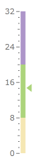
Using the Range Color
If you use ranges in your scale, you can make the indicator consistent with their color. This way, when the indicator enters into a specific range, it will take the color defined for it by the range. For this purpose you have to set the UseRangeColor property of the indicator to True and the IndicatorBackground property of the range to the desired indicator color.
To learn more about ranges, read the Ranges topic.
Here is an example.
<telerik:RadVerticalLinearGauge telerik:StyleManager.Theme="Windows8">
    <telerik:VerticalLinearScale Min="0" Max="32"
                    IsInteractive="True"
                    RangeLocation="OverCenter">
        <telerik:VerticalLinearScale.Ranges>
            <telerik:GaugeRange Background="#F5E7B3"
                            Min="0"
                            Max="8"
                            IndicatorBackground="#F5E7B3"/>
            <telerik:GaugeRange Background="#acd47b"
                            Min="8"
                            Max="20"
                            IndicatorBackground="#acd47b" />
            <telerik:GaugeRange Background="#ad95c9"
                            Min="20"
                            Max="32"
                            IndicatorBackground="#ad95c9" />
        </telerik:VerticalLinearScale.Ranges>
        <telerik:VerticalLinearScale.Indicators>
            <telerik:Marker telerik:ScaleObject.RelativeWidth="0.16"
                    telerik:ScaleObject.RelativeHeight="0.03"
                    telerik:ScaleObject.Location="Inside"
                    UseRangeColor="True"/>
        </telerik:VerticalLinearScale.Indicators>
    </telerik:VerticalLinearScale>
</telerik:RadVerticalLinearGauge>
Here is a snapshot of the result.
Value's Source
This feature of the indicators allow you to specify a data source.The values in the data source can get displayed by the marker in their representive order. This allow you to bind the RadGauge control to a dynamic set of data. To learn more about this feature of the indicators and the RadGauge control, read the Data Binding topic.