Pane's Menu
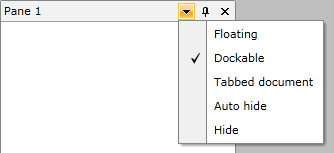
Each RadPane has a menu, which allow you to perform certain actions against the RadPane. By default the RadMenu has the following items:
Floating - makes the RadPane floating.
Dockable - docks the RadPane.
Tabbed Document- places the RadPane in the DocumentHost.
Auto Hide- pins/unpins the RadPane, when it is docked.
Hide - hides the RadPane.

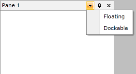
You can modify the menu by using the ContextMenuTemplate property of the RadPane. It is of type DataTemplate and is expected to contain a RadContextMenu. Here is an example:
<telerik:RadPane x:Name="radPane"
             Header="Pane 1">
    <telerik:RadPane.ContextMenuTemplate>
        <DataTemplate>
            <telerik:RadContextMenu>
                <telerik:RadMenuItem Header="Floating" />
                <telerik:RadMenuItem Header="Dockable" />
            </telerik:RadContextMenu>
        </DataTemplate>
    </telerik:RadPane.ContextMenuTemplate>
</telerik:RadPane>
To make the menu items functional you can use the predefined RadDocking commands, which are located in the RadDockingCommands class:
Close
ContextMenuOpen
Dockable
Floating
PaneHeaderMenuOpen
Pin
TabbedDocument
You can also create your own custom commands and use them with the RadPane's menu. To learn how read this topic.
Here is the final code:
The RadDockingCommands class is located in the Telerik.Windows.Controls namespace of the Telerik.Windows.Controls assembly. To use it in XAML you have to declare the following namespace:
xmlns:telerik="http://schemas.telerik.com/2008/xaml/presentation"
<telerik:RadPane x:Name="radPane1"
             Header="Pane 1">
    <telerik:RadPane.ContextMenuTemplate>
        <DataTemplate>
            <telerik:RadContextMenu>
                <telerik:RadMenuItem Header="Floating"
                                       Command="telerik:RadDockingCommands.Floating" />
                <telerik:RadMenuItem Header="Dockable"
                                       Command="telerik:RadDockingCommands.Dockable" />
            </telerik:RadContextMenu>
        </DataTemplate>
    </telerik:RadPane.ContextMenuTemplate>
    <TextBlock Text="Some simple text here" />
</telerik:RadPane>
