Navigator
Since the R2 2020 SP1 version, the RadDocking allows you to navigate through its panes with the help of the DockingNavigator. Press the Ctrl + Tab or Alt + F7 key combinations, use the arrow keys to navigate between panes and get a preview of their content.
Key Properties
The DockingNavigator control consists of two listboxes allowing for the navigation between the RadPanes/RadDocumentPanes and a preview image showing the content of the current pane. It also has a header, description and footer sections showing more information about the selected pane. The following properties allow you to easily modify its look.
- IconTemplate: Gets or sets the ContentTemplate of the icon presenter next to the header of the navigator.
- IconTemplateSelector: Gets or sets the ContentTemplateSelector of the icon presenter next to the header of the navigator.
- HeaderStringFormat: Gets or sets the string format that will be applied to the header of the navigator, if the HeaderTemplate property is not set.
- HeaderTemplate: Gets or sets a DataTemplate that will be applied to the header of the navigator.
- HeaderTemplateSelector: Gets or sets a DataTemplateSelector that allows to select a different DataTemplate depending on the currently selected pane.
- DescriptionStringFormat: Gets or sets the string format that will be applied to the description of the selected pane, if the DescriptionTemplate property is not set.
- DescriptionTemplate: Gets or sets a DataTemplate that will be applied to the presenter of the description for the selected pane.
- DescriptionTemplateSelector: Gets or sets a DataTemplateSelector that will be applied to the presenter of the description for the selected pane.
- ActivePanesListBoxHeader: Gets or sets a string displayed over the DockingNavigatorListBox showing the non-document panes.
- ActiveDocumentsListBoxHeader: Gets or sets a string displayed over the DockingNavigatorListBox showing the RadDocumentPanes.
- ActivePanesListBoxStyle: Gets or sets the Style of the listbox showing the non-document panes. The TargetType should be DockingNavigatorListBox.
- ActiveDocumentsListBoxStyle: Gets or sets the Style of the listbox showing the RadDocumentPanes. The TargetType should be DockingNavigatorListBox.
- ItemTemplateSelector: Gets or sets an DockingNavigatorItemTemplateSelector instance, which allows you to specify DataTemplates for normal and document panes.
- PreviewHeader: Gets or sets a string displayed over the preview image.
- PreviewHeight: Gets or sets the height of the preview image.
- PreviewWidth: Gets or sets the width of the preview image.
- FooterStringFormat: Gets or sets the string format that will be applied to the footer of the navigator, if the FooterTemplate property is not set.
- FooterTemplate: Gets or sets a DataTemplate that will be applied to the footer of the navigator.
- FooterTemplateSelector: Gets or sets a DataTemplateSelector that allows to select a different DataTemplate depending on the currently selected pane.
The values of the ActivePanesListBoxHeader, ActiveDocumentsListBoxHeader and PreviewHeader properties are localized with the following keys: Docking_ActivePanes, Docking_ActiveDocuments and Docking_PreviewHeader. For more information, check out the Localization article.
Attached Properties
The DockingNavigator exposes several attached properties which can be set on RadPane/RadDocumentPane instances in order to transfer information, which can be displayed while navigating. Those properties are used to prepare a NavigatorItemViewModel object, which is the DataContext inside the ItemTemplateSelector.
- Icon: Gets or sets an object that will represent the icon for that pane.
- Header: Gets or sets a object that will represent the header for that pane.
- Footer: Gets or sets a object that will represent the footer for that pane.
- Description: Gets or sets a object that will represent the description for that pane.
Navigator Property
Example 1 demonstrates how you can set the Navigator property of the RadDocking to an instance of the DockingNavigator. It also demonstrates how you can set the DockingNavigator attached properties on the RadPanes/RadDocumentPanes in order to display additional information for a pane while navigating.
Example 1: RadDocking with Navigator property set
<Grid>
<Grid.Resources>
<DataTemplate x:Key="IconTemplate">
<!-- The DataContext here is whatever is set to the telerik:DockingNavigator.Icon of the selected pane-->
<telerik:RadGlyph Glyph="{Binding}" />
</DataTemplate>
<DataTemplate x:Key="DescriptionTemplate">
<!-- The DataContext here is whatever is set to the telerik:DockingNavigator.Description of the selected pane-->
<TextBlock Text="{Binding}" FontWeight="Bold" />
</DataTemplate>
<DataTemplate x:Key="FooterTemplate">
<!-- The DataContext here is whatever is set to the telerik:DockingNavigator.Footer of the selected pane-->
<TextBlock Text="{Binding}" Foreground="Red" FontFamily="Ariel" />
</DataTemplate>
</Grid.Resources>
<telerik:RadDocking x:Name="docking" Margin="150">
<telerik:RadDocking.Navigator>
<telerik:DockingNavigator
PreviewWidth="400"
PreviewHeight="300"
Width="850"
IconTemplate="{StaticResource IconTemplate}"
DescriptionTemplate="{StaticResource DescriptionTemplate}"
FooterTemplate="{StaticResource FooterTemplate}" />
</telerik:RadDocking.Navigator>
<telerik:RadDocking.DocumentHost>
<telerik:RadSplitContainer>
<telerik:RadPaneGroup>
<telerik:RadDocumentPane Header="Document Pane 1"
telerik:DockingNavigator.Icon=""
telerik:DockingNavigator.Description="My first document pane"
telerik:DockingNavigator.Footer="My first document footer">
<TextBlock TextWrapping="Wrap" Text="Press Ctrl + Tab or Alt + F7 to open the DockingNavigator."/>
</telerik:RadDocumentPane>
<telerik:RadDocumentPane Header="Document Pane 2"
telerik:DockingNavigator.Icon=""
telerik:DockingNavigator.Description="My second document pane"
telerik:DockingNavigator.Footer="My second document footer">
<TextBlock TextWrapping="Wrap" Text="Navigate between the panes using the arrow keys."/>
</telerik:RadDocumentPane>
</telerik:RadPaneGroup>
</telerik:RadSplitContainer>
</telerik:RadDocking.DocumentHost>
<telerik:RadSplitContainer InitialPosition="DockedLeft">
<telerik:RadPaneGroup>
<telerik:RadPane Header="Pane 1"
telerik:DockingNavigator.Icon=""
telerik:DockingNavigator.Description="My first pane"
telerik:DockingNavigator.Footer="My first pane footer">
<telerik:RadTreeView>
<telerik:RadTreeViewItem Header="Item 1">
<telerik:RadTreeViewItem Header="Item 1.1" />
<telerik:RadTreeViewItem Header="Item 1.2" />
<telerik:RadTreeViewItem Header="Item 1.3" />
<telerik:RadTreeViewItem Header="Item 1.4" />
</telerik:RadTreeViewItem>
<telerik:RadTreeViewItem Header="Item 2">
<telerik:RadTreeViewItem Header="Item 2.1" />
<telerik:RadTreeViewItem Header="Item 2.2" />
</telerik:RadTreeViewItem>
<telerik:RadTreeViewItem Header="Item 3" IsExpanded="True">
<telerik:RadTreeViewItem Header="Item 3.1" />
<telerik:RadTreeViewItem Header="Item 3.2" />
<telerik:RadTreeViewItem Header="Item 3.3" />
<telerik:RadTreeViewItem Header="Item 3.4" />
<telerik:RadTreeViewItem Header="Item 3.5" />
<telerik:RadTreeViewItem Header="Item 3.5" />
</telerik:RadTreeViewItem>
</telerik:RadTreeView>
</telerik:RadPane>
<telerik:RadPane Header="Pane 2" Content="Pane 2"
telerik:DockingNavigator.Icon=""
telerik:DockingNavigator.Description="My second pane"
telerik:DockingNavigator.Footer="My second pane footer"/>
</telerik:RadPaneGroup>
</telerik:RadSplitContainer>
</telerik:RadDocking>
</Grid>
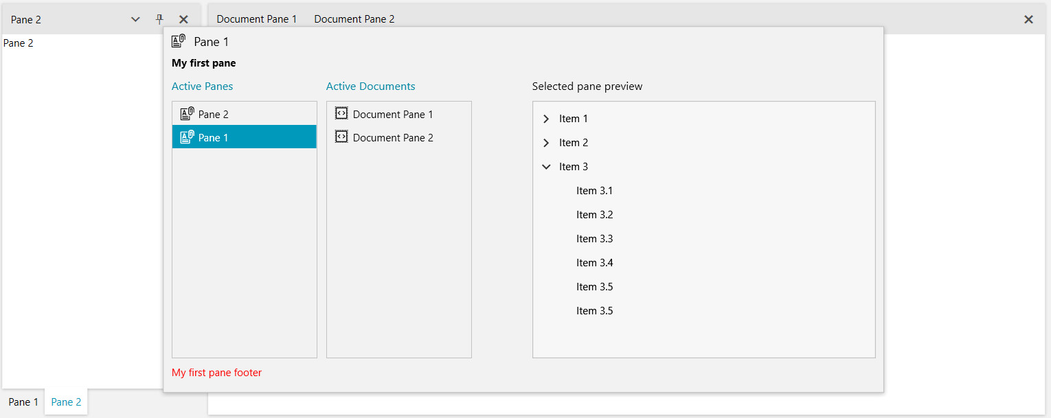
Figure 1: Result from showing the navigator in Example 1
Events
The DockingNavigator class exposes several useful events, which can be used to alter its behavior:
-
Opening: Raised before the DockingNavigator is opened. The event handler receives two arguments:
The sender argument contains the DockingNavigator. This argument is of type object, but can be cast to the DockingNavigator type.
A NavigatorOpeningEventArgs object. It exposes a Cancel property, which allows for preventing the opening.
Example 2: Handling the Opening event
    private void DockingNavigator_Opening(object sender, NavigatorOpeningEventArgs e)
    {
        var navigatorViewModel = (sender as DockingNavigator).DataContext as NavigatorViewModel;

        // Preventing a specific pane from being shown in the navigator
        var itemToRemove = navigatorViewModel.ItemModels.FirstOrDefault(m => m.Header.ToString() == "Pane 1");
        navigatorViewModel.ItemModels.Remove(itemToRemove);
    }
Private Sub DockingNavigator_Opening(ByVal sender As Object, ByVal e As NavigatorOpeningEventArgs) Dim navigatorViewModel = TryCast((TryCast(sender, DockingNavigator)).DataContext, NavigatorViewModel) ' Preventing a specific pane from being shown in the navigator Dim itemToRemove = navigatorViewModel.ItemModels.FirstOrDefault(Function(m) m.Header.ToString() = "Pane 1") navigatorViewModel.ItemModels.Remove(itemToRemove) End Sub -
Closed: Raised after the DockingNavigator is closed. The event handler receives two arguments:
The sender argument contains the DockingNavigator. This argument is of type object, but can be cast to the DockingNavigator type.
A NavigatorClosedEventArgs object. It exposes a PaneToActivate property of type RadPane, which gets or sets the pane that will be activated.