Customizing PolarChart Series
This article demonstrates how you can change the default look of the RadPolarChart series.
Customizing Line Series
PolarLineSeries
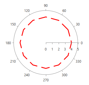
This series expose the ShapeStyle property. It is of type Style and determines the appearance of the Path element used to visualize the PolarLineSeries. Your custom style should target the native Path component. You can set the property like this:
<telerik:PolarLineSeries.ShapeStyle>
  <Style TargetType="Path">
      <Setter Property="StrokeDashArray" Value="10 5"/>
      <Setter Property="Stroke" Value="Red"/>
      <Setter Property="StrokeThickness" Value="3"/>
  </Style>
</telerik:PolarLineSeries.ShapeStyle>
RadarLineSeries
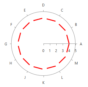
This series expose the ShapeStyle property. It is of type Style and determines the appearance of the Path element used to visualize the RadarLineSeries. Your custom style should target the native Path component. You can set the property like this:
<telerik:RadarLineSeries.ShapeStyle>
  <Style TargetType="Path">
      <Setter Property="StrokeDashArray" Value="10 5"/>
      <Setter Property="Stroke" Value="Red"/>
      <Setter Property="StrokeThickness" Value="3"/>
  </Style>
</telerik:RadarLineSeries.ShapeStyle>
Customizing Area Series
PolarAreaSeries
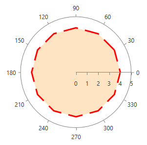
This series expose the ShapeStyle property. It is of type Style and determines the appearance of the Path element used to visualize the PolarAreaSeries. Your custom style should target the native Path component. You can set the property like this:
<telerik:PolarAreaSeries.ShapeStyle>
  <Style TargetType="Path">
      <Setter Property="Fill" Value="Bisque"/>
      <Setter Property="StrokeDashArray" Value="10 5"/>
      <Setter Property="Stroke" Value="Red"/>
      <Setter Property="StrokeThickness" Value="3"/>
  </Style>
</telerik:PolarAreaSeries.ShapeStyle>
RadarAreaSeries
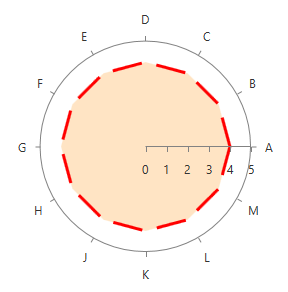
This series expose the ShapeStyle property. It is of type Style and determines the appearance of the Path element used to visualize the RadarLineSeries. Your custom style should target the native Path component. You can set the property like this:
<telerik:RadarAreaSeries.ShapeStyle>
  <Style TargetType="Path">
      <Setter Property="StrokeDashArray" Value="10 5"/>
      <Setter Property="Stroke" Value="Red"/>
      <Setter Property="StrokeThickness" Value="3"/>
  </Style>
</telerik:RadarAreaSeries.ShapeStyle>
Customizing Point Series
PolarPointSeries
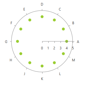
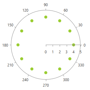
This series expose the DefaultVisualStyle property. It is of type Style and determines the appearance of the Path element used to visualize the PolarPointSeries. Your custom style should target the native Path component. You can set the property like this:
<telerik:PolarPointSeries.DefaultVisualStyle>
  <Style TargetType="Path">
      <Setter Property="Fill" Value="YellowGreen"/>
  </Style>
</telerik:PolarPointSeries.DefaultVisualStyle>
Since Q1 2014 all series exposing the DefaultVisualStyle property, also expose the DefaultVisualStyleSelector property. It is of type StyleSelector and gets or sets custom style-selection logic for a style that can be applied to each generated element.
RadarPointSeries
This series expose the DefaultVisualStyle property. It is of type Style and determines the appearance of the series. Your custom style should target the native Path component. You can set the property like this:
<telerik:RadarPointSeries.DefaultVisualStyle>
  <Style TargetType="Path">
      <Setter Property="Fill" Value="YellowGreen"/>
  </Style>
</telerik:RadarPointSeries.DefaultVisualStyle>
Since Q1 2014 all series exposing the DefaultVisualStyle property, also expose the DefaultVisualStyleSelector property. It is of type StyleSelector and gets or sets custom style-selection logic for a style that can be applied to each generated element.
