Binding the Color of Series Items
This topic demonstrates how to create charts, where each individual item, has its color bound to a property of the underlying data object.
There are small differences in the approaches used with the different series types. For the sake of the example the following series will be used. They cover the possible approaches.
The color binding is done via the DefaultVisualStyle or PointTemplate properties of the series. In case you are using one of the lightweight render options (Direct2D or Bitmap), keep in mind that bindings are not support in the DefaultVisualStyle. Instead, use only fixed values. Also setting the PointTemplate property will disable the lightweight render options and the chart will fallback to the default XAML rendering.
Example Data Model Definition
This section contains the data model used for the series examples in this article and also how to set it up.
Example 1: Defining the data model
public class ChartData : INotifyPropertyChanged
{
    private int _category;
    public int Category
    {
        get { return this._category; }
        set { this._category = value; this.OnPropertyChanged("Category"); }
    }

    private double _value;
    public double Value
    {
        get { return this._value; }
        set { this._value = value; this.OnPropertyChanged("Value"); }
    }

    private Brush _color;
    public Brush Color
    {
        get { return this._color; }
        set { this._color = value; this.OnPropertyChanged("Color"); }
    }

    public event PropertyChangedEventHandler PropertyChanged;
    private void OnPropertyChanged(string propertyName)
    {
        if (this.PropertyChanged != null)
        {
            this.PropertyChanged(this, new PropertyChangedEventArgs(propertyName));
        }
    }
}
Public Class ChartData
    Implements INotifyPropertyChanged
    Private _category As String
    Public Property Category() As String
        Get
            Return Me._category
        End Get
        Set
            Me._category = value
            Me.OnPropertyChanged("Category")
        End Set
    End Property

    Private _value As Double
    Public Property Value() As Double
        Get
            Return Me._value
        End Get
        Set
            Me._value = value
            Me.OnPropertyChanged("Value")
        End Set
    End Property

    Private _color As Brush
    Public Property Color() As Brush
        Get
            Return Me._color
        End Get
        Set
            Me._color = value
            Me.OnPropertyChanged("Color")
        End Set
    End Property

    Public Event PropertyChanged As PropertyChangedEventHandler
    Private Sub OnPropertyChanged(propertyName As String)
        RaiseEvent PropertyChanged(Me, New PropertyChangedEventArgs(propertyName))
    End Sub
End Class
Let's create some data so we can test the result.
Example 2: Populating the data collection
public MainWindow()
{
    InitializeComponent();
    DataContext = GetData(12);
}

public static List<ChartData> GetData(int dataSize)
{
    Random rnd = new Random();
    var result = new List<ChartData>();

    for (int i = 0; i < dataSize; i++)
    {
        result.Add(new ChartData()
        {
            Category = i,
            Value = rnd.Next(1, 100),
            Color = new SolidColorBrush(
                Color.FromArgb(255, (byte)rnd.Next(0, 256), (byte)rnd.Next(0, 256), (byte)rnd.Next(0, 256)))
        });
    }

    return result;
}
Public Sub New()
    InitializeComponent()
    DataContext = GetData(12)
End Sub

Public Shared Function GetData(ByVal dataSize As Integer) As List(Of ChartData)
Dim rnd As Random = New Random()
Dim result = New List(Of ChartData)()

For i As Integer = 0 To dataSize - 1
    result.Add(New ChartData() With {
        .Category = i,
        .Value = rnd.Next(1, 100),
        .Color = New SolidColorBrush(Color.FromArgb(255, CByte(rnd.Next(0, 256)), CByte(rnd.Next(0, 256)), CByte(rnd.Next(0, 256))))
    })
Next

Return result
End Function
Bar Series
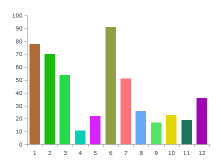
Here is a sample chart with BarSeries defined in Xaml.
Example 3: BarSeries definition
<telerik:RadCartesianChart x:Name="chart" Width="400" Height="300">
    <telerik:RadCartesianChart.VerticalAxis>
        <telerik:LinearAxis/>
    </telerik:RadCartesianChart.VerticalAxis>
    <telerik:RadCartesianChart.HorizontalAxis>
        <telerik:CategoricalAxis/>
    </telerik:RadCartesianChart.HorizontalAxis>
    <telerik:RadCartesianChart.Series>
        <telerik:BarSeries CategoryBinding="Category" ValueBinding="Value" ItemsSource="{Binding}" />
    </telerik:RadCartesianChart.Series>
</telerik:RadCartesianChart>
You can see the data model used for this example in the Example Data Model Definition section.
There are couple approaches which could be used to bind the color from the data object to the fill of the data point visual (the bar).
-
Use the DefaultVisualStyle property of the series. You can use this to target the default visual of the series and bind its properties to the data model object.
Using the data model from this article's example you can bind the Color property from the ChartData class.
Example 4: Setting BarSeries DefaultVisualStyle
<telerik:BarSeries CategoryBinding="Category" ValueBinding="Value" ItemsSource="{Binding}"> <telerik:BarSeries.DefaultVisualStyle> <Style TargetType="Border"> <Setter Property="Background" Value="{Binding DataItem.Color}" /> </Style> </telerik:BarSeries.DefaultVisualStyle> </telerik:BarSeries> -
Use the PointTemplate property of the series. In this case you can define a DataTemplate containing a custom visual element for the data points and bind its color property (Background or Fill for example) to the property from the data model.
Using the data model from this article's example you can bind the Color property from the ChartData class.
Example 5: Setting BarSeries PointTemplate
    <telerik:BarSeries CategoryBinding="Category" ValueBinding="Value" ItemsSource="{Binding}">
        <telerik:BarSeries.PointTemplate>
            <DataTemplate>
                <Rectangle Fill="{Binding DataItem.Color}"/>
            </DataTemplate>
        </telerik:BarSeries.PointTemplate>
    </telerik:BarSeries>
The DataItem in the binding's path points to the custom ChartData model.
The recommended approach for binding the color is to use the DefaultVisualStyle. This is because the PointTemplate creates an additional ContentPresenter for each data point visual which means a bit more rendering time for the framework.
You can use those approaches with most series types of the chart.
Figure 1: Different colored bars

Scatter Point Series
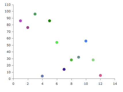
Here is a sample chart with ScatterPointSeries defined in XAML.
Example 3: ScatterPointSeries definition
<telerik:RadCartesianChart x:Name="chart" Width="400" Height="300">
    <telerik:RadCartesianChart.VerticalAxis>
        <telerik:LinearAxis/>
    </telerik:RadCartesianChart.VerticalAxis>
    <telerik:RadCartesianChart.HorizontalAxis>
        <telerik:LinearAxis/>
    </telerik:RadCartesianChart.HorizontalAxis>
    <telerik:RadCartesianChart.Series>
        <telerik:ScatterPointSeries XValueBinding="Category" YValueBinding="Value" ItemsSource="{Binding}" />
    </telerik:RadCartesianChart.Series>
</telerik:RadCartesianChart>
You can see the data model used for this example in the Example Data Model Definition section.
The ScatterPointSeries can be customized using the same manner as with the BarSeries. There are two small differences which could be applied.
As all scatter series, ScatterPointSeries requires the RadCartesianChart to define two LinearAxis as a vertical and horizontal axis.
-
When using DefaultVisualStyle you will need to target a different UI element - a Path in this case. And also you will need to define the size (Width and Height) of the Path.
Example 6: Setting Point Series DefaultVisualStyle
    <telerik:ScatterPointSeries XValueBinding="Category" YValueBinding="Value" ItemsSource="{Binding}">
        <telerik:ScatterPointSeries.DefaultVisualStyle>
            <Style TargetType="Path">
                <Setter Property="Fill" Value="{Binding RelativeSource={RelativeSource Mode=Self}, Path=Tag.DataItem.Color}" />
                <Setter Property="Width" Value="10" />
                <Setter Property="Height" Value="10" />
            </Style>
        </telerik:ScatterPointSeries.DefaultVisualStyle>
    </telerik:ScatterPointSeries>
The data context passed in the DefaultVisualStyle of the ScatterPointSeries (and several other series) is not the DataPoint object, but the context of the series. In this case the DataPoint is stored in the Tag property of the Path.
-
When using PointTemplate the most common shape you will use is an ellipse so you can define an Ellipse element in the template.
Example 7: Setting Point Series PointTemplate
    <telerik:ScatterPointSeries XValueBinding="Category" YValueBinding="Value" ItemsSource="{Binding}">
        <telerik:ScatterPointSeries.PointTemplate>
            <DataTemplate>
                <Ellipse Width="10" Height="10" Fill="{Binding DataItem.Color}"/>
            </DataTemplate>
        </telerik:ScatterPointSeries.PointTemplate>
    </telerik:ScatterPointSeries>
You can see the data model used for this example in the Example Data Model Definition section.
Figure 2: Different colored points

Pie Series
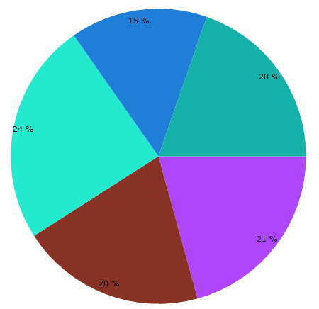
Similar to the BarSeries the PieSeries uses a default visual style to customize the appearance of the pie slices. The Style should target a Path element and it is applied to the DefaultSliceStyle property of the series.
Example 8: Setting Pie Series default visual style
<telerik:RadPieChart x:Name="chart">
    <telerik:PieSeries ValueBinding="Value" ItemsSource="{Binding}">
        <telerik:PieSeries.DefaultSliceStyle>
            <Style TargetType="Path">
                <Setter Property="Fill" Value="{Binding DataItem.Color}" />
            </Style>
        </telerik:PieSeries.DefaultSliceStyle>
    </telerik:PieSeries>
</telerik:RadPieChart>
You can see the data model used for this example in the Example Data Model Definition section.
Figure 3: Different colored pie slices
