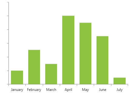
Customizing Axis Labels
The axis labels are automatically generated based on the plotted data and the axis range. The chart allows you to customize their appearance.
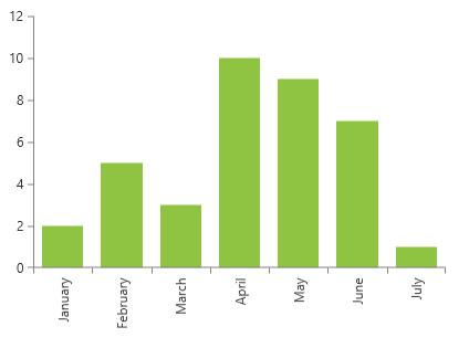
Hiding Labels
To hide the axis labels, set the ShowLabels property to False.
Setting ShowLabels
<telerik:RadCartesianChart.VerticalAxis>
    <telerik:LinearAxis ShowLabels="False" />
</telerik:RadCartesianChart.VerticalAxis>
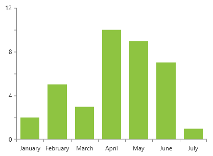
Label Interval
The axis labels are positioned on each tick plotted on the axis. To change this, set the LabelInterval property of the associated axis.
Setting LabelInterval
<telerik:RadCartesianChart.VerticalAxis>
    <telerik:LinearAxis LabelInterval="2" />
</telerik:RadCartesianChart.VerticalAxis>
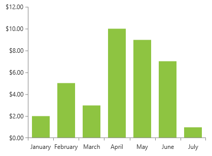
String Format
To adjust the string format of the labels, set the LabelFormat property.
Setting LabelFormat
<telerik:RadCartesianChart.VerticalAxis>
    <telerik:LinearAxis LabelFormat="C" />
</telerik:RadCartesianChart.VerticalAxis>
Rotation
To rotate the axis labels, set the LabelFitMode property to Rotate. This will rotate to labels to a predefined angle. To change the angle, set the LabelRotationAngle property.
In order for the LabelRotationAngle property to take effect, the LabelFitMode should be set to Rotate.
Setting LabelFitMode to Rotate
<telerik:RadCartesianChart.HorizontalAxis>
    <telerik:CategoricalAxis LabelFitMode="Rotate" LabelRotationAngle="-90"/>
</telerik:RadCartesianChart.HorizontalAxis>
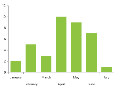
Multi-line Mode
To arrange the labels on different vertical positions that mimics multi-line layout, set the LabelFitMode property to MultiLine.
Setting LabelFitMode to MultiLine
<telerik:RadCartesianChart.HorizontalAxis>
    <telerik:CategoricalAxis LabelFitMode="MultiLine" />
</telerik:RadCartesianChart.HorizontalAxis>
Smart Labels
The axis smart labels feature allows you to avoid situations where the axis has too many labels and they start to overlap one another. The smart mode will try to auto-calculate such label interval that no labels overlap. To enable it, set the SmartLabelsMode property of the axis. Read more in the [Axis Smart Labels]/devtools/silverlight/controls/radchartview/axes/axis-smart-labels article.
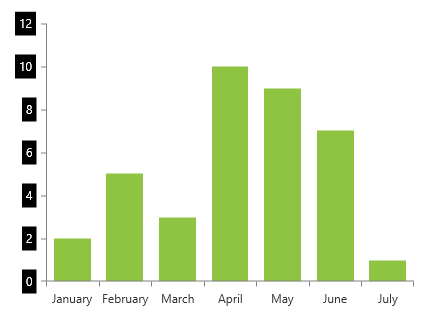
Label Style
The default visual element of the axis labels is TextBlock. To customize its appearance, set the axis' LabelStyle property. The TargetType of the Style object should target the TextBlock class.
Setting LabelStyle
<telerik:RadCartesianChart.VerticalAxis>
    <telerik:LinearAxis>
        <telerik:LinearAxis.LabelStyle>
            <Style TargetType="TextBlock">
                <Setter Property="Foreground" Value="White" />
                <Setter Property="Background" Value="Black" />
                <Setter Property="Padding" Value="4" />
                <Setter Property="Margin" Value="0 0 5 0" />
            </Style>
        </telerik:LinearAxis.LabelStyle>
    </telerik:LinearAxis>
</telerik:RadCartesianChart.VerticalAxis>
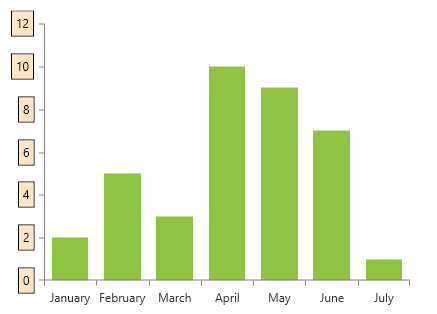
Label Template
To replace the default visual element of the axis labels, set the axis' LabelTemplate property.
Setting LabelTemplate
<telerik:RadCartesianChart.VerticalAxis>
    <telerik:LinearAxis>
        <telerik:LinearAxis.LabelTemplate>
            <DataTemplate>
                <Border BorderBrush="Black" BorderThickness="1" Background="Bisque" Margin="0 0 5 0">
                    <TextBlock Padding="4" Text="{Binding}"/>
                </Border>
            </DataTemplate>
        </telerik:LinearAxis.LabelTemplate>
    </telerik:LinearAxis>
</telerik:RadCartesianChart.VerticalAxis>
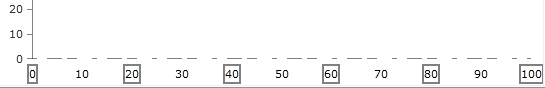
Label Template Selector
To replace the default visual element of the axis labels with different elements based on a condition, use the LabelTemplateSelector property of the axis. The following example shows how to define a DataTemplateSelector and use it to choose between two different DataTemplates.
Defining the view
<Grid.Resources>
   <DataTemplate x:Key="GrayTemplate">
       <Border BorderThickness="2"
               BorderBrush="Gray">
           <TextBlock Text="{Binding}"/>
       </Border>
   </DataTemplate>
   <DataTemplate x:Key="WhiteTemplate">
       <Border BorderThickness="2"
               BorderBrush="White">
           <TextBlock Text="{Binding}"/>
       </Border>
   </DataTemplate>

   <local:BinaryTemplateSelector x:Key="Selector"
                                 Template1="{StaticResource GrayTemplate}"
                                 Template2="{StaticResource WhiteTemplate}"/>
</Grid.Resources>

<telerik:RadCartesianChart x:Name="chart">
    <telerik:RadCartesianChart.HorizontalAxis>
         <telerik:LinearAxis Maximum="100"
                           LineStroke="Gray"
                           LineDashArray="5, 10, 15"
                           TickThickness="5"
                           LabelTemplateSelector="{StaticResource Selector}">
            <telerik:LinearAxis.MajorTickTemplate>
                <DataTemplate>
                    <Ellipse Fill="White"/>
                </DataTemplate>
            </telerik:LinearAxis.MajorTickTemplate>
         </telerik:LinearAxis>
    </telerik:RadCartesianChart.HorizontalAxis>

    <telerik:RadCartesianChart.VerticalAxis>
        <telerik:LinearAxis Maximum="100"/>
    </telerik:RadCartesianChart.VerticalAxis>
</telerik:RadCartesianChart>
Defining the template selector
public class BinaryTemplateSelector : DataTemplateSelector
{
    public DataTemplate Template1
    {
        get;
        set;
    }
    public DataTemplate Template2
    {
        get;
        set;
    }
    public override DataTemplate SelectTemplate(object item, DependencyObject container)
    {
        DataTemplate tmp = this.Template1;
        this.Template1 = this.Template2;
        this.Template2 = tmp;
        return tmp;
    }
}