Silverlight Buttons Overview
Thank you for choosing Telerik RadButtons!
RadButtons for Silverlight is a set of customizable buttons allowing you to build complex forms and to easily manage the user input. You can style the control consistently with the other controls from UI for Silverlight and take advantage of the Command support that RadButtons provide.
- If you are new to the RadButtons control, don't miss the Getting Started guide that demonstrates a basic RadButtons scenario.
- Check out the control demos at demos.telerik.com to see the RadButtons in action.
Key Features
The following list presents the most popular features in Telerik's RadButtons:
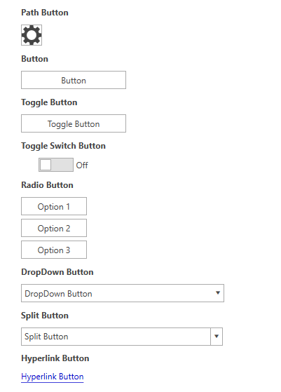
DropDown Button: Provides a menu-like interface model within a button. It can be very handy for creating a more simplistic UI where extensive menus and/or ComboBoxes are not needed. Any kind of content can be placed in the pop-up area displayed upon the activation of the button. See the DropDown Button article for more details.
Split Button: Extends the DropDown Button's functionality with an action area like in a standard button. The Split Button implements the IsChecked state, too. See the Split Button article for more details.
Toggle Button: Mimics the functionality of a check box, but has more flexibility in its design. It offers state management based on the check state of the control. See the Toggle Button article for more details.
Toggle Switch Button: Mimics the functionality of a Toggle button, but has more flexibility in its design. You can specify two states: Check/Uncheck and On/Off. Every state can be customized with different content. See the Toggle Switch Button article for more details.
Radio Button: Mimics the functionality of the radio button, but has more flexibility in its design. See the Radio Button article for more details.
Path Button: Derives from RadButton, but provides the ability to set a Path alongside its content. See the Path Button article for more details.
Hyperlink Button: Extends RadButton with hyperlink capabilities. See the Hyperlink Button article for more details.
Command Support: The full implementation of the Command pattern is available by using RadButtons. You can build complex UIs and keep your code simple by using Commands. See the Commands article for more details.