Getting Started with Silverlight BusyIndicator
This tutorial will walk you through the creation of a sample application that contains RadBusyIndicator.
The RadBusyIndicator is displayed on the UI thread. If this thread is blocked, the control will not be shown. It is meant to indicate to the user that there is a long running background task/process.
Assembly References
In order to use RadBusyIndicator in your projects, you have to add references to the following assembly:
- Telerik.Windows.Controls
Adding RadBusyIndicator to the Project
Make sure the required assembly reference is added to the project before you proceed with adding RadBusyIndicator to your project.
You can add RadBusyIndicator manually by writing the XAML code in Example 1. You can also add the control by dragging it from the Visual Studio Toolbox and dropping it over the XAML view.
Example 1: Adding RadBusyIndicator in XAML
<telerik:RadBusyIndicator x:Name="radBusyIndicator">
    <!--Some Content-->
</telerik:RadBusyIndicator>
In order to use RadBusyIndicator in XAML, you have to add the namespace declaration shown in Example 2.
Example 2: Declaring Telerik Namespace
xmlns:telerik="http://schemas.telerik.com/2008/xaml/presentation"
When you are using RadBusyIndicator, you always have to set its Content property. This will be the content on top of which you want to visualize RadBusyIndicator. Example 3 demonstrates RadBusyIndicator with some custom Content placed inside it:
Example 3: Adding Content
 <telerik:RadBusyIndicator x:Name="radBusyIndicator">
    <Grid>
        <telerik:RadListBox>
            <telerik:RadListBoxItem Content="Australia" />
            <telerik:RadListBoxItem Content="Brazil" />
            <telerik:RadListBoxItem Content="Canada" />
            <telerik:RadListBoxItem Content="China" />
            <telerik:RadListBoxItem Content="England" />
            <telerik:RadListBoxItem Content="Germany" />
        </telerik:RadListBox>
    </Grid>
</telerik:RadBusyIndicator>
Enabling RadBusyIndicator
To activate RadBusyIndicator you have to set its IsBusy boolean property to True. It is a Dependency property that you can data bind in any way that suits your custom logic.
RadBusyIndicator will be visible only when the IsBusy property is set to True.
Example 4 presents RadBusyIndicator with its IsBusy property set to True:
Example 4: Adding Content
 <telerik:RadBusyIndicator x:Name="radBusyIndicator" IsBusy="True">
    <Grid>
        <telerik:RadListBox>
            <telerik:RadListBox>
                <telerik:RadListBoxItem Content="Australia" />
                <telerik:RadListBoxItem Content="Brazil" />
                <telerik:RadListBoxItem Content="Canada" />
                <telerik:RadListBoxItem Content="China" />
                <telerik:RadListBoxItem Content="England" />
                <telerik:RadListBoxItem Content="Germany" />
            </telerik:RadListBox>
        </telerik:RadListBox>
    </Grid>
</telerik:RadBusyIndicator>
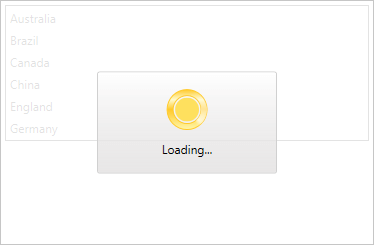
If you run the application you will see RadBusyIndicator placed on top of its Content.
Figure1: This figure is generated by the code in Example 4 RadBusyIndicator

Progress Determination, Custom BusyContent, Delaying of Display
Progress Determination
RadBusyIndicator supports two main modes of execution that could be used to visualize the progress of the control - determined and indetermined. If you need a determined RadBusyIndicator you have to set the value of the IsIndeterminated property to False. Please, check this article for some information concerning the progress determination of RadBusyIndicator.
Custom Busy Content
RadBusyIndicator exposes a BusyContentTemplate property of type DataTemplate. Through this template you can customize what is shown in RadBusyIndicator's content while the indicator is active. For more information, look at this article.
Delaying of display
You can notify the users about an ongoing process with a specific delay when RadBusyIndicator is used. By changing the DisplayAfter property to a certain TimeSpan, RadBusyIndicator will be shown after the corresponding amount of time elapses - the default value of this delay is 100 milliseconds. For detailed information about using a delay with RadBusyIndicator, look at this article.
Setting a Theme
The controls from our suite support different themes. You can see how to apply a theme different than the default one in the Setting a Theme help article.
Changing the theme using implicit styles will affect all controls that have styles defined in the merged resource dictionaries. This is applicable only for the controls in the scope in which the resources are merged.
To change the theme, you can follow the steps below:
Choose between the themes and add reference to the corresponding theme assembly (ex: Telerik.Windows.Themes.Fluent.dll). You can see the different themes applied in the Theming examples from our Silverlight Controls Examples application.
-
Merge the ResourceDictionaries with the namespace required for the controls that you are using from the theme assembly. For the RadBreadcrumb, you will need to merge the following resources:
- Telerik.Windows.Controls
Example 5 demonstrates how to merge the ResourceDictionaries so that they are applied globally for the entire application.
Example 5: Merge the ResourceDictionaries
<Application.Resources>
    <ResourceDictionary>
        <ResourceDictionary.MergedDictionaries>
            <ResourceDictionary Source="/Telerik.Windows.Themes.Fluent;component/Themes/System.Windows.xaml"/>
            <ResourceDictionary Source="/Telerik.Windows.Themes.Fluent;component/Themes/Telerik.Windows.Controls.xaml"/>
        </ResourceDictionary.MergedDictionaries>
    </ResourceDictionary>
</Application.Resources>
Alternatively, you can use the theme of the control via the StyleManager.
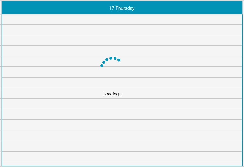
Figure 1 shows a RadBusyIndicator with the Fluent theme applied.
Figure 1: RadBusyIndicator with the Fluent theme
