TextBoxStyle
The TextBoxStyle property makes it easy to customize the RadAutoCompleteBox and RadAutoCompleteBoxItem. This article will show you how to apply a custom TextBoxStyle.
Applying custom TextBoxStyle
The first thing is to create a RadAutoCompleteBox with an ItemsSource bound to a collection of countries.
Example 1: Create an objects class
public class Country
{
    public string Name { get; set; }
    public string Capital { get; set; }
}
Example 2: Create the ViewModel
public class MyViewModel : ViewModelBase
{
    private ObservableCollection<Country> countries;
    public ObservableCollection<Country> Countries
    {
        get
        {
            if (this.countries == null)
            {
                this.countries = new ObservableCollection<Country>();
                this.countries.Add(new Country() { Name = "Australia", Capital = "Canberra" });
                this.countries.Add(new Country() { Name = "Bulgaria", Capital = "Sofia" });
                this.countries.Add(new Country() { Name = "Canada", Capital = "Ottawa" });
                this.countries.Add(new Country() { Name = "Denmark", Capital = "Copenhagen" });
                this.countries.Add(new Country() { Name = "France", Capital = "Paris" });
                this.countries.Add(new Country() { Name = "Germany", Capital = "Berlin" });
                this.countries.Add(new Country() { Name = "India", Capital = "New Delhi" });
                this.countries.Add(new Country() { Name = "Italy", Capital = "Rome" });
                this.countries.Add(new Country() { Name = "Norway", Capital = "Oslo" });
                this.countries.Add(new Country() { Name = "Russia", Capital = "Moscow" });
                this.countries.Add(new Country() { Name = "Spain", Capital = "Madrid" });
                this.countries.Add(new Country() { Name = "United Kingdom", Capital = "London" });
                this.countries.Add(new Country() { Name = "United States", Capital = "Washington, D.C." });
            }
            return countries;
        }
    }
}
Example 3: Create the RadAutoCompleteBox and sets its ItemsSource
<Window.DataContext>
    <local:MyViewModel/>
</Window.DataContext>
<Grid>
    <telerik:RadAutoCompleteBox Name="autoCompleteBox"
                                Width="200" Height="25"
                                ItemsSource="{Binding Countries}"
                                DisplayMemberPath="Name"
                                AutoCompleteMode="Suggest"
                                WatermarkContent="Select a country..."/>
</Grid>
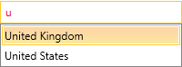
Figure 1: RadAutoCompleteBox without custom TextBoxStyle applied
You have to create a custom Style with TargetType RadAutoCompleteBox or RadAutoCompleteBoxItem:
Example 4: Create the custom Style
<Grid.Resources>
    <Style x:Key="textBoxStyle" TargetType="telerik:RadWatermarkTextBox">
        <Setter Property="BorderThickness" Value="0"/>
        <Setter Property="Margin" Value="3 3 0 0"/>
        <Setter Property="Padding" Value="0"/>
        <Setter Property="BorderBrush" Value="Transparent"/>
        <Setter Property="FocusVisualStyle" Value="{x:Null}"/>
        <Setter Property="HorizontalContentAlignment" Value="Stretch"/>
        <Setter Property="Foreground" Value="Red" />
    </Style>
</Grid.Resources>
If you are using Implicit Styles to style the controls, you would need to base that Style to the default TextBoxStyle of RadAutoCompleteBox named RadAutoCompleteTextBoxStyle.
The last step would be to simply set the custom style as TextBoxStyle of RadAutoCompleteBox:
Example 5: Apply the custom Style
<Grid>
    <telerik:RadAutoCompleteBox Name="autoCompleteBox"
                                Width="200" Height="25"
                                ItemsSource="{Binding Countries}"
                                DisplayMemberPath="Name"
                                AutoCompleteMode="Suggest"
                                WatermarkContent="Select a country..."
                                TextBoxStyle="{StaticResource textBoxStyle}"/>
</Grid>
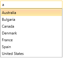
Figure 2: RadAutoCompleteBox with custom TextBoxStyle applied