Getting Started with the .NET MAUI TemplatedPicker
This guide provides the information you need to start using the Telerik UI for .NET MAUI TemplatedPicker by adding the control to your project.
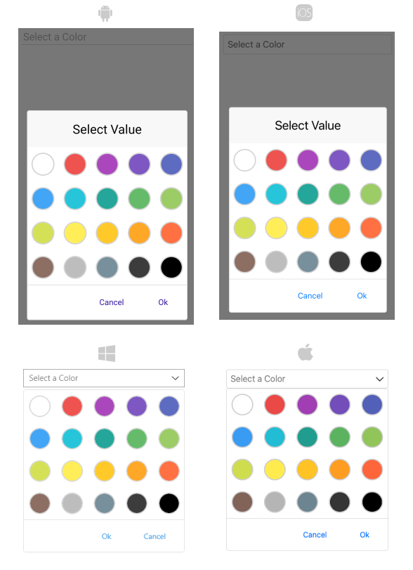
At the end, you will achieve the following result.
Prerequisites
Before adding the TemplatedPicker, you need to:
Define the Control
The TemplatedPicker exposes a SelectorTemplate, which enables you to place any content inside the popup for the user to choose from, and a DisplayTemplate, which allows you to present the selected value as required.
1. When your .NET MAUI application is set up, you are ready to add a TemplatedPicker control to your page. The following example demonstrates a custom picker control, which provides the option to choose a color from a set of predefined colors.
<telerik:RadTemplatedPicker x:Name="picker"
                            Placeholder="Select a Color"
                            SelectedValue="{Binding SelectedColor}"
                            AutomationId="templatedPicker">
    <telerik:RadTemplatedPicker.DisplayTemplate>
        <ControlTemplate>
            <Grid ColumnDefinitions="Auto, *">
                <Grid.GestureRecognizers>
                    <TapGestureRecognizer Command="{TemplateBinding ToggleCommand}" />
                </Grid.GestureRecognizers>
                <telerik:RadBorder WidthRequest="20"
                                   HeightRequest="20"
                                   CornerRadius="10"
                                   VerticalOptions="Center"
                                   BorderColor="LightGray"
                                   BorderThickness="1"
                                   BackgroundColor="{Binding SelectedColor}" />
                <Label Grid.Column="1"
                       Text="{Binding SelectedValue}"
                       Style="{TemplateBinding DisplayLabelStyle}" />
            </Grid>
        </ControlTemplate>
    </telerik:RadTemplatedPicker.DisplayTemplate>
    <telerik:RadTemplatedPicker.SelectorTemplate>
        <ControlTemplate>
            <CollectionView HeightRequest="240"
                            SelectionMode="Single"
                            ItemsSource="{Binding Colors}"
                            SelectedItem="{TemplateBinding SelectedValue, Mode=TwoWay}">
                <CollectionView.Style>
                    <OnPlatform x:TypeArguments="Style">
                        <On Platform="WinUI">
                            <Style TargetType="Grid">
                                <Setter Property="WidthRequest" Value="{Binding Width, Source={x:Reference picker}}" />
                                <Setter Property="BackgroundColor" Value="Transparent"/>
                            </Style>
                        </On>
                    </OnPlatform>
                </CollectionView.Style>
                <CollectionView.ItemTemplate>
                    <DataTemplate>
                        <Grid HeightRequest="60">
                            <VisualStateManager.VisualStateGroups>
                                <VisualStateGroup Name="CommonStates">
                                    <VisualState Name="Normal">
                                        <VisualState.Setters>
                                            <Setter Property="BackgroundColor" Value="{OnPlatform Default=White, WinUI=Transparent}" />
                                        </VisualState.Setters>
                                    </VisualState>
                                    <VisualState Name="Selected">
                                        <VisualState.Setters>
                                            <Setter Property="BackgroundColor" Value="WhiteSmoke" />
                                        </VisualState.Setters>
                                    </VisualState>
                                </VisualStateGroup>
                            </VisualStateManager.VisualStateGroups>
                            <telerik:RadBorder WidthRequest="40"
                                               HeightRequest="40"
                                               CornerRadius="20"
                                               HorizontalOptions="Center"
                                               VerticalOptions="Center"
                                               BorderColor="LightGray"
                                               BorderThickness="2"
                                               BackgroundColor="{Binding}" />
                        </Grid>
                    </DataTemplate>
                </CollectionView.ItemTemplate>
                <CollectionView.ItemsLayout>
                    <GridItemsLayout Orientation="Vertical" Span="5" />
                </CollectionView.ItemsLayout>
            </CollectionView>
        </ControlTemplate>
    </telerik:RadTemplatedPicker.SelectorTemplate>
</telerik:RadTemplatedPicker>
var viewModel = new ColorViewModel();
var templatedPicker = new RadTemplatedPicker
{
    Placeholder = "Select a Color"
};
var displayTemplate = new ControlTemplate(() =>
{
    var displayLayout = new Grid
    {
        ColumnDefinitions =
        {
            new ColumnDefinition
            {
                Width = GridLength.Auto
            },
            new ColumnDefinition
            {
                Width = GridLength.Star
            }
        }
    };
    var displayLabel = new Label();
    var displayBorder = new RadBorder
    {
        WidthRequest = 20,
        HeightRequest = 20,
        CornerRadius = 10,
        HorizontalOptions = LayoutOptions.Center,
        VerticalOptions = LayoutOptions.Center,
        BorderColor = Colors.LightGray,
        BorderThickness = 1
    };
    var styleBinding = new Binding
    {
        Path = "DisplayLabelStyle",
        Source = RelativeBindingSource.TemplatedParent
    };
    var textBinding = new Binding
    {
        Path = "SelectedValue"
    };
    var colorBinding = new Binding
    {
        Path = "SelectedColor"
    };
    var commandBinding = new Binding
    {
        Path = "ToggleCommand",
        Source = RelativeBindingSource.TemplatedParent
    };
    var tapRecognizer = new TapGestureRecognizer();

    Grid.SetColumn(displayLabel, 1);

    tapRecognizer.SetBinding(TapGestureRecognizer.CommandProperty, commandBinding);
    displayBorder.SetBinding(VisualElement.BackgroundColorProperty, colorBinding);
    displayLabel.SetBinding(VisualElement.StyleProperty, styleBinding);
    displayLabel.SetBinding(Label.TextProperty, textBinding);
    displayLayout.Children.Add(displayBorder);
    displayLayout.Children.Add(displayLabel);
    displayLayout.GestureRecognizers.Add(tapRecognizer);

    return displayLayout;
});
var selectorTemplate = new ControlTemplate(() =>
{
    var collectionView = new CollectionView
    {
        HeightRequest = 240,
        SelectionMode = SelectionMode.Single,
    };
    var itemsSourceBinding = new Binding
    {
        Path = "Colors"
    };
    var selectedItemBinding = new Binding
    {
        Path = "SelectedValue",
        Source = RelativeBindingSource.TemplatedParent,
        Mode = BindingMode.TwoWay
    };
    var itemTemplate = new DataTemplate(() =>
    {
        var itemLayout = new Grid
        {
            HeightRequest = 60
        };
        var itemBorder = new RadBorder
        {
            WidthRequest = 40,
            HeightRequest = 40,
            CornerRadius = 20,
            HorizontalOptions = LayoutOptions.Center,
            VerticalOptions = LayoutOptions.Center,
            BorderColor = Colors.LightGray,
            BorderThickness = 2
        };
        var itemBinding = new Binding(".");
        var visualStates = new VisualStateGroupList
        {
            new VisualStateGroup
            {
                Name = "CommonStates",
                States =
                {
                    new VisualState
                    {
                        Name = "Normal",
                        Setters =
                        {
                            new Setter
                            {
                                Property = VisualElement.BackgroundColorProperty,
                                Value = DeviceInfo.Platform == DevicePlatform.WinUI ? Colors.Transparent : Colors.White
                            }
                        }
                    },
                    new VisualState
                    {
                        Name = "Selected",
                        Setters =
                        {
                            new Setter
                            {
                                Property = VisualElement.BackgroundColorProperty,
                                Value = Colors.WhiteSmoke
                            }
                        }
                    }
                }
            }
        };

        itemBorder.SetBinding(VisualElement.BackgroundColorProperty, itemBinding);
        itemLayout.Children.Add(itemBorder);
        VisualStateManager.SetVisualStateGroups(itemLayout, visualStates);

        return itemLayout;
    });
    var itemsLayout = new GridItemsLayout(ItemsLayoutOrientation.Vertical)
    {
        Span = 5
    };

    collectionView.ItemTemplate = itemTemplate;
    collectionView.ItemsLayout = itemsLayout;
    collectionView.SetBinding(ItemsView.ItemsSourceProperty, itemsSourceBinding);
    collectionView.SetBinding(SelectableItemsView.SelectedItemProperty, selectedItemBinding);

    if (DeviceInfo.Platform == DevicePlatform.WinUI)
    {
        collectionView.SetBinding(SelectableItemsView.WidthRequestProperty, new Binding { Path = nameof(templatedPicker.Width), Source = templatedPicker });
        collectionView.BackgroundColor = Colors.Transparent;
    }

    return collectionView;
});
var selectionBinding = new Binding
{
    Path = "SelectedColor"
};

templatedPicker.SetBinding(RadTemplatedPicker.SelectedValueProperty, selectionBinding);
templatedPicker.BindingContext = viewModel;
templatedPicker.DisplayTemplate = displayTemplate;
templatedPicker.SelectorTemplate = selectorTemplate;
2.Add the referenced ColorViewModel, which holds the collection with the predefined colors:
public class ColorViewModel : NotifyPropertyChangedBase
{
    private Color selectedColor;
    private string selectedValue;

    public ColorViewModel()
    {
        this.Colors = new ObservableCollection<Color>
        {
            Color.FromArgb("#FFFFFF"),
            Color.FromArgb("#EE534F"),
            Color.FromArgb("#AB47BC"),
            Color.FromArgb("#7E57C2"),
            Color.FromArgb("#5D6BC0"),
            Color.FromArgb("#42A5F5"),
            Color.FromArgb("#26C5DA"),
            Color.FromArgb("#24A79A"),
            Color.FromArgb("#66BB6A"),
            Color.FromArgb("#9CCC65"),
            Color.FromArgb("#D4E157"),
            Color.FromArgb("#FFEE58"),
            Color.FromArgb("#FFCA29"),
            Color.FromArgb("#FFA726"),
            Color.FromArgb("#FF7043"),
            Color.FromArgb("#8D6E63"),
            Color.FromArgb("#BDBDBD"),
            Color.FromArgb("#78909C"),
            Color.FromArgb("#3C3C3C"),
            Color.FromArgb("#000000")
        };
    }

    public Color SelectedColor
    {
        get => selectedColor;
        set
        {
            if (this.UpdateValue(ref this.selectedColor, value))
            {
                this.SelectedValue = this.selectedColor?.ToHex();
            }
        }
    }

    public string SelectedValue
    {
        get => selectedValue;
        private set => this.UpdateValue(ref this.selectedValue, value);
    }

    public ObservableCollection<Color> Colors { get; }
}
3. Add the following namespace:
xmlns:telerik="http://schemas.telerik.com/2022/xaml/maui"
4. Register the Telerik controls through the Telerik.Maui.Controls.Compatibility.UseTelerik extension method called inside the CreateMauiApp method of the MauiProgram.cs file of your project:
using Telerik.Maui.Controls.Compatibility;

public static class MauiProgram
{
    public static MauiApp CreateMauiApp()
    {
        var builder = MauiApp.CreateBuilder();
        builder
            .UseTelerik()
            .UseMauiApp<App>()
            .ConfigureFonts(fonts =>
            {
                fonts.AddFont("OpenSans-Regular.ttf", "OpenSansRegular");
            });

        return builder.Build();
    }
}
Additional Resources
- .NET MAUI TemplatedPicker Product Page
- .NET MAUI TemplatedPicker Forum Page
- Telerik .NET MAUI Blogs
- Telerik .NET MAUI Roadmap