.NET MAUI ProgressBar Overview
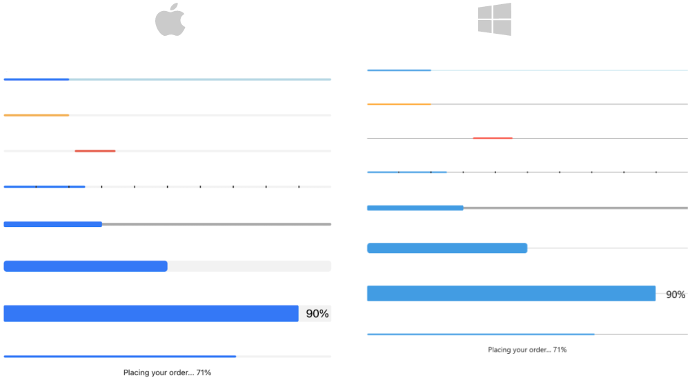
The Telerik .NET MAUI ProgressBar is designed to display progress information to the users during a long-running operation. With the ProgressBar you can track the progress of various tasks. The control has an indeterminate mode and segments support. In addition you can customize it using the Flexible Styling API.
The ProgressBar is part of Telerik UI for .NET MAUI, the most comprehensive UI suite for .NET MAUI! To try it out, sign up for a free 30-day trial and kickstart your cross-platform app development today.
Key Features
- Value and Progress—Features are used to set and report the progress of a task inside the ProgressBar control.
- Value range—Define value ranges by setting the minimum and maximum values.
- Different value display modes—The label that shows the current state of the progress can be set to absolute value, percent, text or fully hidden.
- Segments support—The ProgressBar can be divided in segments.
-
Custom text—ProgressBar gives you the option to display a custom text when
ValueDisplayModeis set toText. - Indeterminate mode support—A mode that displays an animation indicating an unspecified amount of waiting time.
- Different animations—Apply different animation easing and animation duration while changing the value of the ProgressBar.
- Text alignment—Horizontally align the text that displays the progress.
-
Corner radius for progress indicator—Apply corners of the progress indicator by setting the
ProgressCornerRadiusproperty. -
Events—For tracking changes in the progress.
- Flexible styling API—For customizing the progress fill, track fill, indeterminate fill, label text color, font size and more.