Styling the .NET MAUI DatePicker
The DatePicker control for .NET MAUI provides styling options for customizing its appearance. You can style the DatePicker itself, as well as its popup or drop-down depending on the configuration of the picker mode.
Supported Properties
The DatePicker control supports the following styling properties:
-
BackgroundColor—Defines the background color of the picker. -
BorderColor—Defines the border color of the picker. -
BorderThickness—Specifies the border thickness of the picker. Its default value isnew Thickness(0,0,0,1). -
CornerRadius—Specifies the corner radius of the picker. -
ClearButtonStyle(of typeStylewith target typeRadButton)—Defines the style applied to the Clear button. -
ToggleButtonStyle(of typeStylewith target typeRadButton)—Specifies the style of the Toggle button. -
PlaceholderLabelStyle(of typeStylewith target typeLabel)—Specifies the style applied to the label defined in the default PlaceholderTemplate. -
DisplayLabelStyle(of typeStylewith target typeLabel)—Defines the style applied to the label, which is visualized when a date is selected.
The following Style properties are related to the spinner controls inside the popup or drop-down:
-
SpinnerStyle(of typeStylewith target typetelerik:RadSpinner)—Defines the style applied to the spinner item and the selected item. -
SpinnerHeaderStyle(of typeStylewith target typeLabel)—Specifies the style applied to each spinner header label. -
SelectionHighlightStyle(of typeStylewith target typetelerik:RadBorder)—Specifies the style applied to the border that highlights the selection.
Setting the Properties
The following examples demonstrate how to use the styling properties of the DatePicker. Note that in addition to each snippet, you must add the telerik namespaces:
xmlns:telerik="http://schemas.telerik.com/2022/xaml/maui"
Define the style of the DatePicker
<telerik:RadDatePicker BorderColor="#8660C5"
                       SpinnerHeaderStyle="{StaticResource spinnerHeaderStyle}"
                       SpinnerStyle="{StaticResource spinnerStyle}"
                       SelectionHighlightStyle="{StaticResource selectionHighlightStyle}"
                       DisplayLabelStyle="{StaticResource displayLabelStyle}"
                       PlaceholderLabelStyle="{StaticResource placeholderLabelStyle}"
                       ClearButtonStyle="{StaticResource clearButtonStyle}"
                       ToggleButtonStyle="{StaticResource toggleButtonStyle}"
                       SpinnerFormat="yyy/MMM/dd"
                       DisplayStringFormat="yyyy/MMM/dd"
                       IsClearButtonVisible="True"
                       IsToggleButtonVisible="True"
                       AutomationId="datePicker"/>
Define the style of the spinner
<Style TargetType="telerik:RadSpinner" x:Key="spinnerStyle">
    <Setter Property="ItemStyle">
        <Setter.Value>
            <Style TargetType="telerik:SpinnerItemView">
                <Setter Property="TextColor" Value="#4A4949"/>
            </Style>
        </Setter.Value>
    </Setter>
    <Setter Property="SelectedItemStyle">
        <Setter.Value>
            <Style TargetType="telerik:SpinnerItemView">
                <Setter Property="TextColor" Value="Black"/>
                <Setter Property="FontAttributes" Value="Bold"/>
            </Style>
        </Setter.Value>
    </Setter>
    <Setter Property="HeightRequest" Value="240"/>
</Style>
Define the style of the spinner header
<Style TargetType="Label" x:Key="spinnerHeaderStyle">
    <Setter Property="TextColor" Value="Black"/>
    <Setter Property="FontAttributes" Value="Bold"/>
    <Setter Property="HorizontalOptions" Value="FillAndExpand"/>
    <Setter Property="VerticalOptions" Value="FillAndExpand"/>
    <Setter Property="HorizontalTextAlignment" Value="Center"/>
    <Setter Property="VerticalTextAlignment" Value="Center"/>
</Style>
Define the highlight style of the selection
<Style TargetType="telerik:RadBorder" x:Key="selectionHighlightStyle">
    <Setter Property="BorderColor" Value="#8660C5"/>
    <Setter Property="BorderThickness" Value="2"/>
    <Setter Property="VerticalOptions" Value="Center"/>
    <Setter Property="BackgroundColor" Value="Transparent" />
</Style>
Define the style of the placeholder label
<Style TargetType="Label" x:Key="placeholderLabelStyle">
    <Setter Property="TextColor" Value="#4A4949"/>
    <Setter Property="VerticalTextAlignment" Value="Center"/>
    <Setter Property="HorizontalTextAlignment" Value="Center"/>
    <Setter Property="Margin" Value="10"/>
</Style>
Define the style of the displayed label
<Style TargetType="Label" x:Key="displayLabelStyle">
    <Setter Property="TextColor" Value="#151950"/>
    <Setter Property="VerticalTextAlignment" Value="Center"/>
    <Setter Property="HorizontalTextAlignment" Value="Center"/>
    <Setter Property="Margin" Value="10"/>
</Style>
Define the style of the Clear button
<Style TargetType="telerik:RadButton" x:Key="clearButtonStyle">
    <Setter Property="TextColor" Value="#8660C5"/>
</Style>
Define the style of the Toggle button
<Style TargetType="telerik:RadButton" x:Key="toggleButtonStyle">
    <Setter Property="TextColor" Value="#7C59B6"/>
</Style>
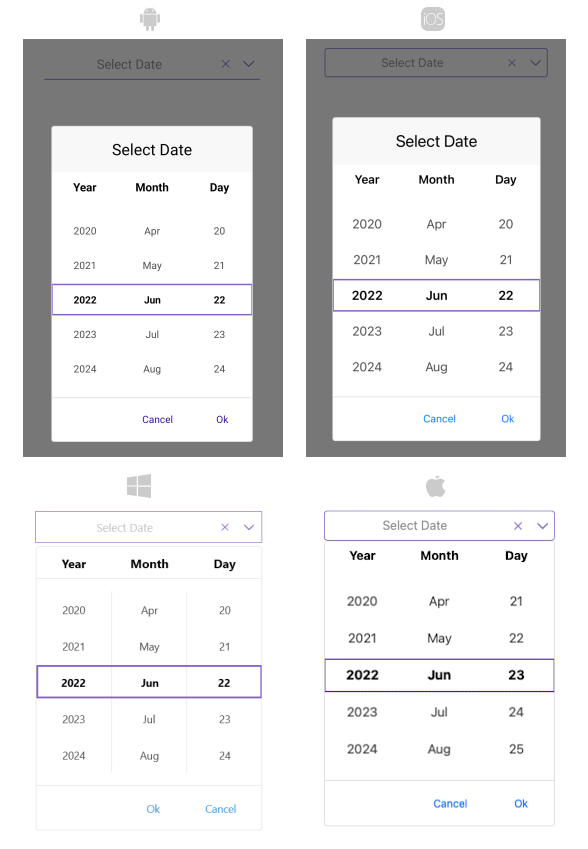
The following image shows a DatePicker control on different platforms after the styles have been applied: