.NET MAUI DatePicker Overview
The Telerik UI for .NET MAUI DatePicker allows you to select a date and visualizes its items inside a popup or a drop-down UI element. The DatePicker also enables you to set date ranges, date formats, and to customize its dialog appearance by configuring its header, footer, and more.
The DatePicker is part of Telerik UI for .NET MAUI, the most comprehensive UI suite for .NET MAUI! To try it out, sign up for a free 30-day trial and kickstart your cross-platform app development today.
Key Features
-
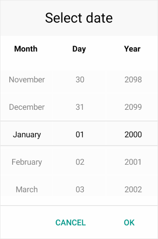
Spinner format—The DatePicker for .NET MAUI allows you to use a standard or custom date format string through its
SpinnerFormatproperty. Depending on the type of format, the picker visualizes spinner controls with the pre-populated values. -
Picker mode—You can choose between the popup and drop-down UI for showing the spinner controls with the available date values. For desktop apps, the default picker mode is
DropDownwhile for mobile it'sPopup. - Templates—The DatePicker provides templates for its header and footer as well as exposes templates for its placeholder and display text.
-
Text upon selection—You can set the text that will be displayed when a date is selected by using the
DisplayStringFormatproperty of the DatePicker. - Date ranges—You can also define date ranges by setting minimum and maximum date values, and choose a date within that range.
- Flexible styling API—The DatePicker provides a number of styling capabilities, which enable you to style its spinners, popup and popup header and footer, the displayed text displayed after a date is selected, and more.
- Commands support—The DatePicker exposes commands that allow you to clear the selected date and to open and close the popup.
- Localization support—Translate the used across the DatePicker text to other languages, so that your app can be adapted to different regions.