.NET MAUI DataGrid Load On Demand
The Telerik UI for .NET MAUI DataGrid enables you to improve its performance and save computing resources, by loading data in the RadDataGrid when the control is already displayed.
To load a large data set on mobile devices, you can use incremental data loading at the time when the user required the items to be visualized.
Modes
The DataGrid provides the following data-loading modes, which are present in the LoadOnDemandMode enumeration:
-
Automatic—The load-on-demand mechanism is activated when you scroll down near the last item present in the viewport.To control when the items will start loading, set the
LoadOnDemandBufferItemsCountproperty. It indicates at which point the additional items will start loading. For example, setting it to20will cause the new items to be loaded when you have scrolled the DataGrid, so that only 20 of the originally loaded items are left below. Manual—A Load More button is present at the bottom of the DataGrid. Clicking it will load additional items based on the approach you have chosen for loading the items (through the event, the command, or the collection).
Approaches
The DataGrid supports the following options for using its load-on-demand feature, depending on your application requirements:
LoadOnDemand Collection
To use this approach, you have to feed the RadDataGrid with a collection of type LoadOnDemandCollection. LoadOnDemandCollection is a generic type, so you need to point the type of objects it will contain. The type extends the ObservableCollection<T> class and expects a Func<CancellationToken, IEnumerable> in the constructor.
The following example demonstrates a simple setup that shows how to use the collection:
this.Items = new LoadOnDemandCollection<Person>((cancelationToken) =>
{
    var list = new List<Person>();
    for (int i = 0; i < 10; i++)
    {
        var person = new Person { Name = "LOD Person " + i, Age = i + 18, Gender = i % 2 == 0 ? Gender.Male : Gender.Female };
        list.Add(person);
    }

    return list;
});
In the example, the Items property is declared as follows:
public LoadOnDemandCollection<Person> Items { get; set; }
LoadOnDemand Event
You can load new items by utilizing the LoadOnDemand event. The event uses LoadOnDemandEventArgs arguments through which you need to indicate when the data is loaded by setting the IsDataLoaded(bool) property.
private void dataGrid_LoadOnDemand(object sender, Telerik.Maui.Controls.DataGrid.LoadOnDemandEventArgs e)
{
    for (int i = 0; i < 15; i++)
    {
        ((sender as RadDataGrid).ItemsSource as ObservableCollection<Person>).Add(new Person() { Name = "Person " + i, Age = i + 18, Gender = i % 2 == 0 ? Gender.Male : Gender.Female });
    }
    e.IsDataLoaded = true;
}
LoadMoreData Command
The LoadMoreData command is another alternative which you can use and which is suitable for MVVM scenarios.
The following example demonstrates how to create the command.
public class CustomLoadMoreDataCommand : DataGridCommand
{
    public CustomLoadMoreDataCommand()
    {
        this.Id = DataGridCommandId.LoadMoreData;
    }

    public override bool CanExecute(object parameter)
    {
        return true;
    }

    public async override void Execute(object parameter)
    {
        if (parameter == null)
        {
            return;
        }

        ((LoadOnDemandContext)parameter).ShowLoadOnDemandLoadingIndicator();

        await System.Threading.Tasks.Task.Delay(1500);
        var viewModel = this.Owner.BindingContext as LoadMoreDataCommandViewModel;
        if (viewModel != null)
        {
            for (int i = 0; i < 10; i++)
            {
                viewModel.Items.Add(new Person { Name = "Person " + i, Age = i + 18, Gender = i % 2 == 0 ? Gender.Male : Gender.Female });
            }
        }
        ((LoadOnDemandContext)parameter).HideLoadOnDemandLoadingIndicator();
    }
}
Eventually, you need to add this custom command to the Commands collection of the DataGrid.
this.dataGrid.Commands.Add(new CustomLoadMoreDataCommand());
Invoking the
ShowLoadOnDemandLoadingIndicatorandHideLoadOnDemandLoadingIndicatorsis a notable part as without calling these methods, theBusyIndicatorused for the functionality will not be visualized.
Styling
Besides the different approaches for loading the data, the DataGrid exposes several mechanisms related to the styling of the functionality which you can use according to the approach you have chosen.
Load-More-Button Row
The LoadOnDemandRowStyle property can be used to style the appearance of the row that contains the Load More button when the LoadOnDemandMode is Manual.
The custom style is of type DataGridLoadOnDemandRowStyle:
<telerik:DataGridLoadOnDemandRowStyle x:Key="CustomDataGridLoadOnDemandRowStyle"
                                      BackgroundColor="#E0F2F1"
                                      IndicatorAnimationColor="#00796B"
                                      IndicatorAnimationType="Animation5"
                                      HorizontalTextAlignment="Center"
                                      VerticalTextAlignment="Center"
                                      OverlayOpacity="0.5"
                                      Text="LOAD MORE"
                                      TextFontAttributes="Bold"
                                      TextFontSize="14"
                                      TextColor="#00796B" />
You have to set it to the LoadOnDemandRowStyle property of the DataGrid:
<telerik:RadDataGrid x:Name="dataGrid"
                     ItemsSource="{Binding Items}"
                     LoadOnDemand="dataGrid_LoadOnDemand"
                     LoadOnDemandMode="Manual"
                     LoadOnDemandRowStyle="{StaticResource CustomDataGridLoadOnDemandRowStyle}"/>
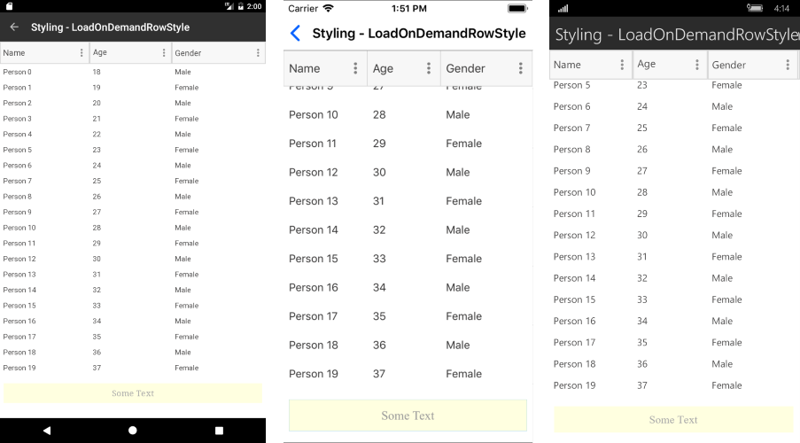
Row appearance after setting the LoadOnDemandRowStyle property
Load-More-Button Row Template
The LoadOnDemandRowTemplate property can be used to set the template of the row that contains the Load More button when the LoadOnDemandMode is Manual.
The following example demonstrates a custom DataTemplate:
<DataTemplate x:Key="CustomLoadOnDemandRowTemplate">
    <telerik:RadBorder IsEnabled="{Binding IsDataLoading, Converter={StaticResource InvertedBooleanConverter}}"
                       BorderBrush="#00897B" BorderThickness="1" CornerRadius="16" HeightRequest="32" Margin="12">
        <telerik:RadBorder.Triggers>
            <Trigger TargetType="telerik:RadBorder" Property="IsEnabled" Value="False">
                <Setter Property="Opacity" Value="0.38" />
            </Trigger>
        </telerik:RadBorder.Triggers>
        <Label Text="Load more items" TextColor="#00897B" HorizontalOptions="Center" VerticalOptions="Center" />
    </telerik:RadBorder>
</DataTemplate>
The following example shows how to set the property:
<telerik:RadDataGrid x:Name="dataGrid"
                     ItemsSource="{Binding Items}"
                     LoadOnDemand="dataGrid_LoadOnDemand"
                     LoadOnDemandMode="Manual"
                     LoadOnDemandRowTemplate="{StaticResource CustomLoadOnDemandRowTemplate}"/>
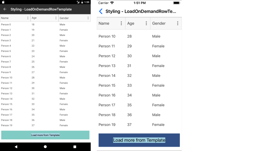
Row appearance after setting the LoadOnDemandRowTemplate
Additional Resources
- .NET MAUI DataGrid Product Page
- .NET MAUI DataGrid Forum Page
- Telerik .NET MAUI Blogs
- Telerik .NET MAUI Roadmap