.NET MAUI DataForm Editors Styling
The DataForm control for .NET MAUI provides styling options for customizing the appearance of its editors. You have to apply a style to each editor individually.
Each editor provides the following properties:
-
BackgroundColor—Defines the background color of the editor. -
BorderColor—Defines the border color of the editor. -
BorderThickness—Specifies the border thickness of the editor. -
EditorStyle(StylewithTargetTypedepending on the input control which the editor uses). For example, the target type of theRadCheckBoxEditorisRadCheckBox.
Example
The following example shows how to style the DataForm:
1. Define the RadDataForm and the editors:
<telerik:RadDataForm x:Name="dataForm" AutoGenerateItems="False">
    <telerik:DataFormRadEntryEditor PropertyName="FirstName"
                                HeaderText="Name"
                                BackgroundColor="#8AAAFF" />
    <telerik:DataFormRadNumericEditor PropertyName="People"
                                   HeaderText="People"
                                   Minimum="1"
                                   BorderColor="Navy"
                                   BorderThickness="2" />
    <telerik:DataFormRadTimeSpanPickerEditor PropertyName="Duration"
                                          HeaderText="Duration"
                                          BackgroundColor="BlanchedAlmond"
                                          BorderColor="Orange"
                                          BorderThickness="2" />
    <telerik:DataFormRadCheckBoxEditor PropertyName="Visited"
                                    HeaderText="Visited before"
                                    EditorStyle="{StaticResource CheckBoxStyle}" />
</telerik:RadDataForm>
Note that local in the snippet above points to the namespace where the EditorsViewModel is defined.
2. Define the CheckBoxStyle for the DataFormRadCheckBoxEditor:
<Style x:Key="CheckBoxStyle" TargetType="telerik:RadCheckBox">
    <Setter Property="CheckedColor" Value="DarkSeaGreen" />
    <Setter Property="UncheckedColor" Value="Orange" />
</Style>
3. Add the following namespace:
xmlns:telerik="http://schemas.telerik.com/2022/xaml/maui"
4. Define the ViewModel used as a BindingContext for the RadDataForm:
public class EditorsViewModel : NotifyPropertyChangedBase
{
    private string name;
    private DateTime? startDate;
    private DateTime? endDate;
    private double? people;
    private bool? visited;
    private TimeSpan? duration;
    private EnumValue accommodation = EnumValue.Apartment;
    public enum EnumValue
    {
        SingleRoom,
        Apartment,
        House
    }

    [Required]
    [Display(Name = "Select accomodation")]
    public EnumValue Accommodation
    {
        get
        {
            return this.accommodation;
        }
        set
        {
            if (this.accommodation != value)
            {
                this.accommodation = value;
                this.OnPropertyChanged();
            }
        }
    }

    [Required]
    [Display(Name = "First Name")]
    public string FirstName
    {
        get => this.name;
        set => this.UpdateValue(ref this.name, value);
    }

    [Required]
    [Display(Name = "Start date")]
    public DateTime? StartDate
    {
        get => this.startDate;
        set => this.UpdateValue(ref this.startDate, value);
    }

    [Required]
    [Display(Name = "End Date")]
    public DateTime? EndDate
    {
        get => this.endDate;
        set => this.UpdateValue(ref this.endDate, value);
    }

    [Required]
    [Display(Name = "Number of People")]
    [Range(1, 10)]
    public double? People
    {
        get => this.people;
        set => this.UpdateValue(ref this.people, value);
    }

    [Display(Name = "Visited before")]
    public bool? Visited
    {
        get => this.visited;
        set => this.UpdateValue(ref this.visited, value);
    }

    [Display(Name = "Duration")]
    public TimeSpan? Duration
    {
        get => this.duration;
        set => this.UpdateValue(ref this.duration, value);
    }
}
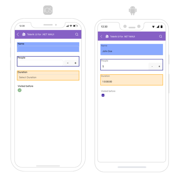
The following image shows what the DataForm control looks like when the styles described above are applied:
For a runnable example with the DataForm Editors Styling scenario, see the SDKBrowser Demo Application and go to DataForm > Styling category.