Items Overview
This topic will give you a general idea of the various items in the RadTreeList control.
TreeList item types:
TreeListDataItem
TreeListHeaderItem
TreeListPagerItem
TreeListDetailTemplateItem
Below, you will find descriptions of these item types.
TreeListDataItem
The rows of the treelist control are called data items and are of type TreeListDataItem. They can be accessed using the Items collection of the control.
If the treelist uses different styling for odd- and even- numbered rows, the even-numbered are called AlternitingItems while the odd ones are just Items. The TreeListDataItem.ItemType property returns whether the current TreeListDataItem is Item or AlternatingItem. Its style can be customized by using respectively the ItemStyle and AlternatingItemStyle properties.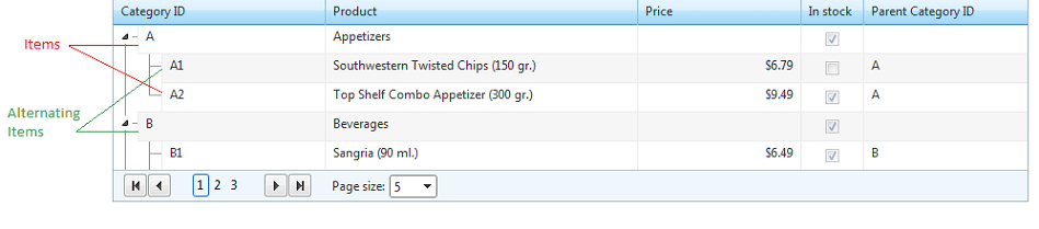
For more information on the TreeListDataItem object, see its Server-side API and Client-side API documentation articles.
TreeListHeaderItem
The header appears over the data items and is of type TreeListHeaderItem. It displays the column names if specified in the HeaderText property and facilitates some functions of the control like sorting. Its look can be customized using the HeaderStyle property.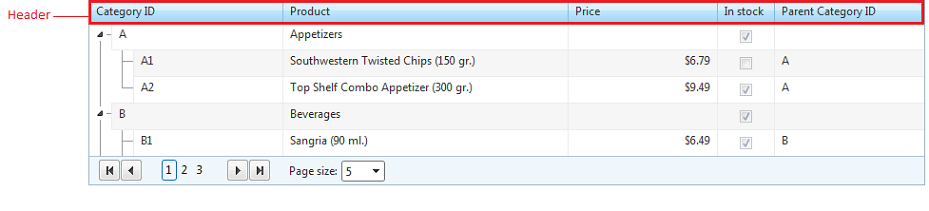
TreeListPagerItem
If AllowPaging is set to true, the RadTreeList control renders a pager item (TreeListPagerItem) which can be positioned on the top and/or bottom of the control. It is always visible, no matter if the number of expanded items is larger than the page size. Each time a row is expanded/collapsed, the pager refreshes based on the number of expanded items.
You can choose what controls to appear in the pager item by setting the PagerStyle.Mode property. If none of the predefined configurations satisfies your requirements, you can specify your own PagerTemplate.
You can read more about the TreeListPagerItem API in the Basic Paging article.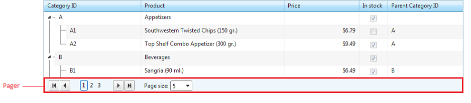
TreeListDetailTemplateItem
RadTreeList allows you to specify a DetailTemplate that will be rendered as a TreeListDetailTemplateItem under each data item, thus allowing you to design an extra row for displaying its data. Note that the detail items are not counted as separate data items when the page count is calculated.
For more information about the DetailTemplate of RadTreeList, you can read the respective help topic and view the Detail Template online demo. 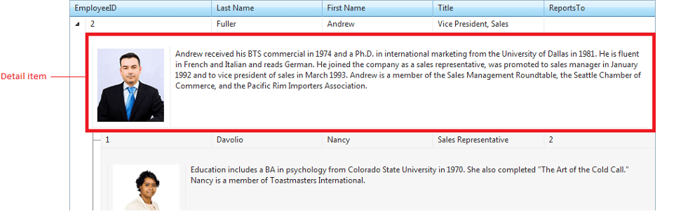
TreeListNoRecordsItem
RadTreeList allows you to specify a NoRecordsTemplate that will be rendered when the treelist control is bound to an empty datasource, allowing you to show a more customized message to the user.