Getting Started Overview
This tutorial will walk you through creating a Web page that contains a RadSplitter control. It shows how to:
Add panes and split bars to the splitter, creating resizable regions.
Set the orientation of the splitter.
Load external content into a pane.
Configure which panes can be collapsed.
Specify the minimum dimensions of a pane.
Add a sliding zone to a pane.
Add sliding panels to a sliding zone.
Use skins to provide a consistent look & feel.
RadSplitter
-
Drag a RadSplitter control from the toolbox onto your Web page. It's Smart Tag should appear automatically:
-
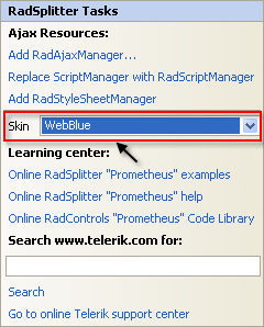
In the Skin drop-down list, select the "WebBlue" skin:
-
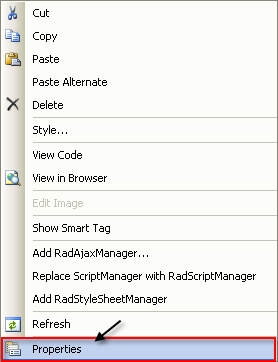
Right-click the RadSplitter control to display its context menu, and choose Properties:
-
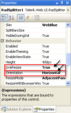
In properties pane for the splitter, locate the LiveResize property, and set it to True. This causes the panes of the splitter to display their content even during resize operations. Locate the Orientation property and set it to "Horizontal". This causes the panes of the splitter to stack on top of each other:
-
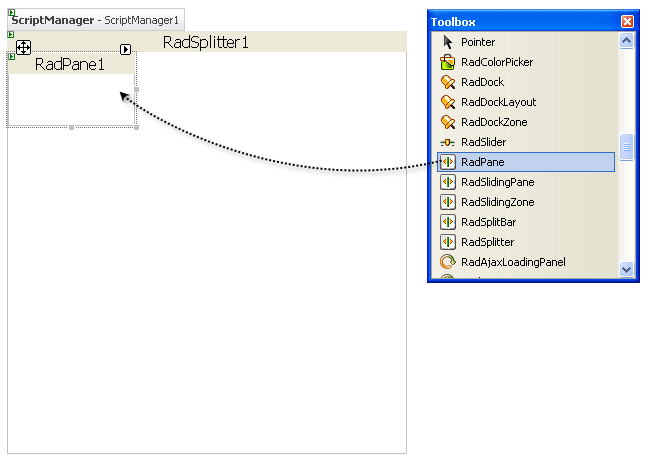
Drag a RadPane control from the toolbox onto the surface of the splitter:
-
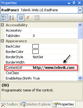
In the properties pane, set the ContentUrl property to "https://www.telerik.com". This tells the pane to load its content from an external source (the Telerik Web site) :
-
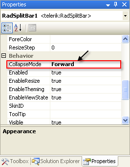
Drag a RadSplitBar from the toolbox onto the RadSplitter control, below the RadPane. Using the properties pane, set its CollapseMode property to "Forward". This gives the split bar the ability to collapse the first RadPane, but not the one that follows it.
Drag a second RadPane from the toolbox onto the RadSplitter control, below the RadSplitBar.
-
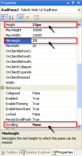
Set its Height property to "25px", its MinHeight property to 25 and its Scrolling property to "None". The Height property sets its initial height to 25 pixels. The MinHeight property ensures that this pane cannot be resized any smaller. The Scrolling property prevents the pane from displaying scroll bars.
Drag a RadSlidingZone control from the toolbox onto the surface of RadPane2. Set its SlideDirection property to "Top". This specifies that sliding panes inside the sliding zone expand upward.
-
Drag a RadSlidingPane from the toolbox onto the surface of the sliding zone. Set the following properties:
- Set TabView to "TextOnly". This specifies that the tab for the sliding panel displays the title but no image.
- Set Title to "Colors". This is the title that appears on the tab for the sliding panel.
- Set Height to 105.
- Set EnableResize to False. This prevents the sliding panel from being resized when it is expanded.
Drag a RadColorPicker control from the toolbox onto the surface of the sliding panel, to give it some content to display.
-
Drag another RadSlidingPane from the toolbox onto the surface of the sliding zone. Set the following properties:
- Set TabView to "TextOnly".
- Set Title to "Calendar".
- Set Height to "180".
Drag a RadCalendar control from the toolbox onto the surface of the RadSlidingPane you just added. Set its Skin property to "WebBlue", so that it matches the splitter controls.
-
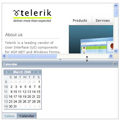
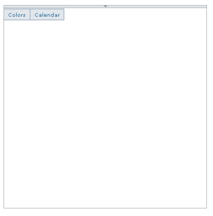
Run the application. The RadSplitter control appears, showing the two panes you added. The top pane shows content from an external source. The lower pane shows the RadSlidingZone, with tabs for the two RadSlidingPane controls:

-
Note that the split bar has a little arrow in the center, click on this arrow to collapse the first pane. The arrow changes direction.
Click on the arrow to restore the first pane.
-
Drag on the split bar. Note that it doesn't let you make the second pane any smaller, but you can resize in an upward direction, and then down again.

-
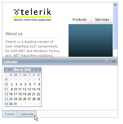
Hover the mouse over the tabs in the RadSlidingZone, and see the sliding panels appear and disappear:
-
Note the controls on the upper right corner of the sliding panel. You can use these to pin the panel in place or make it collapse. The "Calendar" panel has a bar at the top that you can drag on to resize the panel, while the "Colors" panel has no such capability: