Styling
Styling Row/Column/Data table cells
Since Q3 2012 RadPivotGrid provides means to change how the columns, rows, and data cells looks.There are couple ways for changing the default style:
- Globally, through the ColumnHeaderCellStyle, RowHeaderCellStyle and DataCellStyle properties of RadPivotGrid.
<ColumnHeaderCellStyle Width="300px" />
<RowHeaderCellStyle Width="300p" />
<DataCellStyle Width="300px" />
ColumnHeaderCellStyle – applies style to all pivotgrid’s column header table cells.
RowHeaderCellStyle – applies style to all pivotgrid’s row header table cells.
DataCellStyle – applies style to all pivotgrid’s data table cells.
Or specifically for given field though the CellStyle property.
<telerik:PivotGridRowField DataField="TransportType" CellStyle-ForeColor="Red" CellStyle-Font-Size="Small">
</telerik:PivotGridRowField>
Cases and specifics
If CellStyle and a some header style(RowHeaderCellStyle, ColumnHeaderCellStyle, or DataCellStyle) are both set, the CellStyle property takes precedense. The possible scenarios are as follows:
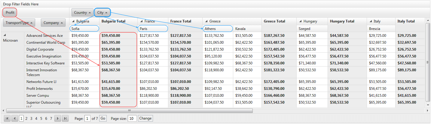
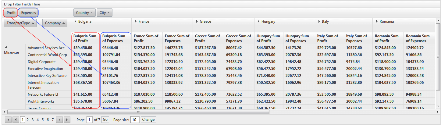
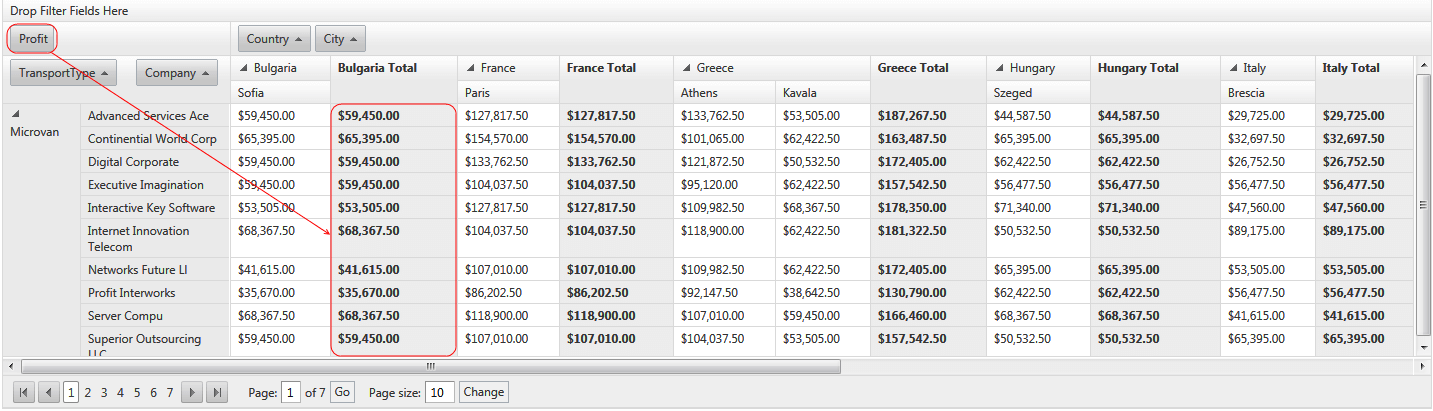
AggregatePosition="Columns"
One aggregate field:
Two or more aggregate fields:
AggregatePosition="Rows"
One aggregate field:
Two or more aggregate fields:
