Getting Started Overview
This tutorial will walk you through creating a RadPanelBar (Accordion) and shows how to:
Use the RadPanelBar Item Builder to build a multi-level panel bar.
Apply a skin to the panel bar to change its look & feel.
Add a template to a panel bar item.
Set RadPanelBar properties.
Creating a panel bar using the RadPanelBar Item Builder
Drag a RadPanelBar component from the toolbox onto your Web page. The RadPanelBar Smart Tag should appear automatically:
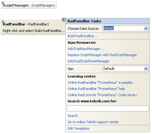
On the Smart Tag, choose Build RadPanelBar. The RadPanelBar Item Builder appears:
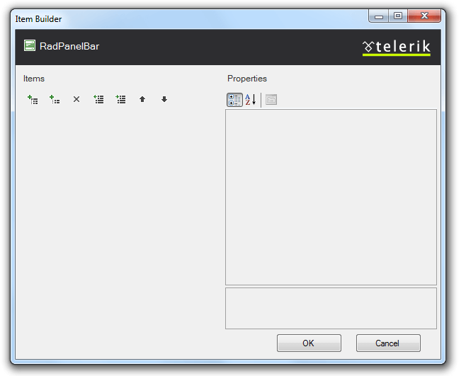
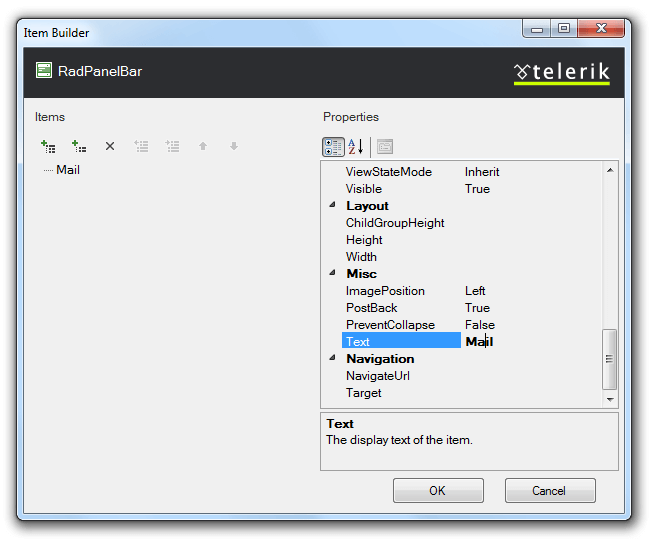
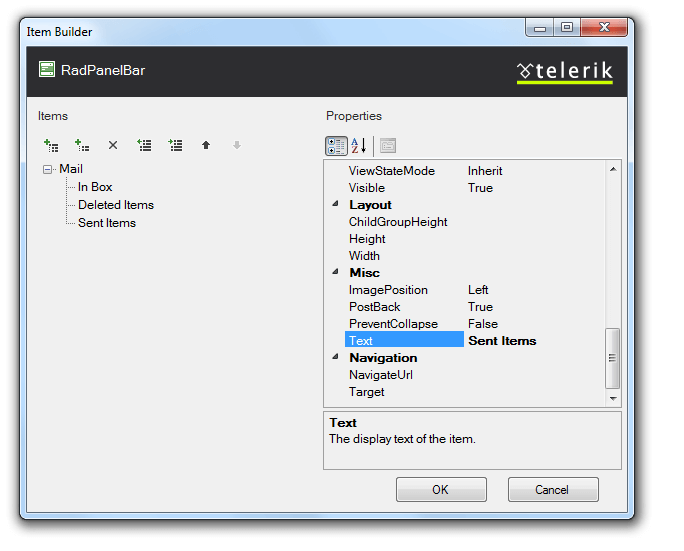
Click the Add root item button (
 ) to add a root item to your panel bar.
Set its Text property to "Mail".
-
With the "Mail" item selected, click the Add child item button (
 ) to add a child to your root item.
- Select the child item and set its Text property to "In Box".
-
Select the "Mail" item again, and click the Add child item button twice to add two more child items.
Set the Text property of the first of these to "Deleted Items".
Set the Text property of the second of these to "Sent Items".
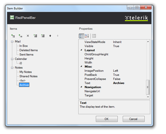
Click the Add root item button to add another root item. Set its Text property to "Calendar".
With the "Calendar" item selected, click the Add child item button to add a child item. Set its Text property to an empty string.
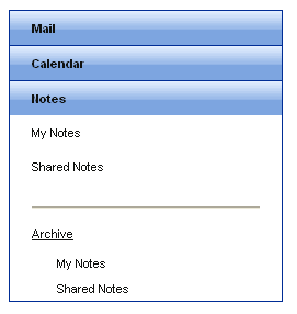
Click the Add root item button again to add a third root item. Set its Text property to "Notes".
-
Select the "Notes" item and click the Add child item button four times to add four child items.
Set the Text property of the first child item to "My Notes".
Set the Text property of the second child item "Shared Notes".
Set the Text property of the third child item to
<hr>and set its IsSeparator property to True.Set the Text property of the fourth child item to "Archive".
-
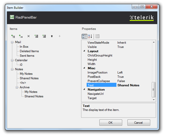
Select the "Archive" child item. With the Archive button selected, click the Add child item button twice to give the child item two child items of its own.
Set the Text property of the first child item to "My Notes"
Set the Text property of the second child item to "Shared Notes".
Click OK to confirm and exit.
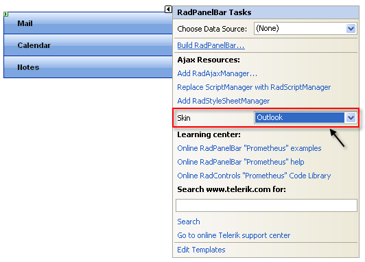
Back in the RadPanelBar Smart Tag, use the Skin drop-down to change the skin for the RadPanelBar to "Outlook". The appearance of the RadPanelBar in the designer changes to reflect the new skin:
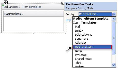
In the RadPanelBar Smart Tag, click the Edit Templates link.
The Smart Tag switches to template editing mode. From the Display drop-down, select the template for the child item of the "Calendar" item:
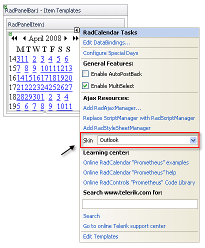
Drag a RadCalendar control from the toolbox onto the Template Design Surface. Set its Skin property to "Outlook" to match the panel bar:
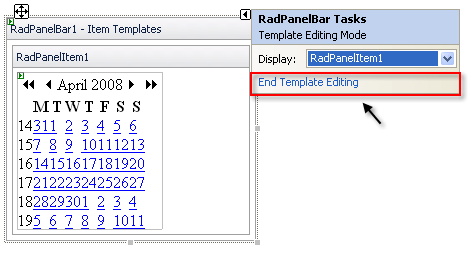
Click on the RadPanelBar Smart Tag anchor to display its Smart Tag again, and choose End Template Editing:
Right click on the RadPanelBar, and from its context menu, choose Properties.
-
In the Behavior section of the properties pane:
Expand the ExpandAnimation property and set the Type to "InOutBounce". This introduces an animated effect when items are expanded.
Set the ExpandMode property to "SingleExpandedItem". This specifies that only one item can be expanded at a time.
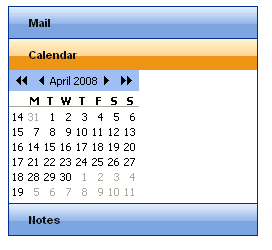
Run the application. Click on the panel bar items to expand them. Note the animated effect. When you expand the "Calendar" item, the template displays:
When you click the Notes item, the second level of items appears. You can then click on the "Archive" item to display the third level of items: