Modes
RadImageGallery control is a flexible control that provides different presentation modes which configures the way the ImageArea and ThumbnailsArea looks.
There are four different DisplayArea Modes that could be set for the ImageGallery control. They determine the ImageArea appearance:
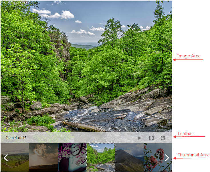
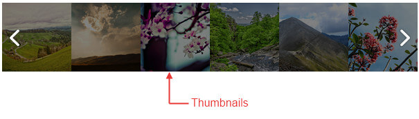
Image – This is the default mode when the ThumbnailsArea and the ImageArea are simultaneously visible.The image below presents all areas and sections in this mode.
 When the DisplayArea Mode is set to Image you could specify different modes for the ThumnbailsArea which are listed below:
Thumbnails- It is available for all DisplayArea Modes. This is the default ThumbnailsArea Mode which is also presented in the image above.
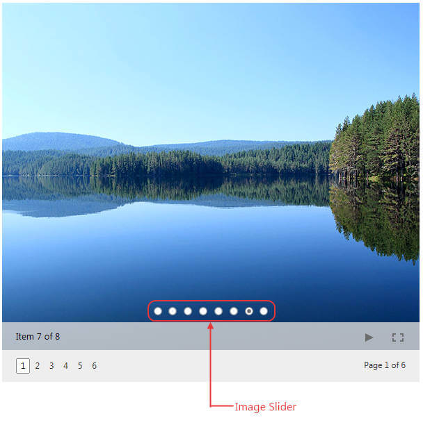
ImageSlider- It is available only for DisplayArea Mode set to Image. In this case the Thumbnails are presented as dots which could be selected to open the image.
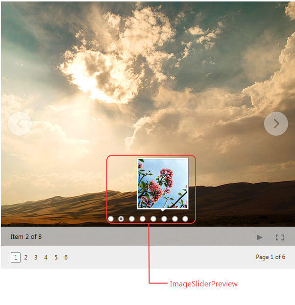
ImageSliderPreview- It is available only for DisplayArea Mode set to Image. In this case the Thumbnails are presented as dots which could be previewed on hover.
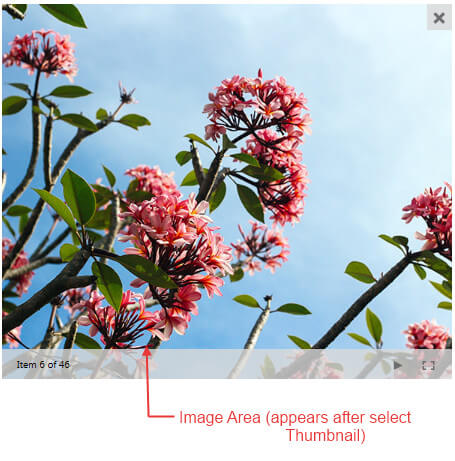
Thumbnails - The area initially shows only thumbnail images and upon click it hides the thumbnails and shows the ImageArea with close button on the top right in order to give the possibility to go back to the ThumbnailsArea.
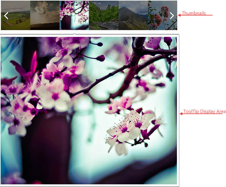
ToolTip – The area initially shows only thumbnail images and on click opens a ToolTip control with the image.
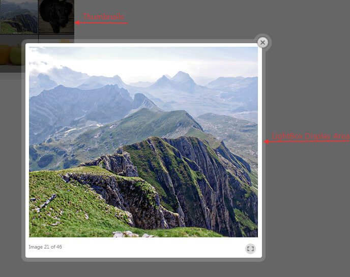
LightBox – The area initially shows only thumbnail images and on click opens a LightBox control with the image.