RadHtmlChart Types Overview
In this article you will find a detailed list of the chart types available in RadHtmlChart, information about their purpose and the most common scenarios in which they can be used.
| Chart Type | Description | When to use | |
|---|---|---|---|
| Area |  |
Area chart shows the data as continuous lines that pass through points defined by their items' values. | Area charts are useful for emphasizing changes in values from several sets of similar data. A colored background will clearly visualize the differences.). |
| Bar |  |
Bar chart displays data as horizontal bars whose lengths vary according to their value. | Bar charts can be used to show a comparison between several sets of data (for example, summaries of sales data for different time periods). |
| Box Plot |  |
Box Plot chart depicts graphically numerical data by displaying a data distribution summary with six indicators (i.e., lower value, first quartile, median, mean, third quartile, upper value) and outliers for each set of data. | Box Plot charts are useful for comparing distributions between different sets of numerical data. |
| Bubble | 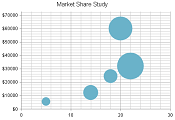 |
Bubble chart shows the data as points with coordinates and size defined by their items' values. This allows a it to display three dimensional data — two values for the items' coordinates and one for their size. | A Bubble chart is useful for visualizing different scientific relationships (economic, social, etc.) |
| Bullet | 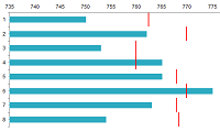 |
Bullet chart compares a given quantitative measure (such as temperature) against qualitative ranges and a symbol marker that encodes the comparative measure. | Bullet charts can be used as a replacement for dashboard gauges and meters. |
| Bullet (vertical) | 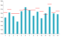 |
Vertical Bullet chart compares a given quantitative measure (such as temperature) against qualitative ranges and a symbol marker that encodes the comparative measure. | Vertical Bullet charts can be used as a replacement for dashboard gauges and meters. |
| Candlestick | 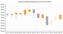 |
Candlestick chart graphically describes the price movements of a financial instrument (e.g security or currency) over time. | Use this chart type to visualize price or currency fluctuations.Typically this chart is used to analyze stock prices or currency changes. |
| Column | 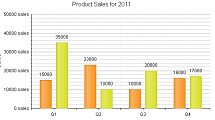 |
Column chart graphically display values in vertical and horizontal bars across categories. | Column charts can be useful for showing a comparison between several sets of data (e.g., snapshots of data across different points in time). |
| Donut |  |
Donut chart is a Pie chart variation with the ability to display single series of data in a two-dimensional circle. | Donut chart is useful for displaying data as parts of a whole. |
| Funnel | 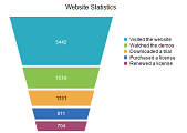 |
Funnel chart displays a single series of data in progressively decreasing or increasing proportions, organized in segments. | Funnel charts are usually used to represent stages in a sales process (e.g., show the amount of potential revenue for each stage);identify a potential problematic areas in any company's process; visualize website visitors trends, etc. |
| Line |  |
Line chart shows data as continuous lines that pass through points defined by their items' values. | Line charts can be useful for showing a trend over time and comparing several sets of similar data. |
| Pie | 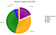 |
Pie chart displays the data as sectors from a in a two-dimensional circle. | Pie charts are useful when you need to display the contribution of fractional parts to a whole. |
| Polar |  |
Polar chart shows data in a circular plot area in polar coordinates where each data point is represented by a distance/radius and an angle, beginning of the coordinate system. | Polar charts are useful for visualizing scientific data like precipitation/heat distribution in the Earth's poles and other multivariate data. |
| Radar | 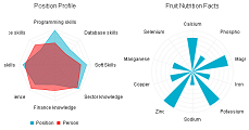 |
Radar chart is a two-dimensional chart that has at least three quantitative factors, illustrated on axes that share the same starting point. | Radar charts are useful in making comparisons between units that depend on such quantitative factors/variables. |
| Range Bar | 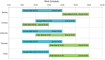 |
Range Bar chart type shows data as bars where each bar represents a value range that spans between its minimum and maximum levels. | Range Bar chart type is useful for comparing the low and high levels of value ranges (e.g., employees' working time, blood glucose levels per day, average minimum and maximum temperatures and rainfalls over time,etc.). |
| Range Column |  |
Range Column chart type shows data as vertical bars where each bar represents a value range that spans between its minimum and maximum levels. | Range Column chart type is useful for comparing the low and high levels of value ranges (e.g., employees' working time, blood glucose levels per day, average minimum and maximum temperatures and rainfalls over time, etc.). |
| ScatterLine |  |
ScatterLine chart shows data as connected points defined by their items' values. | ScatterLine charts can be used for showing the relation between different sets of data, for example scientific (experimental) results, or when you need to have two numerical axes on a line-type chart. |
| Sparkline |  |
Sparkline is a very small chart, drawn without axes,coordinates, legend, title and other chart-specific elements. | Sparklines behave like inline elements so that they can be easily embedded in text. |
| Spline |  |
Spline charts allow you to take a limited set of known data points and approximate intervening values. | The Spline chart is often used for data modeling by taking a limited number of data points and interpolating or estimating the intervening values. |
| Step Line |  |
Step Line chart is a form of line/area chart where each data point from the series is connected with vertical and horizontal lines to form a step-like progression. | The Step line charts are useful in displaying the intermittent changes of a quantity that remains a constant during stages. |
| Waterfall |  |
Waterfall chart shows the cumulative effect of positive or negative values on the starting point, displayed vertically. | The Waterfall chart is useful for different types of quantitative analysis related to inventory, cash flows, performance, etc. |
| Waterfall (horizontal) | 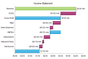 |
Horizontal Waterfall chart shows the cumulative effect of positive or negative values on the starting point, displayed horizontally. | The Horizontal Waterfall chart is useful for different types of quantitative analysis related to inventory, cash flows, performance, etc. |