Structure
The main visual elements of RadColorPicker are:
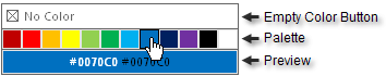
Empty Color Button: This is shown if ShowEmptyColor is False. The user can click this to set "No Color" in the preview area.
Palette: This is made up of color squares that the user can select with the mouse.
Preview: The color square the mouse is currently hovered over displays in the preview area. The color may display as a color name or a hexadecimal string. The string describing the color is displayed in both light and dark colors for better visibility.
RadColorPicker displays as an icon only if ShowIcon is set to True.