Legends
RadChart has been replaced by RadHtmlChart, Telerik's client-side charting component. If you are considering RadChart for new development, examine the RadHtmlChart documentation and online demos first to see if it will fit your development needs. If you are already using RadChart in your projects, you can migrate to RadHtmlChart by following these articles: Migrating Series, Migrating Axes, Migrating Date Axes, Migrating Databinding, Features parity. Support for RadChart is discontinued as of Q3 2014, but the control will remain in the assembly so it can still be used. We encourage you to use RadHtmlChart for new development.
Legends are symbols and text used to provide additional information about the chart.In a multiple series chart the legend typically describes each series to improve readability.By default RadChart includes the color and name of each chart series in the legend. You can also define your own legend and control the style for the legend or each item in the legend using the RadChart Legend property. Legend holds properties for:
Visible: If a legend is not relevant to your chart you can set this false to hide the legend.
Appearance: This property controls the visual style of the legend as a whole including Dimensions, Position, FillStyle, ItemAppearance, ItemMarkerAppearance, ItemTextAppearance, RotationAngle and Shadow.
Items: A collection containing the individual legend text and symbols for each series.Add to this collection to create your own custom legends.
Marker: A visual marker for the legend as a whole. Use the marker Appearance property to control properties like FillStyle, Dimensions and Position. To assign an image to the marker use the marker Appearance.FillStyle property to set FillType to Image and FillSettings.BackgroundImage to the path of the image.
TextBlock: Use TextBlock to control the default text and appearance.
Formatting Legends
Use the legend Appearance ItemTextAppearance property to tailor the look of all legend item text at one time and the ItemMarkerAppearance to format all of the legend markers.Particularly note the CompositionType property that handles the display order of text vs. images where valid values are ColumnImageText, ColumnTextImage, RowImageText (the default) and RowTextImage. "Column" values show the text and image one above the other."Row" shows text and image side-by-side.
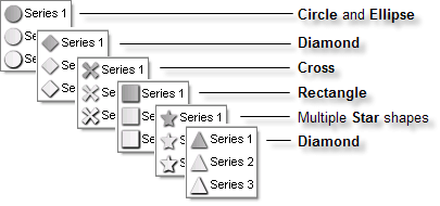
Use the ItemMarkerAppearance Figure property to select from a set of predefined marker shapes.
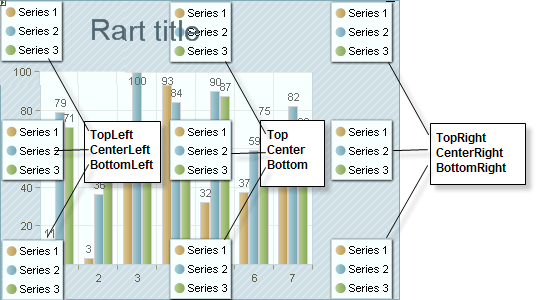
Use the Legend.Appearance.Position property to control where the legend should appear on the chart surface. The AlignedPosition sub property automatically places the legend in a predefined position. Or set the Auto property false and manually set the X properties to place the legend in any exact position.
Use the Legend.Appearance.Dimensions property to control the legend height and width.By default the AutoSize sub property is true and dimensioning is handled for you.Set AutoSize off to manually handle Width, Height, Margins and Paddings.
Adding Custom Legends
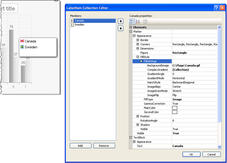
In the collection editor for the Legend Items property add one or more items. Use the Marker property to add images or colored shapes next to the text.Use the TextBlock property to add the text description for the legend item. You can also define image maps using the ActiveRegion property of the legend or legend items.
To add images to the legend you can set the Marker.Appearance.FillStyle.FillType to Image and the Marker.Appearance.FillStyle.FillSettings.BackgroundImage to the path of an image to display.In the example below two legend items are added to the collection where the BackgroundImage contains image paths for two flags and where the TextBlock.Text properties contain corresponding descriptions. In addition the Legend.Appearance.Shadow property has Blur = 5 and Distance = 2.