Clustering
Many applications operate with collections of items which are placed close to others and it's uncomfortable to use them as separate objects for low zoom levels. The VisualizationLayer supports the Clustering feature. It allows grouping of items according to condition.
- Using of the clustering
- Clustering Invalidated Event
- Items Grouping Example
- DefaultClusterGenerator class
- The ClusterData object
Using of the clustering
The VisualizationLayer exposes the following properties which are related to the Clustering feature:
ClusterGenerator: Gets or sets an instance of the class which implements the IClusterGenerator interface. It can be used when you want to define your own grouping algorithm. As default it uses the instance of the built-in DefaultClusterGenerator class.
ClusteringEnabled: Gets or sets a boolean value which indicates whether the clustering is enabled.
ClusteringEnabledThreshold: A property of type int that gets or sets clustering enabled threshold. This value sets the max zoom level for clustering. If current zoom level of the control is greater than this value then clustering will be disabled.
You should set the AutoCalculateClusteringThreshold to False to allow the RadMap to respect the ClusteringEnabledThreshold. The default value of this property is True. This means that you need to explicitly set it to false in all cases when you need to predefine the clustering threshold.
ClusteringEnabledThresholdMinItems: A property of type int that gets or sets the minimum number of items in the cluster for auto calculated clustering threshold. The clustering threshold will be set if number of the items in every cluster is less than this value.
ClusterItemTemplate: Gets or sets the data template which represents the cluster item.
ClusterTemplateSelector: Gets or sets the custom logic for choosing a template used to display each cluster.
DefaultClusterTemplate: Gets or sets the default cluster data template. It’s used when the ClusterTemplateSelector and ClusterItemTemplate properties are not specified.
GenerateClustersOnZoom: A property of type bool that gets or sets value which indicates whether clusters should be re-generated when the zoom level is changed. The default value of this property is true.
In order to enable the Clustering feature you can specify just the ClusteringEnabled property to true. Also you can configure the ItemTemplate and ClusterItemTemplate properties for customizing the appearance of the item and of the cluster.
More information about using of the ItemTemplate property you can find in the Data Binding article.
ClustersInvalidated Event
To get notified when the cluster elements are created, the ClustersInvalidated event of the VisualizationLayer can be utilized.
Example 1: Subscribe to ClustersInvalidated event
<telerik:VisualizationLayer x:Name="VisualizationLayer1" ClustersInvalidated="VisualizationLayer_ClustersInvalidated"/>
Example 2: ClustersInvalidated event handler
private void VisualizationLayer_ClustersInvalidated(object sender, System.EventArgs e)
{
    // custom logic
}
Items Grouping Example
The following example demonstrates how to use the Clustering feature to display the airports of USA. The example displays the point type data which can be found in the “airports” shape-file of our Virtualization and Grouping demo. The file contains 940 airports.
If you try to load this file using the shape-file reader directly, like the sample XAML code below, then the performance of zooming and panning will be slow. Also the data items will be overlapped for low zoom levels (1-7).
Example 3: Displaying Airports of USA
<UserControl x:Class="ItemsGroupingExample.MainPage"
             xmlns="http://schemas.microsoft.com/winfx/2006/xaml/presentation"
             xmlns:x="http://schemas.microsoft.com/winfx/2006/xaml"
             xmlns:d="http://schemas.microsoft.com/expression/blend/2008"
             xmlns:mc="http://schemas.openxmlformats.org/markup-compatibility/2006"
             xmlns:telerik="http://schemas.telerik.com/2008/xaml/presentation"
             d:DesignHeight="300"
             d:DesignWidth="400"
             mc:Ignorable="d">
    <Grid x:Name="LayoutRoot">
        <telerik:RadMap x:Name="RadMap1"
                        Center="40, -100"
                        ZoomLevel="3">
            <telerik:RadMap.Provider>
                <telerik:OpenStreetMapProvider />
            </telerik:RadMap.Provider>
            <telerik:VisualizationLayer x:Name="VisualizationLayer1">
                <telerik:VisualizationLayer.Reader>
                    <telerik:AsyncShapeFileReader Source="/ItemsGroupingExample;component/Resources/airports.shp" ToolTipFormat="AIRPT_NAME" />
                </telerik:VisualizationLayer.Reader>
            </telerik:VisualizationLayer>
        </telerik:RadMap>
    </Grid>
</UserControl>
Here is a snapshot of the displayed items for zoom level 3:
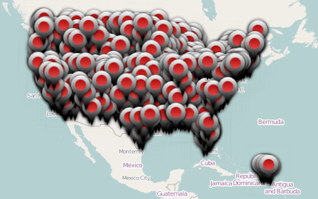
Such performance is a reason to use the Clustering feature to improve the performance of rendering. Also, it allows to avoid displaying the overlapped objects which are placed close to others.
You can set the ClusteringEnabled property to true for enabling the feature.
Example 4: Enable clustering functionality
<telerik:VisualizationLayer x:Name="VisualizationLayer1" ClusteringEnabled="True">
    <telerik:VisualizationLayer.Reader>
        <telerik:AsyncShapeFileReader Source="/ItemsGroupingExample;component/Resources/airports.shp" ToolTipFormat="AIRPT_NAME" />
    </telerik:VisualizationLayer.Reader>
</telerik:VisualizationLayer>
Here is a snapshot of the displayed items for zoom level 3 when the grouping is used:
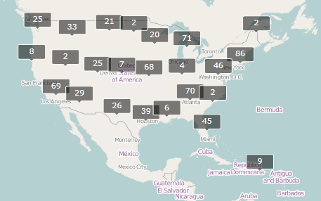
By default the cluster looks like above and it shows how many items it contains.
You can configure the ItemTemplate and ClusterItemTemplate properties to customize the appearance of the item and of the cluster.
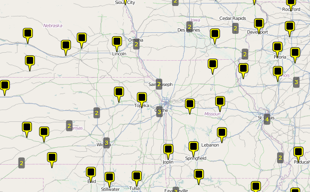
Example 5: Customizing the appearance of the cluster
<UserControl x:Class="ItemsGroupingExample.MainPage"
             xmlns="http://schemas.microsoft.com/winfx/2006/xaml/presentation"
             xmlns:x="http://schemas.microsoft.com/winfx/2006/xaml"
             xmlns:d="http://schemas.microsoft.com/expression/blend/2008"
             xmlns:mc="http://schemas.openxmlformats.org/markup-compatibility/2006"
             xmlns:telerik="http://schemas.telerik.com/2008/xaml/presentation"
             d:DesignHeight="300"
             d:DesignWidth="400"
             mc:Ignorable="d">
    <UserControl.Resources>
        <DataTemplate x:Key="ItemTemplate">
            <Border>
                <telerik:MapLayer.HotSpot>
                    <telerik:HotSpot ElementName="Pin"
                                     X="0.5"
                                     Y="1.0" />
                </telerik:MapLayer.HotSpot>
                <Canvas x:Name="Pin"
                        Width="20"
                        Height="32">
                    <Path Width="20.01"
                          Height="32.005"
                          Data="M1054.5088,458.105L1065.5188,458.105C1067.7278,458.105,1069.5188,459.896,1069.5188,462.105L1069.5188,473.084C1069.5188,475.293,1067.7278,477.084,1065.5188,477.084C1065.5188,477.084,1062.6868,476.831,1062.2128,479.103C1061.6608,481.751,1060.2208,489.11,1060.2208,489.11L1059.3548,489.11C1059.3548,489.11,1058.0138,482.546,1057.2888,479.106C1056.8538,477.041,1054.5088,477.084,1054.5088,477.084C1052.2998,477.084,1050.5088,475.293,1050.5088,473.084L1050.5088,462.105C1050.5088,459.896,1052.2998,458.105,1054.5088,458.105z"
                          Fill="Yellow"
                          Stretch="Fill"
                          Stroke="Black"
                          StrokeEndLineCap="Flat"
                          StrokeLineJoin="Miter"
                          StrokeMiterLimit="10"
                          StrokeStartLineCap="Flat"
                          StrokeThickness="1" />
                    <Path Canvas.Left="3.188"
                          Canvas.Top="2.989"
                          Width="13.42"
                          Height="14.219"
                          Data="M1066.6162,472.8125C1066.6212,473.9125,1065.7252,474.8125,1064.6252,474.8125L1055.2502,474.8125C1054.1502,474.8125,1053.2462,473.9125,1053.2412,472.8125L1053.1962,462.5935C1053.1912,461.4935,1054.0872,460.5935,1055.1872,460.5935L1064.5622,460.5935C1065.6622,460.5935,1066.5662,461.4935,1066.5712,462.5935z"
                          Fill="Black"
                          Stretch="Fill" />
                </Canvas>
            </Border>
        </DataTemplate>

        <DataTemplate x:Key="ClusterTemplate">
            <Border Background="#af3f3f3f"
                    CornerRadius="3"
                    telerik:MapLayer.HotSpot="0.5,0.5">
                <StackPanel x:Name="Text" Margin="3">
                    <TextBlock HorizontalAlignment="Center"
                               Foreground="Yellow"
                               Text="{Binding Path=Count}" />
                </StackPanel>
            </Border>
        </DataTemplate>
    </UserControl.Resources>

    <Grid x:Name="LayoutRoot">
        <telerik:RadMap x:Name="RadMap1"
                        Center="40, -100"
                        ZoomLevel="3">
            <telerik:RadMap.Provider>
                <telerik:OpenStreetMapProvider />
            </telerik:RadMap.Provider>
            <telerik:VisualizationLayer x:Name="VisualizationLayer1"
                                        ClusterItemTemplate="{StaticResource ClusterTemplate}"
                                        ClusteringEnabled="True"
                                        ItemTemplate="{StaticResource ItemTemplate}">
                <telerik:VisualizationLayer.Reader>
                    <telerik:AsyncShapeFileReader Source="/ItemsGroupingExample;component/Resources/airports.shp" ToolTipFormat="AIRPT_NAME" />
                </telerik:VisualizationLayer.Reader>
            </telerik:VisualizationLayer>
        </telerik:RadMap>
    </Grid>
</UserControl>
There are the results of using custom templates for clusters and items:

DefaultClusterGenerator class
The VisualizationLayer has an IClusterGenerator instance member which is responsible for the clustering behavior. By default it uses an instance of the built-in DefaultClusterGenerator class. This class can be used to customize the default grouping algorithm. The DefaultClusterGenerator class exposes the following properties:
- AutoExpandWhenSingle: A property of type Boolean that gets or sets the value which indicates whether cluster should be automatically expanded when it contains one data item only.
- CloseDistance: A property of type double[] that gets or sets an array of the doubles which every item define the max distance between the cluster center and the item for the corresponding ZoomLevel.
- DeleteWhenEmpty: A property of type Boolean that gets or sets the value which indicates whether cluster should be deleted if it is empty.
- ExpandRadius: A property of type double that gets or sets the radius (in pixels) which will be used to calculate coordinates of the items when a cluster is expanded to the polygon vertices.
- HideExpanded: A property of type Boolean that gets or sets whether expanded cluster should be hidden or not.
- Layer: A property of type VisualizationLayer that gets or sets layer which the current map belongs to.
The DefaultClusterGenerator class also provides several methods which can be overridden in order to further customize the clustering algorithm.
- CreateCluster(Location center, object item): This method creates a cluster at the specified location.
- IsItemInClusterRegion(ClusterData cluster, MapObjectInfo info, int zoomLevel): This method checks if a data item belongs to a given cluster.
- RegenerationNeeded(ClusterData cluster, int zoomLevel): This method can be overridden so you can customize if given cluster should be regenerated at a given zoom level. The default value is true.
The ClusterData object
The VisualizationLayer uses the ClusterData object to visualize the cluster. The ClusterData exposes the following properties which can be used in applications:
AutoCalculateBounds: Gets or sets value which indicates whether bounding box of the cluster should be calculated automatically.
AutoExpandWhenSingle: Gets or sets value which indicates whether cluster should be automatically expanded when it contains 1 data item only.
Bounds: Gets or sets bounding box of the cluster.
Children: Gets data items which belong to this cluster.
ClusterState: A property of type ClusterState that gets or sets state of the cluster. It can be Collapsed, Expanded and ExpandedToPolygon. The difference between expanded cluster and cluster expanded to polygon is as following: the expanded cluster uses original locations of the items to show them, the cluster which is expanded to polygon uses vertices of the regular polygon with center at the cluster’s center to show items.
Count: Gets number of the items in the cluster.
Data: Gets or sets additional cluster's data. This data can be used to pass extra information to the cluster's data template or by cluster generator when detecting belonging of the item to the particular cluster.
DeleteWhenEmpty: Gets or sets value which indicates whether cluster should be deleted if it is empty.
ExpandRadius: Gets or sets radius (in pixels) which will be used to calculate coordinates of the items when cluster is expanded to the polygon vertices.
HideExpanded: Gets or sets value which indicates whether the expanded cluster should be hidden.
Hotspot: Gets or sets hotspot of the cluster.
Location: Gets or sets center of the cluster.
ZIndex: Gets or sets the Z-Index of the cluster.
Many of these properties are used by the cluster generator, only. It calculates them automatically during the process of generating clusters. Usually, applications use the ClusterState property to expand the cluster’s items. The following example demonstrates how this can be achieved.
Expand Cluster Example
The ClusterState property allows displaying the items of cluster without increasing of the zoom level. You can attach the mouse events in the cluster template like the XAML code below.
Example 6: Subscribing to MouseLeftButtonDown and MouseRightButtonDown events
<DataTemplate x:Key="ClusterTemplate">
    <Border Background="#af3f3f3f"
            CornerRadius="3"
            MouseLeftButtonDown="ExpandClusterToPolygon"
            MouseRightButtonDown="ExpandCluster"
            telerik:MapLayer.HotSpot="0.5,0.5">
        <StackPanel x:Name="Text" Margin="3">
            <TextBlock HorizontalAlignment="Center"
                       Foreground="Yellow"
                       Text="{Binding Path=Count}" />
        </StackPanel>
    </Border>
</DataTemplate>
The following MouseLeftButtonDown event handler uses to expand the items of cluster to the polygon vertices:
Example 8: MouseLeftButtonDown event handler
private void ExpandClusterToPolygon(object sender, MouseButtonEventArgs e)
{
    FrameworkElement element = sender as FrameworkElement;
    if (element != null)
    {
        ClusterData data = element.DataContext as ClusterData;
        if (data != null)
        {
            if (data.ClusterState != ClusterState.ExpandedToPolygon)
            {
                data.HideExpanded = false;
                data.ClusterState = ClusterState.ExpandedToPolygon;
            }
            else
            {
                data.ClusterState = ClusterState.Collapsed;
            }
        }
    }

    e.Handled = true;
}
Private Sub ExpandClusterToPolygon(sender As Object, e As MouseButtonEventArgs)
    Dim element As FrameworkElement = TryCast(sender, FrameworkElement)
    If element IsNot Nothing Then
        Dim data As ClusterData = TryCast(element.DataContext, ClusterData)
        If data IsNot Nothing Then
            If data.ClusterState <> ClusterState.ExpandedToPolygon Then
                data.HideExpanded = False
                data.ClusterState = ClusterState.ExpandedToPolygon
            Else
                data.ClusterState = ClusterState.Collapsed
            End If
        End If
    End If

    e.Handled = True
End Sub
The following MouseRightButtonDown event handler uses to expand the items of cluster to their original locations:
Example 9: MouseRightButtonDown event handler
private void ExpandCluster(object sender, MouseButtonEventArgs e)
{
    FrameworkElement element = sender as FrameworkElement;
    if (element != null)
    {
        ClusterData data = element.DataContext as ClusterData;
        if (data != null)
        {
            if (data.ClusterState != ClusterState.Expanded)
            {
                data.HideExpanded = false;
                data.ClusterState = ClusterState.Expanded;
            }
            else
            {
                data.ClusterState = ClusterState.Collapsed;
            }
        }
    }

    e.Handled = true;
}
Private Sub ExpandCluster(sender As Object, e As MouseButtonEventArgs)
    Dim element As FrameworkElement = TryCast(sender, FrameworkElement)
    If element IsNot Nothing Then
        Dim data As ClusterData = TryCast(element.DataContext, ClusterData)
        If data IsNot Nothing Then
            If data.ClusterState <> ClusterState.Expanded Then
                data.HideExpanded = False
                data.ClusterState = ClusterState.Expanded
            Else
                data.ClusterState = ClusterState.Collapsed
            End If
        End If
    End If

    e.Handled = True
End Sub
In the snapshots below you can see how the above example will be displayed using different ClusterState values. The ClusterState of cluster which contains six items is Collapsed.
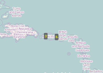
The ClusterState value is ExpandedToPolygon.

The ClusterState value is Expanded.
