Customized Fields
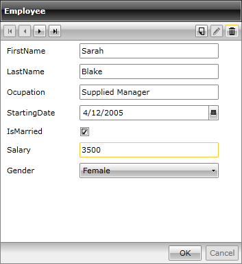
RadDataForm auto-generates its fields by default based on the properties of the source objects. They are stacked vertically in a standard form layout and depend on the type of each property.
Figure 1: RadDataForm with autogenerated fields
However, sometimes you may decide on customizing or totally changing them. In addition to displaying auto-generated fields, RadDataForm allows custom placement of the fields. Consequently, it may be designed to look like:
Figure 2: RadDataForm with customized fields
The key properties here are:
ReadOnlyTemplate
NewItemTemplate
EditTemplate
All of them are of type DataTemplate and there is no limitation on the types of controls you may place inside. Their DataContext will be the current item of the RadDataForm.
Custom-defined fields may coexist with the auto-generated ones or the auto-generated may be canceled.
Once you set the AutoGenerateFields property of the RadDataForm to False, the implicit generation of the fields will be turned off:
Example 1: Disabling the autogeneration of fields
this.DataForm1.AutoGenerateFields = false;
Me.DataForm1.AutoGenerateFields = False
Example 1: Disabling the autogeneration of fields
<telerik:RadDataForm x:Name="DataForm1" AutoGenerateFields="False" />
The three data templates - ReadOnlyTemplate, NewItemTemplate and EditTemplate - correspond to the relevant modes of RadDataForm. So, when the form is in read-only mode, the ReadOnlyTemplate is displayed, when in edit-mode - the EditTemplate and when a new item is added - the NewItemTemplate.
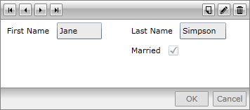
Lets say you have defined the following DataTemplate:
Example 2: Definition of a DataTemplate
<Grid.Resources>
    <DataTemplate x:Key="MyTemplate">
        <Grid>
            <Grid.ColumnDefinitions>
                <ColumnDefinition/>
                <ColumnDefinition/>
            </Grid.ColumnDefinitions>
            <Grid.RowDefinitions>
                <RowDefinition/>
                <RowDefinition/>
            </Grid.RowDefinitions>
            <telerik:DataFormDataField Label="First Name" DataMemberBinding="{Binding FirstName, Mode=TwoWay}" />
            <telerik:DataFormDataField Grid.Column="1" Label="Last Name" DataMemberBinding="{Binding LastName, Mode=TwoWay}" />
            <telerik:DataFormCheckBoxField Grid.Column="1" Grid.Row="1" Label="Married" DataMemberBinding="{Binding IsMarried, Mode=TwoWay}" />
        </Grid>
    </DataTemplate>
</Grid.Resources>
Then you can assign the ReadOnlyTemplate like so:
Example 3: Assigning a ReadOnlyTemplate
<telerik:RadDataForm AutoGenerateFields="False"
                ReadOnlyTemplate="{StaticResource MyTemplate}">
</telerik:RadDataForm>
Figure 3 shows the result:
Figure 3: RadDataForm with custom ReadOnlyTemplate
Similarly you can assign the EditTemplate:
Example 3: Assigning an EditTemplate
<telerik:RadDataForm AutoGenerateFields="False"
                ReadOnlyTemplate="{StaticResource MyTemplate}">
</telerik:RadDataForm>
The result can bee seen in Figure 4:
Figure 4: RadDataForm with custom EditTemplate
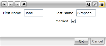
For each different state, you will need to define another template. It could be with the same content or it could be with a different one.
You will need to define separate templates for the read-only and edit modes.
On the other hand, if you make your mind on displaying quite different controls instead of the standard ones, you may place them in the data templates as well. For example, for editing number values, you may use the RadNumericUpDown control:
Example 4: Using a RadNumericUpDown for editing number values
<Grid>
    <Grid.Resources>
        <DataTemplate x:Key="MyTemplate">
            <StackPanel Orientation="Horizontal" >
                <TextBlock Text="Age" Width="20" Height="20" Foreground="Blue" Margin="0,0,10,0" />
                <telerik:RadNumericUpDown Value="{Binding Age, Mode=TwoWay}" />
            </StackPanel>
        </DataTemplate>
    </Grid.Resources>
    <telerik:RadDataForm AutoGenerateFields="False"
                    EditTemplate="{StaticResource MyTemplate}">
    </telerik:RadDataForm>
</Grid>
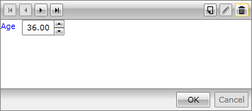
The result is displayed in Figure 5:
Figure 5: RadNumericUpDown as EditTemplate
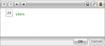
Furthermore, you may customize the data fields as well. For example, a regular DataFormDataField may be defined in a custom template and the default content may be replaced:
Example 5: Replacing the default field content
<Grid Background="White">
    <Grid.Resources>
        <DataTemplate x:Key="MyTemplate">
            <StackPanel Orientation="Horizontal" >
                <telerik:DataFormDataField>
                    <telerik:DataFormDataField.ContentTemplate>
                        <DataTemplate>
                            <StackPanel Orientation="Horizontal">
                                <TextBox Text="{Binding Age,Mode=TwoWay}" Margin="0,0,10,0" />
                                <TextBlock Text="years" Foreground="Green"  VerticalAlignment="Bottom" />
                            </StackPanel>
                        </DataTemplate>
                    </telerik:DataFormDataField.ContentTemplate>
                </telerik:DataFormDataField>
            </StackPanel>
        </DataTemplate>
    </Grid.Resources>
    <telerik:RadDataForm AutoGenerateFields="False"
                   EditTemplate="{StaticResource MyTemplate}">
    </telerik:RadDataForm>
</Grid>
Figure 6: Replacing the default field content