Blazor Switch Overview
The Blazor Switch component allows the user to toggle between checked and unchecked states.
The Switch component is part of Telerik UI for Blazor, a
professional grade UI library with 110+ native components for building modern and feature-rich applications. To try it out sign up for a free 30-day trial.
Creating Blazor Switch
- Use the
<TelerikSwitch>tag - Provide a
Value(one-way binding) or@bind-Value(two-way binding)
Basic setup of the Telerik Switch using two-way data binding
@* Basic setup of the Telerik Switch Component *@

<label>
    <TelerikSwitch @bind-Value="@isSelected" />
    @( isSelected ? "Selected" : "Not selected" )
</label>

@code {
    private bool isSelected { get; set; }
}
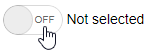
The result from the code snippet above
Labels
The Switch has dedicated On and Off labels serving as text representation of the component value. Read more about the Switch labels....
Events
The Blazor Switch generates events that you can handle and further customize its behavior. Read more about the Switch events....
Validation
You can ensure that the component value is acceptable by using the built-in validation. Read more about input validation....
Switch Parameters
The following table lists the Switch parameters. Also check the Switch API Reference for a full list of all properties, methods and events.
| Attribute | Type and Default Value | Description |
|---|---|---|
Enabled |
bool |
Whether the component is enabled. |
Id |
string |
Renders as the id attribute on the wrapping <span> element of the component. |
TabIndex |
int |
The tabindex attribute rendered on the Switch. |
Value |
bool or bool?
|
The value of the Switch. Supports two-way binding. |
OnLabel |
string |
The label of the component when the Value is true. |
OffLabel |
string |
The label of the component when the Value is false. |
Styling and Appearance
The following parameters enable you to customize the appearance of the Blazor Switch:
| Attribute | Type and Default Value | Description |
|---|---|---|
Class |
string |
The CSS class that will be rendered on the main wrapping element of the Switch. Use it to customize the Switch background color and other styles |
Width |
string |
The width of the component. You can set the Width parameter to any of the supported units. |
To learn more about the appearance, anatomy, and accessibility of the Switch, visit the Progress Design System documentation—an information portal offering rich component usage guidelines, descriptions of the available style variables, and globalization support details.
Switch Reference and Methods
The Switch is a generic component and its type comes from the model field it is bound to - it is either bool or bool? (a null value is treated as false). Add a reference to the component instance to use the Switch methods.
| Method | Description |
|---|---|
FocusAsync |
programmatically focuses the Switch. |
@* Use the Switch reference to programmatically focus the component *@

<TelerikButton OnClick="@FocusSwitch">Focus Switch</TelerikButton>

<TelerikSwitch @bind-Value="@toggleSwitch" @ref="@SwitchRef" />

@code {
    bool toggleSwitch { get; set; } // the type of this field determines the type of the reference
    TelerikSwitch<bool> SwitchRef { get; set; }

    void FocusSwitch()
    {
        SwitchRef.FocusAsync();
    }
}