Blazor PanelBar Overview
The Blazor PanelBar component displays data (flat or hierarchical) in an accordion type structure. In addition to built-in navigation capabilities, you can navigate through the items and their children, define templates, render text and icons/images, and respond to events.
The PanelBar component is part of Telerik UI for Blazor, a
professional grade UI library with 110+ native components for building modern and feature-rich applications. To try it out sign up for a free 30-day trial.
Creating Blazor PanelBar
- Add the
TelerikPanelBartag - Populate the
Dataproperty with the collection of items that you want to appear in the PanelBar. The component will automatically recognize property names likeId,ParentId,Textand a few others. Otherwise, use bindings to configure custom property names.
Basic PanelBar with hierarchical data binding
@* Provide a flat collection of models to the PanelBar *@

<TelerikPanelBar Data="@Items">
</TelerikPanelBar>


@code {
    public List<PanelBarItem> Items { get; set; }

    public class PanelBarItem
    {
        public string Text { get; set; }
        public bool Disabled { get; set; }
        public string Url { get; set; }
        public List<PanelBarItem> Items { get; set; }
    }

    protected override void OnInitialized()
    {
        Items = GenerateData();

        base.OnInitialized();
    }

    private List<PanelBarItem> GenerateData()
    {
        List<PanelBarItem> collection = new List<PanelBarItem>()
        {
            new PanelBarItem()
            {
                Text = "Item 1",
                Items = new List<PanelBarItem>()
                {
                    new PanelBarItem()
                    {
                        Text = "Item 1.1"
                    },
                    new PanelBarItem()
                    {
                        Text = "Item 1.2",
                        Disabled = true,
                        Items = new List<PanelBarItem>()
                        {
                            new PanelBarItem()
                            {
                                Text = "Item 1.2.1"
                            },
                            new PanelBarItem()
                            {
                                Text = "Item 1.2.2"
                            }
                        }
                    }
                }
            },
            new PanelBarItem()
            {
                Text = "Item 2",
                Items = new List<PanelBarItem>()
                {
                    new PanelBarItem()
                    {
                        Text = "Item 2.1",
                        Items = new List<PanelBarItem>()
                        {
                            new PanelBarItem()
                            {
                                Text = "Item 2.1.1"
                            }
                        }
                    },
                    new PanelBarItem()
                    {
                        Text = "Item 2.2",
                        Url = "https://google.com"
                    }
                }
            },
            new PanelBarItem()
            {
                Text = "Item 3"
            }
        };

        return collection;
    }
}
Data Binding
To show any items, the Blazor PanelBar requires a data source that you can provide through the Data property. The PanelBar allows you to display the items both as flat data and hierarchically. Read more about the Blazor PanelBar data binding...
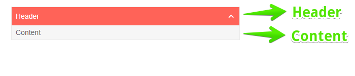
Elements of a PanelBar Item
Each item in the PanelBar consists of a Header and Content. The image below illustrates the concept.
The Header contains the Text of the corresponding data item (model). The Content represents the items in the hierarchy that do not have children.
Templates
The PanelBar allows customizing of its item elements. Use Header Template and Content Template to override the default rendering. A ContentTemplate displays like a child item. It is rendered only for the items, which have no children.
Navigation
The PanelBar can be used to navigate between different pages in the application. Read more about the Blazor PanelBar navigation...
Icons
To illustrate the purpose of each item, the Blazor PanelBar allows you to add images, icon classes, or font icons. Read more about the Blazor PanelBar icons...
Events
The Blazor PanelBar generates events that you can handle to respond to the user action. Read more about the Blazor PanelBar events...
PanelBar Parameters
The following table lists PanelBar parameters, which are not related to other features on this page. Check the PanelBar API Reference for a full list of properties, methods and events.
| Parameter | Type and Default Value | Description |
|---|---|---|
Class |
string |
The CSS class that will be rendered on the main wrapping element of the component. |
ExpandedItems |
IEnumerable<Object> |
A collection of the expanded PanelBar items. Supports two-way binding. Read more in the ExpandedItems article. |
ExpandMode |
PanelBarExpandMode enum ( PanelBarExpandMode.Multiple) |
Whether the PanelBar will allow single or multiple items to be expanded at a time. Read more in the ExpandMode section. |
PanelBar Reference and Methods
To execute PanelBar methods, obtain reference to the component instance via @ref.
The PanelBar is a generic component. Its type depends on the type of its model and the type of its Value. In case you cannot provide either the Value or Data initially, you need to set the corresponding types to the TItem and TValue parameters.
The table below lists the PanelBar methods. Also consult the PanelBar API.
| Method | Description |
|---|---|
Rebind |
Refreshes the component data. |
<TelerikPanelBar @ref="@PanelBarRef" .../>

@code{
    private TelerikPanelBar PanelBarRef;
}