Scatter Chart
The Blazor Scatter chart shows data as points defined by their items' values. Its x-axis is also numerical and does not require categorical items, but numerical values.
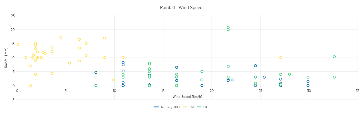
Scatter charts are useful for showing the relation between different sets of data, for example scientific (experimental) results.
This article assumes you are familiar with the chart basics and data binding.
To create a scatter chart:
- add a
ChartSeriesto theChartSeriesItemscollection - set its
Typeproperty toChartSeriesType.Scatter - provide a data collection to its
Dataproperty, which contains numerical data for the X and Y axes
A bubble chart that shows projected population change on a plot of life expectancy versus fertility rate
@* Scatter Series *@

<TelerikChart>
    <ChartTitle Text="Unrecoverable Errors Per Minute vs. Signal Level"></ChartTitle>

    <ChartSeriesItems>
        <ChartSeries Type="ChartSeriesType.Scatter"
                     Data="@Series1Data"
                     Name="APSK modulation"
                     XField="@nameof(ModelData.Strength)"
                     YField="@nameof(ModelData.Errors)">
        </ChartSeries>

        <ChartSeries Type="ChartSeriesType.Scatter"
                     Data="@Series2Data"
                     Name="QAM modulation"
                     XField="@nameof(ModelData.Strength)"
                     YField="@nameof(ModelData.Errors)">
        </ChartSeries>
    </ChartSeriesItems>

    <ChartXAxes>
        <ChartXAxis Max="-30" AxisCrossingValue="@(new object[] { -100 })">
            <ChartXAxisTitle Text="Signal Strength, dBm"></ChartXAxisTitle>
        </ChartXAxis>
    </ChartXAxes>

    <ChartYAxes>
        <ChartYAxis>
            <ChartYAxisTitle Text="Error count"></ChartYAxisTitle>
        </ChartYAxis>
    </ChartYAxes>
</TelerikChart>

@code {
    public class ModelData
    {
        public double Strength { get; set; }
        public double Errors { get; set; }
    }

    public List<ModelData> Series1Data = new List<ModelData>()
    {
       new ModelData { Strength = -82, Errors = 15  },
       new ModelData { Strength = -79, Errors = 13  },
       new ModelData { Strength = -77, Errors = 10  },
       new ModelData { Strength = -74, Errors = 7  },
       new ModelData { Strength = -70, Errors = 3  },
       new ModelData { Strength = -65, Errors = 1  }
    };

    public List<ModelData> Series2Data = new List<ModelData>()
    {
       new ModelData { Strength = -80, Errors = 25  },
       new ModelData { Strength = -76, Errors = 22  },
       new ModelData { Strength = -73, Errors = 17  },
       new ModelData { Strength = -70, Errors = 15  },
       new ModelData { Strength = -65, Errors = 12  },
       new ModelData { Strength = -61, Errors = 10  },
       new ModelData { Strength = -55, Errors = 7  },
       new ModelData { Strength = -50, Errors = 3  }
    };
}
Scatter Chart Specific Appearance Settings
Markers
Each data item is denoted by a marker. You can control its settings through the child ChartSeriesMarkers tag of the series.
You can hide the markers by setting their Visible property to false.
The Size property is the size of the marker in pixels.
The Type property is a member of the Telerik.Blazor.ChartSeriesMarkersType enum:
-
Circle- the default CrossSquareTriangle
The Rotation property is the degrees with which the marker is rotated from its default orientation.
Color
The color of the line and markers is controlled through the Color property that can take any valid CSS color (for example, #abcdef, #f00, or blue).
You can control the color of the markers by using the Background property of the nested ChartSeriesMarkers tag.
ColorField
You can pass a ColorField to the chart as a part of the model, and the data points (markers) will use that color instead of the Color of the series or the Background of the markers settings.
Customize Chart Elements - Nested Tags Settings
When configuring nested properties and child elements in your chart, the inner tags will contain their parent tag name and add specifics to its end. In general the structure of such nested tags will be <Chart*Category**Specifics*> where the Category can be one of the following:
- CategoryAxis
- ChartArea
- Legend
- PlotArea
- SeriesItems
- Title
- Tooltip
- ValueAxis
- XAxes
- YAxes
- and others
To customize the chart, look for nested tags and their properties - the inner tags will contain their parent tag name and add specifics to its end. For example, the
ChartSeriestag has aChartSeriesLabelstag that exposes configuration options and more child tags.
For example, for numerical charts you can rotate the Labels for ChartXAxes or ChartYAxes depending on your application design needs and layout. This can be done through the
ChartXAxes > ChartXAxis > ChartXAxisLabelsRotation tag
where you can set the Angle property to the desired value in degrees (they might be negative or positive numbers). By using similar approach you can take control over ChartXAxisLabelsBorder (add borders), ChartXAxisLabelsMargin (add margin for top, bottom, left and right) and others.
This approach is not limited only to the Labels - it can be used with to all tags that are applicable for the chart type, for example the Chart Title ChartTitle > ChartTitleMargin.
See the code snippet above to observe setting the title text for the
ChartXAxisand theChartYAxes.