Area Chart
The Blazor Area chart shows the data as continuous lines that pass through points defined by their items' values. The portion of the graph beneath the lines is filled with a particular color for every series. Colors in an Area chart can be useful for emphasizing changes in values from several sets of similar data. A colored background will clearly visualize the differences.
An Area chart emphasizes the volume of money, data or any other unit that the given series has encompassed. When backgrounds are semi-transparent, it lets the user clearly see where different sets of data overlap.
The Area Chart is similar to the Range Area Chart, which allows the area to raise above the horizontal axis.
This article assumes you are familiar with the chart basics and data binding.
To create an area chart:
- add a
ChartSeriesto theChartSeriesItemscollection - set its
Typeproperty toChartSeriesType.Area - provide a data collection to its
Dataproperty - optionally, provide data for the x-axis
Categories
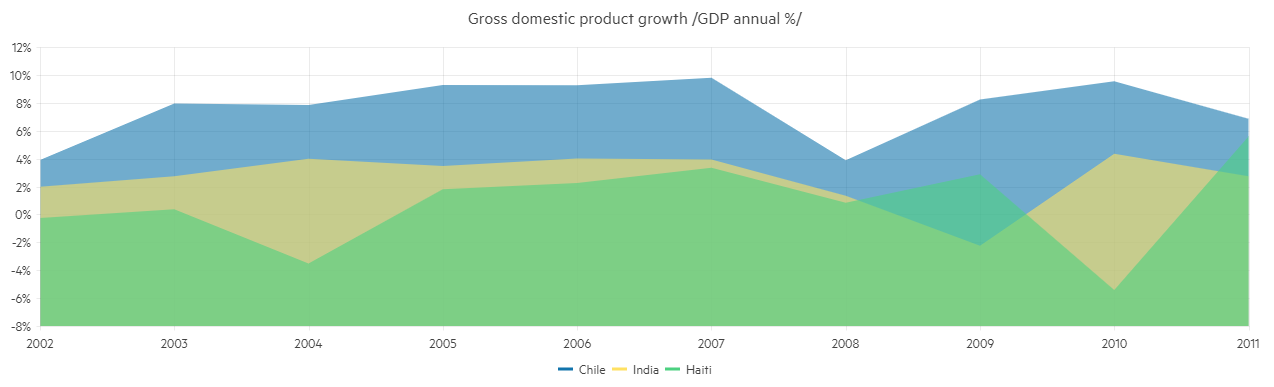
An area chart that shows product revenues
@*Area series*@

<TelerikChart>
    <ChartSeriesItems>
        <ChartSeries Type="ChartSeriesType.Area" Name="Product 1" Data="@series1Data">
        </ChartSeries>
        <ChartSeries Type="ChartSeriesType.Area" Name="Product 2" Data="@series2Data">
        </ChartSeries>
    </ChartSeriesItems>

    <ChartCategoryAxes>
        <ChartCategoryAxis Categories="@xAxisItems"></ChartCategoryAxis>
    </ChartCategoryAxes>

    <ChartTitle Text="Quarterly revenue per product"></ChartTitle>

    <ChartLegend Position="Telerik.Blazor.ChartLegendPosition.Right">
    </ChartLegend>
</TelerikChart>

@code {
    public List<object> series1Data = new List<object>() { 10, 2, 7, 5 };
    public List<object> series2Data = new List<object>() { 5, 12, 8, 2 };
    public string[] xAxisItems = new string[] { "Q1", "Q2", "Q3", "Q4" };
}
Area Chart Specific Appearance Settings
Color
The color of a series is controlled through the Color property that can take any valid CSS color (for example, #abcdef, #f00, or blue). The color control the fill color of the area.
You can control the color of the line itself separately by using the Color property of the nested TelerikChartSeriesLine tag.
Opacity
You can control how transparent the series fill is through the Opacity property. 0 means a completely transparent series, and 1 means a completely opaque (non-transparent) fill. You can use decimal values to set the desired transparency (for example, Opacity="0.3").
Missing Values
If some values are missing from the series data (they are null), you can have the chart work around this by setting the MissingValues property of the series to the desired behavior (member of the Telerik.Blazor.ChartSeriesMissingValues enum):
-
Zero- the default behavior. The line goes to the 0 value mark. -
Interpolate- the line will go through the interpolated value of the missing data points and connect to the next data point with a value. -
Gap- behaves the same way asZerobecause a line chart cannot have a gap in its filled area.
Line Style
You can render the lines between the points with different styles. The supported styles can be set via the Style property of the child ChartSeriesLine tag - it takes a member of Telerik.Blazor.ChartSeriesLineStyle enum:
-
Normal—This is the default style. It produces a straight line between data points. -
Step—The style renders the connection between data points through vertical and horizontal lines. It is suitable for indicating that the value is constant between the changes. -
Smooth—This style causes the Area Chart to display a fitted curve through data points. It is suitable when the data requires to be displayed with a curve, or when you wish to connect the points with smooth instead of straight lines.
Customize Chart Elements - Nested Tags Settings
When configuring nested properties and child elements in your chart, the inner tags will contain their parent tag name and add specifics to its end. In general the structure of such nested tags will be <Chart*Category**Specifics*> where the Category can be one of the following:
- CategoryAxis
- ChartArea
- Legend
- PlotArea
- SeriesItems
- Title
- Tooltip
- ValueAxis
- XAxes
- YAxes
- and others
To customize the chart, look for nested tags and their properties - the inner tags will contain their parent tag name and add specifics to its end. For example, the
ChartSeriestag has aChartSeriesLabelstag that exposes configuration options and more child tags.
An example of this is the rotation the Labels of a categorical chart. You can use the
ChartCategoryAxes > ChartCategoryAxis > ChartCategoryAxisLabels > ChartCategoryAxisLabelsRotation tag
and set the Angle property to the desired value in degrees (they might be negative or positive numbers). By using similar approach you can take control over ChartCategoryAxisLabelsMargin (add margin for top, bottom, left and right), ChartCategoryAxisLabelsPadding (add padding for top, bottom, left and right) and others.
This approach is not limited only to the Labels - it can be used with all tags that are applicable for the chart type, for example the Chart Title ChartTitle > ChartTitleMargin.
Change the rendering Step, Color and Font of the Category Axis Labels
@* Change the rendering Step, Color and Font of the Category Axis Labels *@

<TelerikChart>
    <ChartSeriesItems>
        <ChartSeries Type="ChartSeriesType.Area" Name="Product 1" Data="@series1Data">
        </ChartSeries>
        <ChartSeries Type="ChartSeriesType.Area" Name="Product 2" Data="@series2Data">
        </ChartSeries>
    </ChartSeriesItems>

    <ChartCategoryAxes>
        <ChartCategoryAxis Categories="@xAxisItems">
            <ChartCategoryAxisLabels Step="2" Color="#008000" Font="bold 12px 'Helvetica'"></ChartCategoryAxisLabels>
        </ChartCategoryAxis>
    </ChartCategoryAxes>

    <ChartTitle Text="Quarterly revenue per product"></ChartTitle>

    <ChartLegend Position="Telerik.Blazor.ChartLegendPosition.Right">
    </ChartLegend>
</TelerikChart>

@code {
    public List<object> series1Data = new List<object>() { 10, 2, 7, 5 };
    public List<object> series2Data = new List<object>() { 5, 12, 8, 2 };
    public string[] xAxisItems = new string[] { "Q1", "Q2", "Q3", "Q4" };
}