Getting Started with Silverlight Sparklines
This tutorial will walk you through the creation of a sample application that contains RadLinearSparkline. The other controls from the RadSparkline suite are set up using the same principle.
Assembly References
In order to use the RadSparkline control, you will need to add references to the following assemblies:
- Telerik.Windows.Controls
- Telerik.Windows.Controls.DataVisualization
- Telerik.Windows.Data
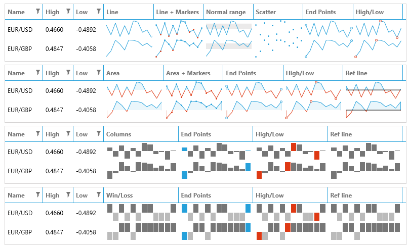
Sparkline Types
The sparkline bundle contains few controls which can be used for different data visualization. The supported visualizations are line, scatter points, area, column and win/loss bars. Read more about this in the Sparkline Types article.
Defining Sparkline
To show the sparkline control you can define a custom model for the data points as shown in Example 1. Then create a collection with the model and set it to the ItemsSource of the sparkline control (see Example 3).
Example 1: Create the model
public class PlotInfo
{
    public double YValue { get; set; }
    public double XValue { get; set; }
}
Example 2: Define the sparkline
<telerik:RadLinearSparkline x:Name="sparkline"
                            YValuePath="YValue"
                            XValuePath="XValue" />
Example 3: Populate and set the ItemsSource
var randomNumberGenerator = new Random();
var source = new ObservableCollection<PlotInfo>();
for (int i = 0; i < 30; i++)
{
    source.Add(new PlotInfo() { XValue = i, YValue = randomNumberGenerator.Next(100, 300) });
}
this.sparkline.ItemsSource = source;
Figure 1: RadLinearSparkline

Showing Axis
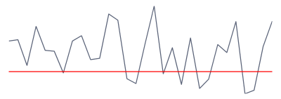
You can show the axis of the sparkline control by setting its ShowAxis property to True. The axis is horizontal. Read more about customizing the axis range and appearance in the Axis article.
By default the axis will be shown on value 0. This means that if the axis' range doesn't contain the 0 value, the axis won't be displayed. In this case you can set the AxisOriginValue property of the sparkline control manually.
Figure 2: Sparkline axis
Setting a Theme
The controls from our suite support different themes. You can see how to apply a theme different than the default one in the Setting a Theme help article.
Changing the theme using implicit styles will affect all controls that have styles defined in the merged resource dictionaries. This is applicable only for the controls in the scope in which the resources are merged.
To change the theme, you can follow the steps below:
Choose between the themes and add reference to the corresponding theme assembly (ex: Telerik.Windows.Themes.Windows8.dll). You can see the different themes applied in the Theming examples from our Silverlight Controls Examples application.
-
Merge the ResourceDictionaries with the namespace required for the controls that you are using from the theme assembly. For the RadSparkLine, you will need to merge the following resources:
- Telerik.Windows.Controls
- Telerik.Windows.Controls.DataVisualization
Example 3 demonstrates how to merge the ResourceDictionaries so that they are applied globally for the entire application.
Example 3: Merge the ResourceDictionaries
<Application.Resources>
    <ResourceDictionary>
        <ResourceDictionary.MergedDictionaries>
            <ResourceDictionary Source="/Telerik.Windows.Themes.Windows8;component/Themes/System.Windows.xaml"/>
            <ResourceDictionary Source="/Telerik.Windows.Themes.Windows8;component/Themes/Telerik.Windows.Controls.xaml"/>
            <ResourceDictionary Source="/Telerik.Windows.Themes.Windows8;component/Themes/Telerik.Windows.DataVisualization.xaml"/>
        </ResourceDictionary.MergedDictionaries>
    </ResourceDictionary>
</Application.Resources>
Alternatively, you can use the theme of the control via the StyleManager.
Figure 1 shows a RadSparkLine with the Windows8 theme applied.
Figure 1: RadSparkLine with the Windows8 theme