Ribbon Group
Telerik RadRibbonView provides a simple and consistent way for building interfaces similar to the ribbon control used in Microsoft Office. The RadRibbonView consists of various elements, one of which is the Ribbon Group. This topic discusses concepts fundamental to the Ribbon Group at first and then goes into the usage of the RadRibbonGroup class and its features.
Before proceeding with this tutorial, it is recommended to get familiar with the Visual Structure of the RadRibbonView control.
Ribbon Group - Fundamentals
The RadRibbonView helps end-users to quickly find the tools and options they need in order to complete a task. Tools and options are organized in logical groups that are collected together under specific tabs. Or in other words - the Ribbon Group lets you categorize the commands to be displayed for the end-users.
Ribbon Groups are defined into the Ribbon Tab. A single Ribbon Tab usually contains many Ribbon Groups to layout its content.
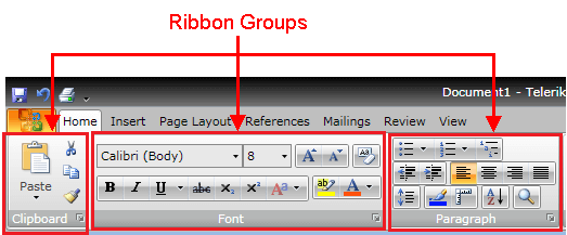
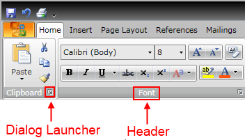
Each Ribbon Group may have a Header and a Dialog Launcher. The Dialog Launcher appears in the bottom right corner of the group.
The class that represents the ribbon group is Telerik.Windows.Controls.RadRibbonGroup.
The RadRibbonGroup is a HeaderedItemsControl and is the main part of the layout mechanism of the RadRibbonView.
Layout Resizing
One of the most important feature of the RadRibbonGroup is the dynamic resizing. It refers to the ability of the RadRibbonView to optimize its layout depending on how much space is available.
Each RadRibbonGroup in a RadRibbonTab may have four possible sizes (Variants):
-
Large - this is the default size (Variant).
The RadRibbonGroups assumes their DefaultVariant (which by default is Large) state whenever they can.
Medium
Small
Collapsed

For more information about the layout resizing mechanism, please refer to the Resizing topic. Check out the rest of the topic which is entirely dedicated to the RadRibbonGroup.
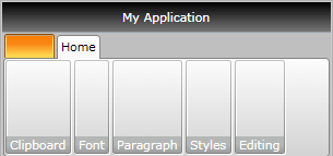
Adding Ribbon Groups to a RadRibbonView Control
As it is described in the Fundamentals section, various user commands are organized in logical groups that are collected together under specific RadRibbonTabs. So the first step before declaring the RadRibbonGroups is to add RadRibbonTabs to your ribbon control. For more information about how to add ribbon tabs, take a look at the Ribbon Tab topic.
Adding RadRibbonGroups is done through the RadRibbonTab's Items property. The next example shows how to add several RadRibbonGroups and how to set their Header property.
<telerik:RadRibbonView x:Name="radRibbonView">
    <telerik:RadRibbonTab Header="Home">
        <telerik:RadRibbonGroup Header="Clipboard">
        </telerik:RadRibbonGroup>
        <telerik:RadRibbonGroup Header="Font">
        </telerik:RadRibbonGroup>
        <telerik:RadRibbonGroup Header="Paragraph">
        </telerik:RadRibbonGroup>
        <telerik:RadRibbonGroup Header="Styles">
        </telerik:RadRibbonGroup>
        <telerik:RadRibbonGroup Header="Editing">
        </telerik:RadRibbonGroup>
    </telerik:RadRibbonTab>
</telerik:RadRibbonView>
Enabling the Dialog Launcher
Any group can have a dialog launcher button which appears in the bottom right corner of the group. By default the dialog launcher is not visible. In order to enable it you should set the RadRibbonGroup's DialogLauncherVisibility property to Visibility.Visible.
<telerik:RadRibbonView x:Name="radRibbonView">
    <telerik:RadRibbonTab Header="Home">
        <telerik:RadRibbonGroup Header="Clipboard" DialogLauncherVisibility="Visible">
        </telerik:RadRibbonGroup>
        <telerik:RadRibbonGroup Header="Font" DialogLauncherVisibility="Visible">
        </telerik:RadRibbonGroup>
        <telerik:RadRibbonGroup Header="Paragraph" DialogLauncherVisibility="Visible">
        </telerik:RadRibbonGroup>
        <telerik:RadRibbonGroup Header="Styles" DialogLauncherVisibility="Visible">
        </telerik:RadRibbonGroup>
        <telerik:RadRibbonGroup Header="Editing" DialogLauncherVisibility="Visible">
        </telerik:RadRibbonGroup>
    </telerik:RadRibbonTab>
</telerik:RadRibbonView>
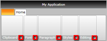
The default value of the RadRibbonGroup's DialogLauncherVisibility property is Visibility.Collapsed.
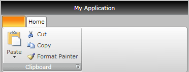
Adding Content to the Ribbon Groups
The RadRibbonGroup is a HeaderedItemsControl. Which means that the RadRibbonGroup contains a heading (or title) and multiple items. You already learned how to set the Header property. Now it's time to add some content to the RadRibbonGroup. You should do this using the RadRibbonGroup's Items property. The next example shows you how to build the "Clipboard" RadRibbonGroup.
<telerik:RadRibbonView x:Name="radRibbonView">
    <telerik:RadRibbonTab Header="Home">
        <telerik:RadRibbonGroup DialogLauncherVisibility="Visible" Header="Clipboard">
            <telerik:RadRibbonSplitButton LargeImage="Images/IconMSOffice/32/paste.png"
                                            Size="Large"
                                            SmallImage="Images/IconMSOffice/16/paste.png"
                                            telerik:ScreenTip.Description="Paste the contents of the Clipboard."
                                            telerik:ScreenTip.Title="Paste"
                                            Text="Paste">
                <telerik:RadRibbonSplitButton.DropDownContent>
                    <telerik:RadContextMenu BorderThickness="0">
                        <telerik:RadMenuItem Header="Paste">
                            <telerik:RadMenuItem.Icon>
                                <Image Source="Images/IconMSOffice/16/paste.png" />
                            </telerik:RadMenuItem.Icon>
                        </telerik:RadMenuItem>
                        <telerik:RadMenuItem Header="Paste Special...">
                            <telerik:RadMenuItem.Icon>
                                <Image Source="Images/IconMSOffice/16/pastespecial.png" />
                            </telerik:RadMenuItem.Icon>
                        </telerik:RadMenuItem>
                        <telerik:RadMenuItem Header="Paste as Hyperlink" IsEnabled="False">
                            <telerik:RadMenuItem.Icon>
                                <Image Source="Images/IconMSOffice/16/pastehyperlink.png" />
                            </telerik:RadMenuItem.Icon>
                        </telerik:RadMenuItem>
                    </telerik:RadContextMenu>
                </telerik:RadRibbonSplitButton.DropDownContent>
            </telerik:RadRibbonSplitButton>
            <StackPanel>
                <telerik:RadRibbonButton CollapseToSmall="WhenGroupIsMedium"
                                            SmallImage="Images/IconMSOffice/16/cut.png"
                                            telerik:ScreenTip.Description="Cut the selection from the document and put it on the Clipboard."
                                            telerik:ScreenTip.Title="Cut"
                                            Text="Cut" />
                <telerik:RadRibbonButton CollapseToSmall="WhenGroupIsMedium"
                                            SmallImage="Images/IconMSOffice/16/copy.png"
                                            telerik:ScreenTip.Description="Copy the selection and put it on the Clipboard."
                                            telerik:ScreenTip.Title="Copy"
                                            Text="Copy" />
                <telerik:RadRibbonButton CollapseToSmall="WhenGroupIsMedium"
                                            SmallImage="Images/IconMSOffice/16/formatpainter.png"
                                            telerik:ScreenTip.Description="Copy formatting from one place and apply it to another.Double-click this button to apply the same formatting to multiple places in the document."
                                            telerik:ScreenTip.Title="Format Painter"
                                            Text="Format Painter" />
            </StackPanel>
        </telerik:RadRibbonGroup>
    </telerik:RadRibbonTab>
</telerik:RadRibbonView>
Setting Screen Tip
The Telerik RadRibbonView's API allows you to associate screen tips with each one of the RibbonGroup. For more information, take a look at the Screen Tips topic.
Specifying Group Variants
Each RadRibbonGroup in a RadRibbonTab may have four possible sizes (Variants): Large, Medium, Small and Collapsed. Collapsed groups always look the same - only the Header and an image are shown.
The resizing of the elements is defined per RadRibbonTab. The resizing behavior of the tab is defined by setting the Variant collection to each of its RadRibbonGroups and is based on priorities. By default, if no priorities are set to the Variants of the RibbonGroups, they will be resized from right to left. In order to customize the order by which the groups will be resized, the developer needs to specify a Priority for each of the RibbonGroup Variants.
For more information and explanations about the Variants and Priorities, take a look at the Resizing topic.
Setting Collapsed Icon
When a RibbonGroup is in Collapsed state only Header and Icon (image) are shown. To set the image source for the collapsed icon you need to set the RadRibbonGroup's Icon property.
The collapsed state icon is displayed inside an Image element with Width/Height set to 16 and Stretch set to None. If your image is not displayed as intended, resize it to 16x16 or edit the ControlTemplate of the RadRibbonDropDownButton inside the RadRibbonGroup, which hosts the Image. The recommended DPI for the image files is 96dpi.
Events
Any group can have a dialog launcher button. When you want to handle the click over this button you should attach to the RadRibbonGroup's LaunchDialog event.
<telerik:RadRibbonGroup DialogLauncherVisibility="Visible" Header="Clipboard" LaunchDialog="RadRibbonGroup_LaunchDialog">
 ...
</telerik:RadRibbonGroup>
The LaunchDialog event handler receives two arguments:
The sender argument contains the RadRibbonGroup. This argument is of type object, but can be cast to the RadRibbonGroup type.
The second argument is a RadRoutedEventArgs object.
For a full list of the exposed by the RadRibbonView events, take a look at the Events - Overview topic.
The RadRibbonView is a complex control and the ribbon groups are only a small part of it. The RadRibbonView consists of various elements such as:
- Application Menu
- Backstage Menu
- Quick Access ToolBar
- Ribbon Tab
- Ribbon Gallery
- RibbonButtons Overview
- Ribbon ComboBox
- Screen Tips
Additional features that you may find interesting are: