Styling
The RadListView control exposes the following properties that can help you customize the appearance of its elements:
- ItemTemplate
- ItemTemplateSelector
- ItemStyle
- ItemStyleSelector
- GroupHeaderTemplate
- GroupHeaderTemplateSelector
- GroupHeaderStyle
- GroupHeaderStyleSelector
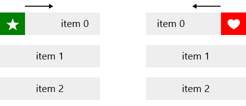
Item Actions Customization
This example will demonstrate how to to customize the RadListView items and action content.
<telerikDataControls:RadListView IsActionOnSwipeEnabled="True" x:Name="listView">
<telerikDataControls:RadListView.ItemStyle>
<Style TargetType="telerikListView:RadListViewItem">
<Setter Property="Margin" Value="0,5,0,5"/>
<Setter Property="Padding" Value="0"/>
<Setter Property="Background" Value="#EEEEEE"/>
</Style>
</telerikDataControls:RadListView.ItemStyle>
<telerikDataControls:RadListView.FirstActionContent>
<Grid Width="50" Margin="-5,0,-5,0">
<Rectangle Fill="Green"/>
<TextBlock Text="" Foreground="White" FontFamily="Segoe UI Symbol" VerticalAlignment="Center" FontSize="25" HorizontalAlignment="Center"/>
</Grid>
</telerikDataControls:RadListView.FirstActionContent>
<telerikDataControls:RadListView.SecondActionContent>
<Grid Width="50" Margin="-5,0,-5,0">
<Rectangle Fill="Red"/>
<TextBlock Text="" Foreground="White" FontFamily="Segoe UI Symbol" VerticalAlignment="Center" FontSize="25" HorizontalAlignment="Center"/>
</Grid>
</telerikDataControls:RadListView.SecondActionContent>
<telerikDataControls:RadListView.ItemTemplate>
<DataTemplate>
<TextBlock Text="{Binding}" VerticalAlignment="Center" HorizontalAlignment="Center"/>
</DataTemplate>
</telerikDataControls:RadListView.ItemTemplate>
</telerikDataControls:RadListView>
listView.ItemsSource = new List<string> { "item 0", "item 1", "item 2" };
Here is the result: