Custom Cell Styling
The RadCalendar control exposes public properties for styling the different types of cell.
If you need to style the cells by custom logic, not by cell type, or change the cell type, you can use special slots.
Properties for Cell Styling
Here are described all available calendar properties that affect the style of the cells:
- NormalCellStyle: Gets or sets the style of the normal cells.
- AnotherViewCellStyle: Gets or sets the style of the cells holding dates from the previous/next month.
- BlackoutCellStyle: Gets or sets the style of the cells that hold date/month/year/decade outside the [DisplayDateStart, DisplayDateEnd] range.
- SelectedCellStyle: Gets or sets the style of the currently selected cells.
- HighlightedCellStyle: Gets or sets the style of the cell holding the date today.
- CurrentCellStyle: Gets or sets the style of the currently focused cell.
- PointerOverCellStyle: Gets or sets the style of the cells in pointe over state.
- DayNameCellStyle: Gets or sets the style of the cells holding the days of the week in month view.
- WeekNumberCellStyle: Gets or sets the style of the cells holding the week numbers in month view.
- CellStyleSelector: Gets or sets cell style depending on custom logic. >The context that the CalendarCell receives is of type CalendarCellModel.
CalendarCellModel class properties
- Date: Gets the date represented by the calendar cell.
- IsBlackout: Gets a value indicating whether the calendar cell is selectable (i.e. enabled).
- IsHighlighted: Gets a value indicating whether the calendar cell is highlighted.
- IsSelected: Gets a value indicating whether the calendar cell is selected.
- IsFromAnotherView: Gets a value indicating whether this calendar cell represents a date that belongs to another view.
- IsPointerOver: Gets a value indicating whether the pointer is over this calender cell.
- IsCurrent: Gets a value indicating whether this calender cell is currently focused.
CalendarCellStyle class
All style properties of the calendar are of CalendarCellStyle type which has two properties:
- ContentStyle: this property expects style with TextBlock TargetType and affects the content of the calendar cell.
- DecorationStyle: this property expects style with Border TargetType and affects the basic cell decoration e.g. border, background.
Setting CellStyle Example
In this example we demonstrate how to define a custom cell style and apply it to specific cell types. First you have to define new CalendarCellStyle in your application resources as shown below:
<telerik:CalendarCellStyle x:Key="CustomCellStyle">
    <telerik:CalendarCellStyle.ContentStyle>
        <Style TargetType="TextBlock">
            <Setter Property="Margin" Value="7,0,4,4"/>
            <Setter Property="FontSize" Value="18" />
            <Setter Property="FontWeight" Value="Bold" />
            <Setter Property="Foreground" Value="RoyalBlue" />
            <Setter Property="TextAlignment" Value="Center" />
            <Setter Property="VerticalAlignment" Value="Center" />
        </Style>
    </telerik:CalendarCellStyle.ContentStyle>
    <telerik:CalendarCellStyle.DecorationStyle>
        <Style TargetType="Border">
            <Setter Property="Background" Value="PaleGreen" />
            <Setter Property="BorderBrush" Value="SkyBlue"/>
        </Style>
    </telerik:CalendarCellStyle.DecorationStyle>
</telerik:CalendarCellStyle>
Then you can use this style for the cells you want to customize, in the example below this is the selected cell.
<telerik:RadCalendar SelectedCellStyle="{StaticResource CustomCellStyle}" />
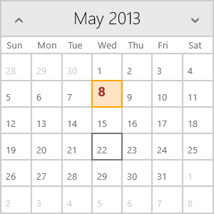
And this is the result: