TKSideDrawer for Xamarin.iOS: Customizations
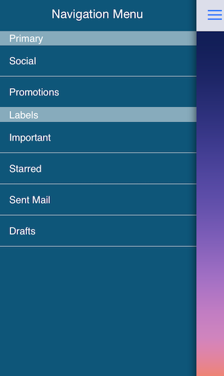
TKSideDrawer allows customizing almost every aspect of its visual appearance. This article demonstrates some of the customization techniques that can be used with it.
The most useful settings for changing the visual appearance of TKSideDrawer are grouped in its Style property of type TelerikUI.TKSideDrawerStyle.
Styling
Here are the SideDrawer styling options:
Blur
- BlurEffect(UIKit.UIBlurEffectStyle)
- BlurTintColor(UIKit.UIColor)
- BlurType(TelerikUI.TKSideDrawerBlurType)
Note that the default transition set to TKSideDrawer is SlideInOnTop with blur enabled. If you prefer a solid color instead, you should set the BlurType property to TKSideDrawerBlurType.None before setting the desired Fill:
Example
sideDrawer.Fill = new TKSolidFill (UIColor.Gray);
sideDrawer.Style.BlurType = TKSideDrawerBlurType.None;
Height
- FooterHeight(nfloat): Defines the height of the FooterView
- HeaderHeight(nfloat): Defines the height of the HeaderView
- ItemHeight(nfloat): Defienes the height of the item
- SectionHeaderHeight(nfloat): Defines the height of the header when it is selected.
Example
sideDrawer.Style.HeaderHeight = 44;
Shadow
-
ShadowMode(TelerikUI.TKSideDrawerShadowMode). Defins the mode of the shadow. There are three options:
None,HostViewandSideDrawer. - ShadowOffset(CGSize)
- ShadowOpacity(nfloat)
- ShadowRadius(nfloat)
Example
sideDrawer.Style.ShadowMode = TKSideDrawerShadowMode.Hostview;
sideDrawer.Style.ShadowOffset = new CGSize (-2f, -0.5f);
sideDrawer.Style.ShadowRadius = 5;
There are cases when you may need to update the styles of specific TKSideDrawer items like the text color. Or, you may need to show a separator. This can be done by adopting the TKSideDrawerDelegate protocol and implementing its sideDrawer:updateVisualsForItem:inSection: method.
public override void UpdateVisualsForItem (TKSideDrawer sideDrawer, NSIndexPath indexPath)
{
    TKSideDrawerItem item = sideDrawer.Sections[indexPath.Section].Items[indexPath.Item];
    item.Style.ContentInsets = new UIEdgeInsets (0, -5, 0, 0);
    item.Style.SeparatorColor = new TKSolidFill (UIColor.Clear);
}
If needed you can easily update the visual styles of the sections. This is done by implementing TKSideDrawerDelegate method UpdateVisualsForSection:
public override void UpdateVisualsForSection (TKSideDrawer sideDrawer, int sectionIndex)
{
    TKSideDrawerSection section = sideDrawer.Sections[sectionIndex];
    section.Style.ContentInsets = new UIEdgeInsets (0, -15, 0, 0);
}
Custom content
In some scenarios you may need to use custom views for TKSideDrawer header or footer. The TKSideDrawer properties headerView and footerView inherit from UIView allowing you to use the view that best suit your needs.
Setting the Content property of TKSideDrawer you can easily change the content of the side drawer. It also inherits from UIView. By default the content is TKSideDrawerTableView.
SideDrawer CustomContent example can be found in our Native Xamarin.iOS examples.