Customize the Control
RadSlideView has several properties which you can use to customize its appearance and behavior. This article lists them briefly.
Customizing the indicators
The indicators are the little ellipses displayed under the selected view used for switching between the views. RadSlideView provides various options for customzing the look of the indicators via the following properties:
ShowIndicators: This property sets the visibility of the indicators. You can hide them by setting it to False.
IndicatorText: Indicators are represents by a string symbol that could be changed through IndicatorText property;
IndicatorFontSize: Defines the indicator text font size of all indicators except the selected one;
SelectedIndicatorFontSize: Sets the indicator text font size of the selected indicator;
IndicatorFontFamily: Specified the indicator text FontFamily of the indicators except the selected one;
SelectedIndicatorFontFamily: Sets the indicator text FontFamily of the selected indicator;
IndicatorColor: This property sets the color of the indicators except the selected one.
SelectedIndicatorColor: This property sets the color of the selected indicator.
IndicatorsSpacing: This property sets the spacing between the indicators.
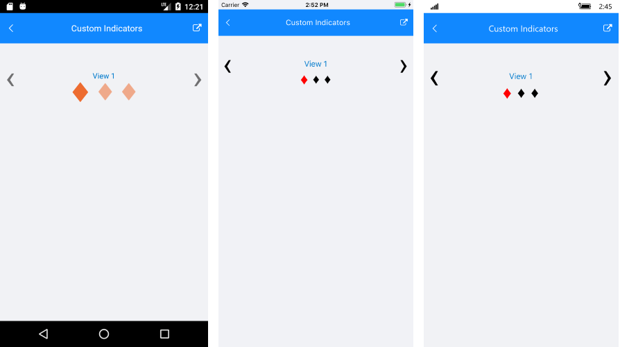
Here is a quick example on how to customize the indicators:
<telerikPrimitives:RadSlideView x:Name="slideView"
IndicatorText="♦"
SelectedIndicatorText="♦"
SelectedIndicatorFontSize="32"
SelectedIndicatorColor="Red">
<telerikPrimitives:RadSlideView.ItemsSource>
<x:Array Type="{x:Type ContentView}">
<ContentView>
<Grid HeightRequest="100">
<Label Text="View 1" />
</Grid>
</ContentView>
<ContentView>
<Label Text="View 2" />
</ContentView>
<ContentView >
<Label Text="View 3" />
</ContentView>
</x:Array>
</telerikPrimitives:RadSlideView.ItemsSource>
</telerikPrimitives:RadSlideView>
And the result:
Customizing the slide buttons
The slide buttons can be customized via the following properties:
ShowButtons: This property sets the buttons visibility. You can hide them by setting it to False.
SlideButtonsColor: This property sets the buttons color.
SlideButtonsSize: This property sets the buttons size.
Customizing the content alignment
You can set the alignment of the content of the SlideView item via the following properties:
HorizontalContentOptions: This property sets the horizonal alignment
VerticalContentOptions: This property sets the vertical alignment.
HorizontalContentOptions and VerticalContentOptions are respected only when there isn't ContentView or Template defined. In other cases, you would need to handle the content alignment inside the View/Template respectively.
Add page spacing
The control allows you to define a spacing between each slide using the PageSpacingProperty(int).
Disabling the animation
The control supports a built-in sliding animation which is enabled by default. To disable it you can set the control's IsAnimated property to False.
Disabling swiping
You can disable the swiping and allow the end user to change the view only with the slide buttons. To do this set the IsSwipingEnabled property to False.
Enabling infinity scrolling
By default when you reach to the last view, the 'next' slide button won't do anything. You can alter this and allow repeating of the views when you reach the last view, via the IsInfiniteScrollingEnabled property.
Setting orientation
You change the orientation of the slide animation via the Orientation property of RadSlideView.