Key Features
The purpose of this help article is to show you the key features of the RadPopup control.
Open / Close the popup
In order to show the RadPopup control you would need to set IsOpen property to True. By default the popup stays open until the IsOpen property is set to False or the user taps outside in case of a non-modal popup.
Setting Content
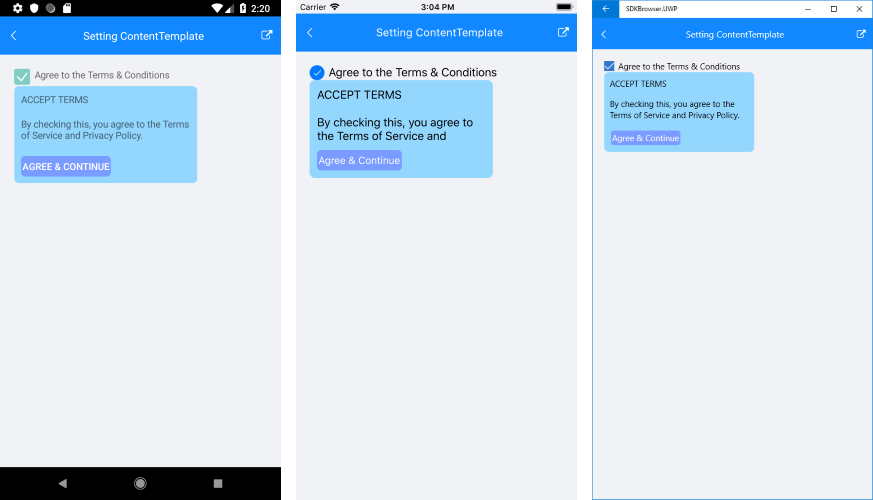
To host content inside RadPopup control you can either add it directly as a child element or use the popup’s ContentTemplate property.
The example below demonstrates how you could create a sample DataTemplate and set it as RadPopup ContentTemplate.
First, add the needed DataTemplate to the page Resources:
<ResourceDictionary>
<DataTemplate x:Key="PopupTemplate">
<telerikPrimitives:RadBorder CornerRadius="8"
BackgroundColor="#93D7FF"
WidthRequest="250"
Padding="10">
<Grid>
<Grid.RowDefinitions>
<RowDefinition Height="30" />
<RowDefinition Height="50" />
<RowDefinition Height="30" />
</Grid.RowDefinitions>
<Label Text="ACCEPT TERMS" />
<Label Grid.Row="1"
Text="By checking this, you agree to the Terms of Service and Privacy Policy." />
<Button Grid.Row="2"
Padding="2"
HorizontalOptions="Start"
Text="Agree & Continue"
Clicked="ClosePopup"
CornerRadius="6"
BackgroundColor="#7A9BFF"
TextColor="White"/>
</Grid>
</telerikPrimitives:RadBorder>
</DataTemplate>
</ResourceDictionary>
Then, when defining the RadPopup control either in XAML or code-behind, apply ContentTemplate property:
<StackLayout Orientation="Horizontal" VerticalOptions="Start">
<telerikPrimitives:RadCheckBox x:Name="checkbox"
IsCheckedChanged="Checkbox_IsCheckedChanged">
<telerikPrimitives:RadPopup.Popup>
<telerikPrimitives:RadPopup x:Name="popup"
Placement="Bottom"
ContentTemplate="{StaticResource PopupTemplate}" />
</telerikPrimitives:RadPopup.Popup>
</telerikPrimitives:RadCheckBox>
<Label Text="Agree to the Terms & Conditions"/>
</StackLayout>
Add the events as shown below:
private void ClosePopup(object sender, EventArgs e)
{
    popup.IsOpen = false;
}
private void Checkbox_IsCheckedChanged(object sender, IsCheckedChangedEventArgs e)
{
    if (e.NewValue == true)
        popup.IsOpen = true;
}
Here is the result:
Modal popup
You could define whether the popup will be modal or not through the IsModal Boolean property. In both cases, the UI behind the popup gets inactive and cannot be used until the popup is closed. For non-modal popups, however, you could easily focus on the content behind, by just clicking outside the popup, thus hiding it.
Applying overlay color
OutsideBackgroundColor property lets you customize the color outside the popup. In most cases this is used for modal popups to indicate the user cannot interact with the UI behind. The default value is Color.Transparent.
The transparency of the overlay could be applied through the alpha channel of the chosen color. If you're using a hexadecimal code, its format should be #AARRGGBB, where the first pair of letters, the AA, represents the alpha channel.
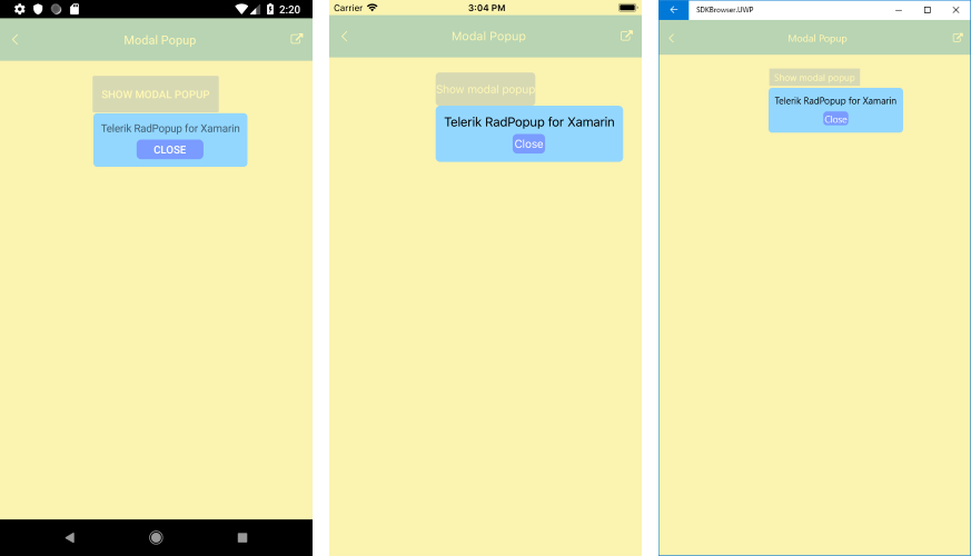
Below is an example on how you could apply OutsideBackgroundColor to a modal popup.
<Button HorizontalOptions="Center"
        VerticalOptions="Start"
        BackgroundColor="#7A9BFF"
        TextColor="White"
        Text="Show modal popup"
        Clicked="ShowPopup"
        x:Name="button">
    <telerikPrimitives:RadPopup.Popup>
        <telerikPrimitives:RadPopup x:Name="popup"
                                    IsModal="True"
                                    OutsideBackgroundColor="#B3FFF493">
            <telerikPrimitives:RadBorder
                CornerRadius="6"
                BackgroundColor="#93D7FF"
                Padding="10">
                <Grid>
                    <Grid.RowDefinitions>
                        <RowDefinition Height="Auto" />
                        <RowDefinition Height="26" />
                    </Grid.RowDefinitions>
                    <Label Text="Telerik RadPopup for Xamarin" />
                    <Button Grid.Row="1"
                            Padding="2"
                            HorizontalOptions="Center"
                            Text="Close"
                            Clicked="ClosePopup"
                            CornerRadius="6"
                            BackgroundColor="#7A9BFF"
                            TextColor="White" />
                </Grid>
            </telerikPrimitives:RadBorder>
        </telerikPrimitives:RadPopup>
    </telerikPrimitives:RadPopup.Popup>
</Button>
And the needed event handlers used to show/hide the popup:
private void ClosePopup(object sender, EventArgs e)
{
    popup.IsOpen = false;
}
private void ShowPopup(object sender, EventArgs e)
{
    popup.IsOpen = true;
}
Check the Popup with applied overlay color on different platforms below:
Placement Configuration
RadPopup provides a few useful properties which will help you position it per your preferences.
- PlacementTarget: Defines an element relative to which the popup is positioned when it is open;
-
Placement: Specifies the way the popup aligns to its placement target. Placement property is of type PlacementMode and can be set to any of the Top, Right, Left, Bottom, Center or Relative options where:
- Top, Right, Left, Bottom: aligns the popup control to the corresponding corner of the placement target;
- Center: aligns the popup at the middle of the PlacementTarget;
- Relative: a position that aligns the top left corner of the popup with the top left corner of the placement target.
HorizontalOffset / VerticalOffset: Specifies the horizontal/vertical distance between the placement target and the alignment point.
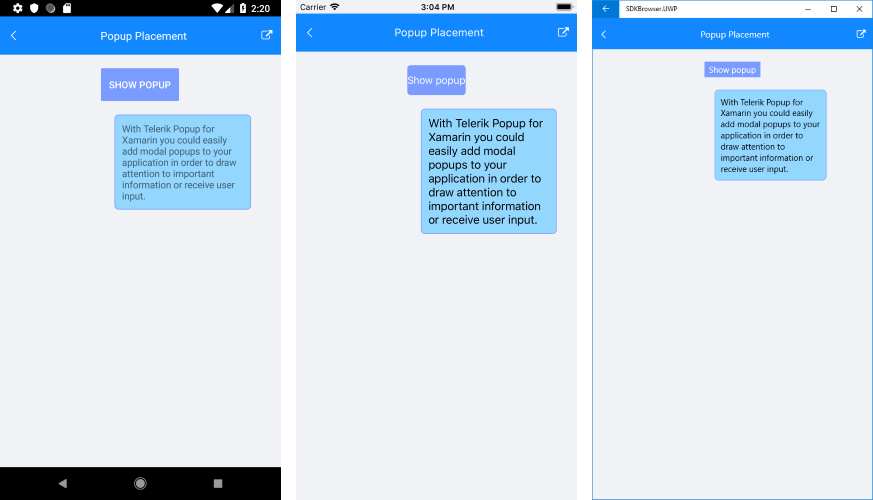
<Button HorizontalOptions="Center"
        VerticalOptions="Start"
        BackgroundColor="#7A9BFF"
        TextColor="White"
        Text="Show popup"
        Clicked="ShowPopup"
        x:Name="button">
    <telerikPrimitives:RadPopup.Popup>
        <telerikPrimitives:RadPopup x:Name="popup"
                                    Placement="Bottom"
                                    HorizontalOffset="20"
                                    VerticalOffset="20">
            <telerikPrimitives:RadBorder
                WidthRequest="180"
                CornerRadius="6"
                BackgroundColor="#93D7FF"
                BorderColor="#7A9BFF"
                Padding="10">
                <Label Text="With Telerik Popup for Xamarin you could easily add modal popups to your application in order to draw attention to important information or receive user input." />
            </telerikPrimitives:RadBorder>
        </telerikPrimitives:RadPopup>
    </telerikPrimitives:RadPopup.Popup>
</Button>
var myButton = new Button()
{
    HorizontalOptions = LayoutOptions.Center,
    VerticalOptions = LayoutOptions.StartAndExpand,
    BackgroundColor = Color.FromHex("#7A9BFF"),
    TextColor = Color.White,
    Text = "Show popup",
};

var popup = new RadPopup()
{
    Placement = PlacementMode.Bottom,
    HorizontalOffset = 20,
    VerticalOffset = 20,
    PlacementTarget = myButton
};

myButton.Clicked += ((sender, args) => { popup.IsOpen = true; });

popup.Content = new RadBorder()
{
    WidthRequest = 180,
    CornerRadius = new Thickness(6),
    BackgroundColor = Color.FromHex("#93D7FF"),
    BorderColor = Color.FromHex("#7A9BFF"),
    Padding = new Thickness(10),
    Content = new Label() { Text= "With Telerik Popup for Xamarin you could easily add modal popups to your application in order to draw attention to important information or receive user input."}
};

this.Content = new Grid()
{
    Margin = new Thickness(10),
    Children = { myButton  }
};
Here is the Button Clicked event handler:
private void ShowPopup(object sender, EventArgs e)
{
    popup.IsOpen = true;
}
In the XAML example RadPopup is defined inline through RadPopup.Popup attached property applied to the Button control, so the Button is considered as PlacementTarget of the popup. If you create the Popup with code, PlacementTarget property should be explicitly set.
Here is the result:
If you need to center the popup when it is declared in XAML, attach it to the Page element and set its Placement property to "Center".
Animation Settings
RadPopup provides two built-in animations played when the popup is shown/hidden. You could apply the animation through AnimationType property which exposes the following options:
- None (use it to disable the animation)
- Fade
- Zoom
The default AnimationType is Fade.
You could also customize the duration and easing (acceleration over time) through AnimationDuration (in ms) and AnimationEasing (of type Xamarin.Forms.Easing) properties. The default duration is 300ms and the default easing is Easing.Linear.