Material Theme
The Material Theme comes with built-in elements that provide interaction feedback, with easy-to-customize colors and Material design drop shadows with beautiful and smooth transitions between the states.
With the R2 2021 release of the UI for WPF suite, we have designed and delivered a brand new color variation of the Material theme - the Dark one. In addition to it, the theme palette expanded its brushes collection with the DialogBackgroundBrush and the SelectedUnfocusedBrush, which are available for both color variations and are described below.
Jump to the following topics to learn about the specifics of the theme's palette and features.
- Default Theme Colors
- Default Theme Brushes
- Changing Palette Colors
- Changing Theme Variation
- Changing Font Properties
- Using Glyphs
- Changing Corner Radius
- Visual Helpers
- Material Control
- Changing Opacity
Default Theme Colors
Since the R2 2021 release of the UI for WPF suite, the Material Theme has two color variations. The theme is designed to be easily modified via the exposed colors in the theme palette. Additionally, the introduction of the MaterialAssist helper class makes it easier than ever to modify appearance-related properties directly in the instance of the control without the need to extract and modify the default control templates of the basic controls.
The default values of the brushes in the theme are listed below:
| Color name | Light | Dark | ||
|---|---|---|---|---|
| MainColor | #FFFFFFFF | #FF303030 | ||
| PrimaryColor | #FFFAFAFA | #FF424242 | ||
| ComplementaryColor | #FFE0E0E0 | #FF171717 | ||
| AlternativeColor | #FFF5F5F5 | #FF212121 | ||
| DividerColor | #1E000000 | #1FFFFFFF | ||
| MarkerColor | #FF000000 | #FFF1F1F1 | ||
| MarkerInvertedColor | #FFFFFFFF | #FFFFFFFF | ||
| IconColor | #FF000000 | #FFFFFFFF | ||
| ValidationColor | #FFD50000 | #FFCF6679 | ||
| AccentNormalColor | #FFFFAB40 | #FF00ACC1 | ||
| AccentHoverColor | #FFFFD180 | #FF26C6DA | ||
| AccentPressedColor | #FFFF9100 | #FF0097A7 | ||
| PrimaryNormalColor | #FF3F51B5 | #FF7986CB | ||
| PrimaryHoverColor | #FF303F9F | #FF5C6BC0 | ||
| PrimaryPressedColor | #FF1A237E | #FF3F51B5 | ||
| PrimaryFocusColor | #FF9FA8DA | #FF536DFE | ||
| RippleColor | #FFFFFFFF | #FFFFFFFF | ||
| DividerSolidColor | #FFE1E1E1 | #FF474747 | ||
| ReadOnlyBackgroundColor | #00FFFFFF | #00FFFFFF | ||
| ReadOnlyBorderColor | #FFABABAB | #FFABABAB | ||
| DialogBackgroundColor | #FFFFFFFF | #FF262626 | ||
| SelectedUnfocusedColor | #FFEEEEEE | #FF262626 |
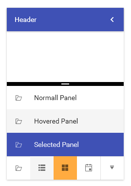
Theme colors represented in RadOutlookBar
Default Theme Brushes
Below you can find more details about each brush and where it is usually applied. The brushes can be divided in 4 groups based on their color:
Neutral Brushes
White, Gray, Black
They are used for backgrounds, non-intrusive interaction states, glyphs and icons, borders and separators, text.
-
MainBrush—White by default and it is mainly used as background of the controls. -
PrimaryBrush—This brush is very light gray by default and it is used as secondary background color (background of RadDocking, CarouselItem). -
AlternativeBrush—A slightly darker gray brush that is used for the Mouse Over states of buttons, button-like controls and ListBoxItems. It is also used as a background in the RadRibbonBackstage and PrintPreview controls and dialogs. -
ComplementaryBrush—Even darker gray brush that is used for the Pressed states of the buttons, button-like controls and ListBoxItems. -
DividerBrush—A black brush with 12% opacity that is used for borders and separators. It is transparent, so that it could allow for the background color to pass through since it is very light grey. -
DividerSolidBrush—This is a special brush that is the solid color variation of the DividerBrush. It is calculated by overlaying the DividerBrush on top of the MainBrush. It is created for scenarios that the border or the separator should not be transparent, because it overlaps with other borders, lines or separators but should be the same color as the DividerBrush. It is used in controls which have stacked lines on top of each other like RadGridView, RadScheduleView, RadPivotGrid, RadPropertyGrid. -
MarkerBrush—A standard black brush for the text elements. -
MarkerInvertedBrush—A white brush for text elements that are on a dark background. -
IconBrush—A black brush that is used for the icon paths and glyphs when they are on light backgrounds. It is often combined with opacity to achieve the desired shade of black. -
DialogBackgroundBrush—White by default brush that is used for the background of the window and dialog elements.
The
DialogBackgroundBrushis not available with versions prior to the R2 2021 release of the UI for WPF suite.
Primary brushes
Indigo
-
PrimaryNormalBrush—By default, it is blue (indigo) and is used for coloring the primary accent elements - headers, important, selected or checked elements (RadListBoxItem, RadToggleButton, checked CheckBox background), slider thumbs etc. -
PrimaryHoverBrush—Variation of the PrimaryNormalBrush that is used for the hovered states of primary accent elements – raised/flat buttons. -
PrimaryPressedBrush—Darker blue than the previous two brushes for pressed states of primary accent elements – pressed RadToggleButton/RadRadioButton, pressed state of raised/flat buttons. -
PrimaryFocusBrush—Light variation of the indigo color scheme which is used as a main brush for backgrounds and underlines, indicating focused states, as well as selection and dragging layovers – underlines for the input controls in focused states (TextBox, RadNumericUpDown, RadWatermarkTextBox etc.), backgrounds in normal states of buttons, RadListBoxItems and similar, focus halos for CheckBox and RadioButton.
Accent brushes
Amber
-
AccentNormalBrush—Bright amber-orange brush used as a background for the secondary accent element (RadScheduleView’s Appointments, RadGanttView Summary containers), hover state for checked/selected elements (selected RadListBoxItem hover, checked RadToggleButton hover), tab items focus underline (focused RadTabItem, focused LayoutControlTabGroupItem, selected docked RadDocumentPane), RadDiagramShape fill, RadDocking’s selected docked/undocked pinned RadPane/ToolWindow. -
AccentHoverBrush—Lighter variation of the amber color for the elements that have AccentNormalBrush as a background in their default state (RadScheduleView’s Appointments, header buttons in selected RadPane/ToolWindow in RadDocking), RadGridView frozen columns splitter, checked CheckBox and RadioButton, RadDiagramShade stroke. -
AccentPressedBrush—Darker amber color for the pressed/selected states of secondary accent controls - RadScheduleView’s Appointments, pressed or checked CheckBox and RadioButton, pressed states for header buttons in RadDocking’s RadDocking’s selected docked/undocked pinned RadPane/ToolWindow.
Special brushes
-
ValidationBrush—A bright red brush used for indicating validation errors - for the underline of the invalid control and as a background for the error tooltip, background for invalid rows and cells as well as for clear buttons' mouse over states. -
RippleBrush—A white by default brush which is used for the ripple effect of the MaterialControl. By itself it is a solid color, the opacity of the ripple comes from the MaterialControl’s RippleOpacity property. -
ReadOnlyBackgroundBrush—Used for the background of the controls in their read-only state. -
ReadOnlyBorderBrush—Used for the border color of the controls in their read-only state. -
SelectedUnfocusedBrush—Used for the background color of the controls in their selected, not focused state (e.g., the GridViewRow, TreeListViewRow and the TreeViewItem).
The
SelectedUnfocusedBrushis not available with versions prior to the R2 2021 release of the UI for WPF suite.
Other Properties
-
DisabledOpacity—Used for disabled text. Backgrounds usually use theAlternativeBrushwhen disabled. -
ReadOnlyOpacity—Used for text in inputs when they are in a read-only state.
Changing Palette Colors
The Material theme provides dynamic change of the palette colors responsible for the brushes used in the controls. Their defaults are stated above. This mechanism is used to modify the color variation of the theme.
The general naming convention is: MaterialPalette.Palette.[name]Color is responsible for [name]Brush – e.g. MaterialPalette.Palette.AccentNormalColor sets the color for telerik:MaterialResource ResourceKey=AccentNormalBrush
Changing the colors can be achieved in code behind.
Setting palette colors
MaterialPalette.Palette.AccentNormalColor = Color.FromRgb(255, 0, 0);
Changing Theme Variation
Since the R2 2021 release of the UI for WPF suite the Material theme offers two color variations. Both variations correspond to the Material Design color palettes. The Light variation is the default one and is based on the Indigo and Amber colors, and the Dark - based on the Indigo and Cyan colors. The following example demonstrates the ability to switch between the supported Light and Dark color palettes by calling the LoadPreset method as shown below:
Changing the color variation of the theme
//default color variation
MaterialPalette.LoadPreset(MaterialPalette.ColorVariation.Light);

//Dark color variation
MaterialPalette.LoadPreset(MaterialPalette.ColorVariation.Dark);
The
Darkvariation of the theme is designed with a dark background in mind. It is recommended to use such a background in your application when working with it.
Changing Font Properties
When using the Material theme you can dynamically change the FontSize and FontFamily properties of all components in the application the same way as you do in all other Available Themes which support ThemePalette.
The FontSize and FontFamily properties are public so you can easily modify the theme resources at a single point. The most commonly used font size in the theme is with value 14 and can be modified through the MaterialPalette.Palette.FontSize property.
The default font used in the theme is Roboto.
For complex scenarios we strongly recommend setting the FontSize property only before the application is initialized Also, we recommend values between 11px and 19px for it.
Example 2 shows the default font sizes and families.
Default FontSize and FontFamily properties:
MaterialPalette.Palette.FontSizeS = 12;
MaterialPalette.Palette.FontSize = 14;
MaterialPalette.Palette.FontSizeL = 18;
MaterialPalette.Palette.FontFamily = new FontFamily("Roboto");
Example view definition
<telerik:RadCalendar HorizontalAlignment="Center" />
<telerik:RadButton Content="Change Font" Click="OnButtonChangeFontSizeClick"
         HorizontalAlignment="Center" VerticalAlignment="Center"/>
Changing the theme's FontSize and FontFamily
private void OnButtonChangeFontSizeClick(object sender, RoutedEventArgs e)
{
    MaterialPalette.Palette.FontSize = 12;
    MaterialPalette.Palette.FontFamily = new FontFamily("Calibri");
}
Using Glyphs
The Material Theme uses and supports the same approach for adding icons and icon-like images introduced with the Office2016 Theme. Instead of images or paths we are using a font of glyphs by default. The TelerikWebUI font provides over 400 scalable vector glyphs that are available for use to our clients.
You can read more about the usage and range of the new glyphs in the Font Glyphs Overview article.
Adding the ResourceDictionary with the glyphs
<ResourceDictionary Source="/Telerik.Windows.Controls;component/Themes/FontResources.xaml"/>
Changing Corner Radius
The Material Theme exposes an easy way to modify the corner radius of many elements in your application. You can directly use the corner radius property of the palette. By default the CornerRadius value is 2.
Default corner radius values
  MaterialPalette.Palette.CornerRadius = new CornerRadius(2);
  MaterialPalette.Palette.CornerRadiusTop = new CornerRadius(2, 2, 0, 0);
  MaterialPalette.Palette.CornerRadiusBottom = new CornerRadius(0, 0, 2, 2);
  MaterialPalette.Palette.CornerRadiusLeft = new CornerRadius(2, 0, 0, 2);
  MaterialPalette.Palette.CornerRadiusRight = new CornerRadius(0, 2, 2, 0);
Changing the default corner radius
MaterialPalette.Palette.CornerRadius = new CornerRadius(10);

Material Assist
The MaterialAssist static class comes from the Material theme and it is reused in the Fluent theme. It exposes a set of attached properties and can be used to directly modify the appearance of a specific basic control without the need to alter its control template. You can use the following dependency properties directly in XAML:
-
ShadowDepth—Enum property that indicates the depth of the shadow effect over the control. There are 5 values that can be selected. -
IsShadowDisabled—The property is used to control the visibility of the shadow effect.
Theme Helper
The ThemeHelper class is used in the Windows11 theme. It exposes a set of attached properties and can be used to directly modify the appearance of a specific basic control without the need to alter its control template.
The following examples show a RadToggleButton control with modified brushes for its different states through the above helper classes:
Declare the namespace for the helpers
xmlns:mat="clr-namespace:Telerik.Windows.Controls.MaterialControls;assembly=Telerik.Windows.Controls"
xmlns:helpers="clr-namespace:Telerik.Windows.Controls.Theming.Helpers;assembly=Telerik.Windows.Controls"
Set RadToggleButton's visual appearance through the helpers
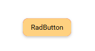
  <telerik:RadToggleButton Content="RadButton"
                           Margin="10"
                           helpers:ThemeHelper.MouseOverBrush="{telerik:MaterialResource ResourceKey=AccentHoverBrush}"
                           helpers:ThemeHelper.PressedBrush="{telerik:MaterialResource ResourceKey=AccentPressedBrush}"
                           helpers:ThemeHelper.CheckedBrush="{telerik:MaterialResource ResourceKey=ValidationBrush}"
                           helpers:ThemeHelper.FocusBrush="{telerik:MaterialResource ResourceKey=PrimaryNormalBrush}"/>
Shadow
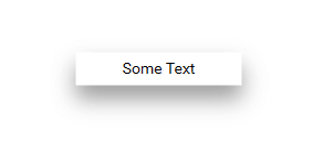
The Shadow is one of the newly introduced elements designed specifically for the needs of the Material Theme. It is used to add a shadow effect around another control or element.
The Shadow element __is not intended to directly host other elements_ as the WPF drop shadow effect affects any nested texts and results in blurry characters.
If you would like to use it separately in your application, you should work with its Width/Height properties so that it appears around the desired element as shown in the following example.
Using a Shadow component separately
 <Grid>
            <mat:Shadow Background="White" Width="150" Height="30" ShadowDepth="Depth5"/>
            <TextBlock Text="Some Text"
                       HorizontalAlignment="Center"
                       VerticalAlignment="Center"/>
 </Grid>
The Shadow element should have a background set for the effect to appear.
The element exposes a ShadowDepth enum property which takes one of the following values: Depth5, Depth4, Depth3, Depth2, Depth1, Depth0. The larger the depth number is the stronger the shadow effect will be.
Shadow effect applied over a TextBlock
Material Control
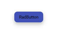
Another element specifically designed for the Material theme and used to display the interaction of the users with some of the controls is the Material Control. It is mainly used within the template of controls that suggest user actions such as the RadButton, RadToggleButton, etc. It adds a "ripple" effect and exposes several properties which you can use to modify the ripple functionality and its appearance:
-
IsRippleEnabled—Indicates whether the ripple effect is enabled. -
IsRippleCentered—Controls the initial position from where the ripple effect starts. Setting the property to true will cause the effect to always start from the center of the control. Otherwise, the cursor position is respected. -
IsSmartClipped—Sets whether the ripple should be within the boundaries of the corner radius. -
RippleBrush—Sets the brush used for the ripple effect. -
RippleOpacity—Sets the opacity of the ripple effect.
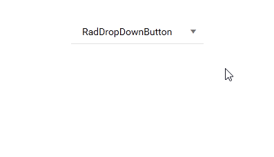
Ripple effect on RadDropDownButton
Declaration of the Button element with a glyph as text
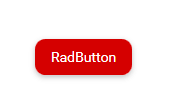
     <Button VerticalAlignment="Center" HorizontalAlignment="Center" Style="{StaticResource RoundRadButtonStyle}">
            <TextBlock FontFamily="{StaticResource TelerikWebUI}"
                       FontSize="32" FontWeight="Normal" FontStyle="Normal"
                       Text="{StaticResource GlyphEdit}" VerticalAlignment="Center" HorizontalAlignment="Center" />
     </Button>
Button's Style declaration
 <Style x:Key="RoundRadButtonStyle" TargetType="Button">
        <Setter Property="Background" Value="#FF2196F3" />
        <Setter Property="Foreground" Value="{telerik:MaterialResource ResourceKey=MarkerInvertedBrush}" />
        <Setter Property="mat:MaterialAssist.MouseOverBrush" Value="#FF1976D2" />
        <Setter Property="mat:MaterialAssist.PressedBrush" Value="#FF1565C0" />
        <Setter Property="mat:MaterialAssist.CornerRadius" Value="30" />
        <Setter Property="Width" Value="60" />
        <Setter Property="Height" Value="60" />
        <Setter Property="Padding" Value="14" />
        <Setter Property="Template">
            <Setter.Value>
                <ControlTemplate TargetType="Button">
                    <Grid>
                        <mat:Shadow Background="{TemplateBinding Background}"
                                    ShadowDepth="Depth4"
                                    CornerRadius="{TemplateBinding mat:MaterialAssist.CornerRadius}" />
                        <mat:MaterialControl IsRippleCentered="True"
                                             RippleBrush="#FF82B1FF"
                                             RippleOpacity="0.8"
                                             IsSmartClipped="True"
                                             CornerRadius="{TemplateBinding mat:MaterialAssist.CornerRadius}">
                            <ContentPresenter Focusable="False"
                                              TextBlock.Foreground="{TemplateBinding Foreground}"
                                              Margin="{TemplateBinding Padding}"
                                              Content="{TemplateBinding Content}" />
                        </mat:MaterialControl>
                    </Grid>
                </ControlTemplate>
            </Setter.Value>
        </Setter>
  </Style>

Note that for this button the
MouseOverBrushand thePressedBrushproperties from the above listed helpers are modified. They are are responsible for the mouse over and pressed animations and are automatically bound to the templated parent.
It is possible to disable the ripple effect of the MaterialControl through a style. The following example demonstrates how this can be achieved. The style can be included in the scope of the Telerik control(s) whose ripple effect needs to be disabled.
Disabling the Ripple effect
 <!--If you are using the NoXaml binaries you should base the style on the default one for the theme like so
    <Style TargetType="mat:MaterialControl" BasedOn="{StaticResource MaterialControlStyle}" >
    -->

<Style TargetType="mat:MaterialControl" >
    <Setter Property="IsRippleEnabled" Value="False" />
</Style>
Changing Opacity
If you need to change the opacity of the disabled and read-only elements, you can now easily do so by using the DisabledOpacity and ReadOnlyOpacity properties of the MaterialPalette. The default values are 0.26 and 1 respectively.
Changing the opacity
MaterialPalette.Palette.DisabledOpacity = 0.5;
MaterialPalette.Palette.ReadOnlyOpacity = 0.5;
MaterialPalette.Palette.DisabledOpacity = 0.5
MaterialPalette.Palette.ReadOnlyOpacity = 0.5
Merging Modified Palette Resources With StyleManager Theming Approach
When modifying fonts, colors, or other resources from the MaterialPalette and StyleManager is used as theming mechanism, the theme's ResourceDictionary needs to be merged in App.xaml file to apply the changes.
Merging the theme's ResourceDictionary in App.xaml
<Application.Resources>
    <ResourceDictionary>
        <ResourceDictionary.MergedDictionaries>
            <telerik:MaterialResourceDictionary/>
        </ResourceDictionary.MergedDictionaries>
    </ResourceDictionary>
</Application.Resources>