How to Make the Tab Headers Editable
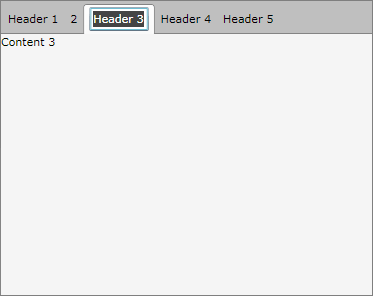
The goal of this tutorial is to create a tab control with editable headers of the tab items. The idea is to allow runtime change of the tab item's header text as shown on the snapshot below.
For the purpose of this example, you will need to create an empty WPF Application project and open it in Visual Studio.
If you copy and paste the source code directly from this XAML examples, don't forget to change xmlns:example alias to import the namespace used in your project.
First add references to the assemblies Telerik.Windows.Controls, Telerik.Windows.Controls.Navigation and Telerik.Windows.Data.
Then create a new class EditableTabHeaderControl that derives from ContentControl and leave it empty for now.
public class EditableTabHeaderControl : ContentControl
{
 static EditableTabHeaderControl()
 {
  DefaultStyleKeyProperty.OverrideMetadata(typeof(EditableTabHeaderControl), new FrameworkPropertyMetadata(typeof(EditableTabHeaderControl)));
 }
}
Public Class EditableTabHeaderControl
    Inherits ContentControl
    Shared Sub New()
        DefaultStyleKeyProperty.OverrideMetadata(GetType(EditableTabHeaderControl), New FrameworkPropertyMetadata(GetType(EditableTabHeaderControl)))
    End Sub
End Class
Create a new style__for the __EditableTabHeader control.
<Style TargetType="{x:Type example:EditableTabHeaderControl}">
    <Setter Property="Template">
        <Setter.Value>
            <ControlTemplate TargetType="{x:Type example:EditableTabHeaderControl}">
                <Grid>
                    <TextBox x:Name="PART_EditArea"
                            Text="{Binding RelativeSource={RelativeSource TemplatedParent}, Path=Content, Mode=TwoWay}"
                            Visibility="Collapsed" />
                    <ContentPresenter x:Name="ContentPresenter"
                            Content="{Binding RelativeSource={RelativeSource TemplatedParent}, Path=Content, Mode=TwoWay}" />
                </Grid>
                <ControlTemplate.Triggers>
                    <Trigger Property="IsInEditMode" Value="True">
                        <Trigger.Setters>
                            <Setter TargetName="PART_EditArea" Property="Visibility" Value="Visible" />
                            <Setter TargetName="ContentPresenter" Property="Visibility" Value="Collapsed" />
                        </Trigger.Setters>
                    </Trigger>
                </ControlTemplate.Triggers>
            </ControlTemplate>
        </Setter.Value>
    </Setter>
</Style>
In the XAML code above a new style is created for the EditableTabHeaderControl and this style will be the default template for that control. The template is made of ContentPresenter, TextBox and a trigger for EditMode. When the control is in EditMode the content presenter control is hidden and the text box is made visible, while in the ViewMode the control will have its default appearance.
Add the following implementation to the code behind of the EditableTabHeaderControl class.
[TemplatePart(Name = "PART_EditArea", Type = typeof(TextBox))]
public class EditableTabHeaderControl : ContentControl
{
 static EditableTabHeaderControl()
 {
  DefaultStyleKeyProperty.OverrideMetadata(typeof(EditableTabHeaderControl), new FrameworkPropertyMetadata(typeof(EditableTabHeaderControl)));
 }
 private TextBox textBox;
 public static DependencyProperty IsInEditModeProperty =
  DependencyProperty.Register("IsInEditMode", typeof(Boolean), typeof(EditableTabHeaderControl));
 public bool IsInEditMode
 {
  get
  {
   return (bool)this.GetValue(IsInEditModeProperty);
  }
  set
  {
   this.SetValue(IsInEditModeProperty, value);
  }
 }
 public override void OnApplyTemplate()
 {
  base.OnApplyTemplate();
  this.textBox = this.Template.FindName("PART_EditArea", this) as TextBox;
  this.textBox.LostFocus += new RoutedEventHandler(textBox_LostFocus);
  this.MouseDoubleClick += new MouseButtonEventHandler(EditableTabHeaderControl_MouseDoubleClick);
 }
 private void textBox_LostFocus(object sender, RoutedEventArgs e)
 {
  this.IsInEditMode = false;
 }
 private void EditableTabHeaderControl_MouseDoubleClick(object sender, MouseButtonEventArgs e)
 {
  if (e.LeftButton == MouseButtonState.Pressed)
  {
   this.IsInEditMode = true;
  }
 }
}
<TemplatePart(Name:="PART_EditArea", Type:=GetType(TextBox))>
Public Class EditableTabHeaderControl
    Inherits ContentControl
    Shared Sub New()
        DefaultStyleKeyProperty.OverrideMetadata(GetType(EditableTabHeaderControl), New FrameworkPropertyMetadata(GetType(EditableTabHeaderControl)))
    End Sub

    Private textBox As TextBox

    Public Shared IsInEditModeProperty As DependencyProperty = DependencyProperty.Register("IsInEditMode", GetType([Boolean]), GetType(EditableTabHeaderControl))

    Public Property IsInEditMode() As Boolean
        Get
            Return CBool(Me.GetValue(IsInEditModeProperty))
        End Get
        Set(value As Boolean)
            Me.SetValue(IsInEditModeProperty, value)
        End Set
    End Property

    Public Overrides Sub OnApplyTemplate()
        MyBase.OnApplyTemplate()

        Me.textBox = TryCast(Me.Template.FindName("PART_EditArea", Me), TextBox)
        AddHandler Me.textBox.LostFocus, AddressOf textBox_LostFocus
        AddHandler Me.MouseDoubleClick, AddressOf EditableTabHeaderControl_MouseDoubleClick
    End Sub

    Private Sub textBox_LostFocus(sender As Object, e As RoutedEventArgs)
        Me.IsInEditMode = False
    End Sub

    Private Sub EditableTabHeaderControl_MouseDoubleClick(sender As Object, e As MouseButtonEventArgs)
        If e.LeftButton = MouseButtonState.Pressed Then
            Me.IsInEditMode = True
        End If
    End Sub

End Class
The major changes in the implementation of the EditableTabHeaderControl are:
An attribute of type TemplatePart placed right above the class definition. With this attribute you identify the types of the named parts that are used for templating.
New dependency property IsInEditMode of Boolean type was added.
One text box field declaration. The text box field is initialized with the reference from the text box defined in the template when the base method OnApplyTemplate() is invoked.
An event handler for the MouseDoubleClick event is added. When the user makes a double click with his left mouse button, then the control is in edit mode. That automatically triggers the states of the content presenter and the text box.
An event handler for the LostFocus event of the text box is added. When the user presses the "tab" keyboard and the text box lost its focus, the control restore its initial appearance.
Add a new RadTabControl declaration.
<telerik:RadTabControl x:Name="radTabControl"/>
Populate the RadTabControl with some data (tabs):
public partial class MainWindow : Window
{
 public MainWindow()
 {
  InitializeComponent();
  radTabControl.ItemsSource = Enumerable.Range(1, 5).Select(num =>
  new TabItemModel()
  {
   Name = String.Format("Header {0}", num),
   Content = String.Format("Content {0}", num)
  });
 }
}
public class TabItemModel : ViewModelBase
{
 private String name;
 private String content;
 public String Name
 {
  get
  {
   return this.name;
  }
  set
  {
   if (this.name != value)
   {
    this.name = value;
    OnPropertyChanged("Name");
   }
  }
 }
 public String Content
 {
  get
  {
   return this.content;
  }
  set
  {
   if (this.content != value)
   {
    this.content = value;
    OnPropertyChanged("Content");
   }
  }
 }
}
Imports Telerik.Windows.Controls

Class MainWindow
    Public Sub New()
        InitializeComponent()

        radTabControl.ItemsSource = Enumerable.Range(1, 5).Select
    End Sub

End Class
Public Class TabItemModel
    Inherits ViewModelBase
    Private _name As [String]
    Private _content As [String]

    Public Property Name() As [String]
        Get
            Return Me._name
        End Get
        Set(value As [String])
            If Me._name <> value Then
                Me._name = value
                OnPropertyChanged("Name")
            End If
        End Set
    End Property

    Public Property Content() As [String]
        Get
            Return Me._content
        End Get
        Set(value As [String])
            If Me._content <> value Then
                Me._content = value
                OnPropertyChanged("Content")
            End If
        End Set
    End Property

End Class
Define the RadTabControl ItemTemplate and ContentTemplate properties:
<telerik:RadTabControl x:Name="radTabControl">
    <telerik:RadTabControl.ContentTemplate>
        <!--The Content Template:-->
        <DataTemplate>
            <Grid Background="WhiteSmoke">
                <TextBlock Text="{Binding Content}" />
            </Grid>
        </DataTemplate>
    </telerik:RadTabControl.ContentTemplate>
    <telerik:RadTabControl.ItemTemplate>
        <!--The Header Template:-->
        <DataTemplate>
            <example:EditableTabHeaderControl Content="{Binding Name, Mode=TwoWay}" />
        </DataTemplate>
    </telerik:RadTabControl.ItemTemplate>
</telerik:RadTabControl>
Run your demo. Double click on the Tab's Header will switch them in Edit Mode. Loosing the focus (pressing the "tab" key) will switch the Tab's Header in its default (ViewMode) appearance.