Ribbon DropDownButton
The RadRibbonDropDownButton represents an extension of the RadDropDownButton. It provides an easier interaction with the RadRibbonView control. What is special about the RadRibbonDropDownButton is that upon activation it can display a popup area. Any content of any kind can be nested inside the popup area.
To learn more about the RadDropDownButton control read its documentation.
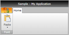
Here is a sample definition of a RadRibbonDropDownButton without having any drop down content defined:
<telerik:RadRibbonDropDownButton LargeImage="Icons/32/paste.png"
                                 Size="Large"
                                 SmallImage="Icons/16/paste.png"
                                 Text="Paste" />
As all buttons in the RadRibbonView's set slightly expose the same functionality, take a look at the Overview topic.
This button has its initial size set to Large and its text label set to "Paste".
Setting the Drop Down Content
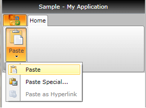
To set the popup content you have to simply set the DropDownContent property of the button. Here is an example of a RadRibbonDropDownButton with three menu items inside its drop down.
<telerik:RadRibbonDropDownButton LargeImage="Icons/32/paste.png"
                                 Size="Large"
                                 SmallImage="Icons/16/paste.png"
                                 Text="Paste">
    <telerik:RadRibbonDropDownButton.DropDownContent>
        <telerik:RadContextMenu BorderThickness="0">
            <telerik:RadMenuItem Header="Paste">
                <telerik:RadMenuItem.Icon>
                    <Image Source="Icons/16/paste.png" />
                </telerik:RadMenuItem.Icon>
            </telerik:RadMenuItem>
            <telerik:RadMenuItem Header="Paste Special...">
                <telerik:RadMenuItem.Icon>
                    <Image Source="Icons/16/pastespecial.png" />
                </telerik:RadMenuItem.Icon>
            </telerik:RadMenuItem>
            <telerik:RadMenuItem Header="Paste as Hyperlink" IsEnabled="False">
                <telerik:RadMenuItem.Icon>
                    <Image Source="Icons/16/pastehyperlink.png" />
                </telerik:RadMenuItem.Icon>
            </telerik:RadMenuItem>
        </telerik:RadContextMenu>
    </telerik:RadRibbonDropDownButton.DropDownContent>
</telerik:RadRibbonDropDownButton>
Handling the Drop Down Events
Besides the Click event, the RadRibbonDropDownButton exposes several drop down related events:
DropDownClosed - fires after the popup area has been closed.
DropDownOpening - fires before the popup area gets opened.
DropDownOpened - fires after the popup area has been opened.
<telerik:RadRibbonDropDownButton LargeImage="Icons/32/paste.png"
                                 ...
                                 DropDownClosed="RadRibbonDropDownButton_DropDownClosed"
                                 DropDownOpened="RadRibbonDropDownButton_DropDownOpened"
                                 DropDownOpening="RadRibbonDropDownButton_DropDownOpening">
 ...
</telerik:RadRibbonDropDownButton>
private void RadRibbonDropDownButton_DropDownClosed(object sender, RoutedEventArgs e)
{
}
private void RadRibbonDropDownButton_DropDownOpened(object sender, RoutedEventArgs e)
{
}
private void RadRibbonDropDownButton_DropDownOpening(object sender, RoutedEventArgs e)
{
}
Private Sub RadRibbonDropDownButton_DropDownClosed(sender As Object, e As RoutedEventArgs)
End Sub

Private Sub RadRibbonDropDownButton_DropDownOpened(sender As Object, e As RoutedEventArgs)
End Sub

Private Sub RadRibbonDropDownButton_DropDownOpening(sender As Object, e As RoutedEventArgs)
End Sub