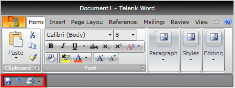
Quick Access Toolbar
Telerik RadRibbonView provides a simple and consistent way for building interfaces similar to the RibbonView used in Microsoft Office. The RadRibbonView consists of various elements, one of which is the Quick Access Toolbar. This topic discusses concepts fundamental to the Quick Access Toolbar at first and then goes into the usage of the QuickAccessToolbar class and its features.
Before proceeding with this tutorial, it is recommended to get familiar with the Visual Structure of the RadRibbonView control.
Quick Access ToolBar - Fundamentals
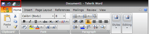
The Quick Access Toolbar is used to render a set of RadRibbonView controls that are most commonly used in the application. It is rendered above the ApplicationButton to make it easily accessible to end-users.
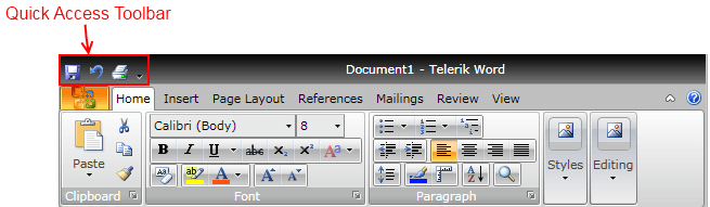
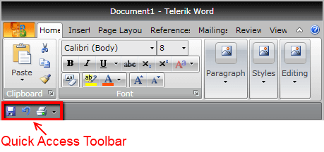
This is the default position of the Quick Access Toolbar. However, it is also possible to position the Quick Access Toolbar below the Ribbon control.
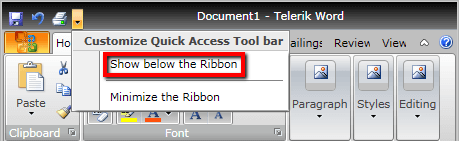
An integral part of the Quick Access Toolbar is the Quick Access Menu, which is rendered right next to the Quick Access Toolbar.
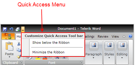
The Quick Access Menu can be used by the end-user to choose the place of the Quick Access Toolbar - above or below the ribbon, or to hide the entire ribbon control.
The class that represents the Quick Access Toolbar is Telerik.Windows.Controls.QuickAccessToolbar.
The QuickAccessToolbar control is an ItemsControl ( it indirectly derives from ItemsControl). That fact allows you to easily customize it by adding/removing commands.
Check out the rest of this topic, which is entirely dedicated to the QuickAccessToolbar.
Adding QuickAccessToolbar to a RadRibbonView Control
In order to add a quick access toolbar to your RadRibbonView control you need to set the RadRibbonView's QuickAccessToolbar property. The next several code-snippets show you how to do that in XAML, as well as in the code-behind.
<telerik:RadRibbonView x:Name="radRibbonView" Title="My Title" ApplicationName="My Application">
    <telerik:RadRibbonView.QuickAccessToolBar>
        <telerik:QuickAccessToolBar />
    </telerik:RadRibbonView.QuickAccessToolBar>
</telerik:RadRibbonView>
this.radRibbonView.QuickAccessToolBar = new QuickAccessToolBar();
Me.radRibbonView.QuickAccessToolBar = New QuickAccessToolBar()
Adding QuickAccessToolbar Items
When you want to add toolbar items to your RadRibbonView's Quick Access Toolbar, you need to populate the QuickAccessToolbar's Items collection. It is handy to use the RadRibbonButton, RadRibbonSplitButton, RadRibbonDropDownButton and RadToolBarSeparator controls.
For more information about the different types of RadRibbonButtons and their properties, take a look at the Ribbon Buttons topic.
The next example demonstrates how to add several buttons as toolbar items to your Quick Access Toolbar.
<telerik:RadRibbonView x:Name="radRibbonView">
    <telerik:RadRibbonView.QuickAccessToolBar>
        <telerik:QuickAccessToolBar>
            <telerik:RadRibbonButton Text="Save" SmallImage="Images/IconMSOffice/16/save.png"
                                        Size="Small"
                                        telerik:KeyTipService.AccessText="1" />
            <telerik:RadRibbonButton Text="Undo" SmallImage="Images/IconMSOffice/16/undo.png"
                                        Size="Small"
                                        telerik:KeyTipService.AccessText="2" />
            <telerik:RadRibbonButton Text="Print" SmallImage="Images/IconMSOffice/16/print.png"
                                        Size="Small"
                                        telerik:KeyTipService.AccessText="3" />
        </telerik:QuickAccessToolBar>
    </telerik:RadRibbonView.QuickAccessToolBar>
</telerik:RadRibbonView>
Changing the QuickAccessToolbar Position
The default position of the QuickAccessToolbar is right next to the Application Menu button. However, you can change its position either design-time or run-time. In order to change the QuickAccessToolbar position design-time, you need to set the RadRibbonView's QuickAccessToolBarPosition property. Its values are predefined in the QuickAccessToolBarPosition enumeration, which exposes the following fields:
AboveRibbon - position the QuickAccessToolbar above the ribbon.
BelowRibbon - position the QuickAccessToolbar below the ribbon.
NotHosted - the QuickAccessToolbar is not hosted. Use this value, when you want to hide the QuickAccessToolbar.
The next example demonstrates how to set the QuickAccessToolBarPosition property.
<telerik:RadRibbonView x:Name="radRibbonView" QuickAccessToolBarPosition="BelowRibbon">
radRibbonView.QuickAccessToolBarPosition = QuickAccessToolBarPosition.BelowRibbon;
radRibbonView.QuickAccessToolBarPosition = QuickAccessToolBarPosition.BelowRibbon
The result from the previous example is that when you run your application, the QuickAccessToolbar will be positioned below the ribbon.
The default value of the RadRibbonView's QuickAccessToolBarPosition property is QuickAccessToolBarPosition.AboveRibbon.
RadRibbonView has a built-in feature, which allows you to change the QuickAccessToolbar position run-time. Suffice it to execute the QuickAccessMenu's "Show below/above the Ribbon" command.
Hiding the QuickAccessToolbar
When you want to hide the QuickAccessToolbar, you should set the RadRibbonView's QuickAccessToolBarPosition property to QuickAccessToolBarPosition.NotHosted.
<telerik:RadRibbonView x:Name="radRibbonView" QuickAccessToolBarPosition="NotHosted">
radRibbonView.QuickAccessToolBarPosition = QuickAccessToolBarPosition.NotHosted;
radRibbonView.QuickAccessToolBarPosition = QuickAccessToolBarPosition.NotHosted
Events
The RadRibbonView class exposes the ToolBarPositionChanged event, which is fired when the QuickAccessToolbar position is changed.
<telerik:RadRibbonView x:Name="radRibbonView" ToolBarPositionChanged="radRibbonView_ToolBarPositionChanged">
- The sender argument contains the RadRibbonView. This argument is of type object, but can be cast to the RadRibbonView type.
- The second argument is a RadRoutedEventArgs object.
private void radRibbonView_ToolBarPositionChanged( object sender, RadRoutedEventArgs e )
{
RadRibbonView ribbonView = sender as RadRibbonView ;
QuickAccessToolBarPosition newPosition = ribbonView.QuickAccessToolBarPosition;
// Do some logic here.
}
Private Sub radRibbonView_ToolBarPositionChanged(ByVal sender As Object, ByVal e As RadRoutedEventArgs)
Dim ribbonView As RadRibbonView = TryCast(sender, RadRibbonView)
' Do some logic here.'
Dim newPosition As QuickAccessToolBarPosition = ribbonView.QuickAccessToolBarPosition
End Sub
You can handle the ToolBarPositionChanged event to get notified when the user changes the ToolBar position.
For a full list of the exposed by the RadRibbonView events, take a look at the Events - Overview topic.
The RadRibbonView is a complex control and the Quick Access Toolbar is only a small part of it. The RadRibbonView consists of various elements such as:
- Application Menu
- Backstage Menu
- Ribbon Tab
- Ribbon Group
- Ribbon Gallery
- RibbonButtons Overview
- Ribbon ComboBox
- Screen Tips
Additional features that you may find interesting are: