Configuration
This help topic describes the basic properties used to configure the way RadRadialMenu looks & behaves.
Open the RadialMenu
Initially RadRadialMenu is closed, you should click on the RadialMenuButton in order to open it and show its items. IsOpen boolean property of the RadialMenu allows you to make it open by default. Example 1 shows how IsOpen can be set.
Example 1: Setting IsOpen property
<telerik:RadRadialMenu IsOpen="True">
    <!--...-->
</telerik:RadRadialMenu>
Automatically Size the MenuItems
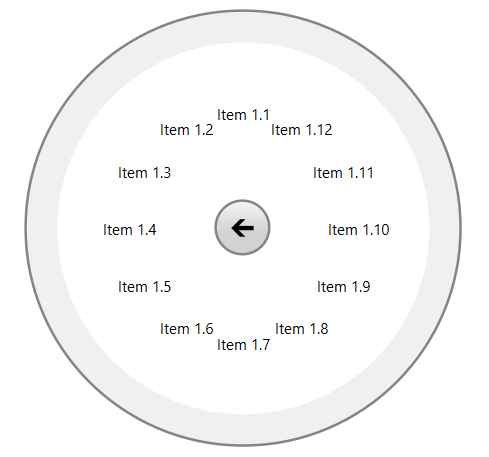
Since the R1 2021 release, the RadRadialMenu can auto-size its items. This enables the option of defining more or less than 8 items per level. In order to turn on this feature, set the AutoSizeMenuItems property of the RadRadialMenu to True.
When the items are auto-sized, the start angle of the first item is automatically calculated. If you want the StartAngle property to be respected in that case, you can set the AutoCalculateStartAngle property to False.
Example 2: Setting the AutoSizeMenuItems property
<telerik:RadRadialMenu IsOpen="True" AutoSizeMenuItems="True">
    <telerik:RadRadialMenuItem Header="Item 1">
        <telerik:RadRadialMenuItem Header="Item 1.1" />
        <telerik:RadRadialMenuItem Header="Item 1.2" />
        <telerik:RadRadialMenuItem Header="Item 1.3" />
        <telerik:RadRadialMenuItem Header="Item 1.4" />
        <telerik:RadRadialMenuItem Header="Item 1.5" />
        <telerik:RadRadialMenuItem Header="Item 1.6" />
        <telerik:RadRadialMenuItem Header="Item 1.7" />
        <telerik:RadRadialMenuItem Header="Item 1.8" />
        <telerik:RadRadialMenuItem Header="Item 1.9" />
        <telerik:RadRadialMenuItem Header="Item 1.10" />
        <telerik:RadRadialMenuItem Header="Item 1.11" />
        <telerik:RadRadialMenuItem Header="Item 1.12" />
    </telerik:RadRadialMenuItem>
    <telerik:RadRadialMenuItem Header="Item 2" />
    <telerik:RadRadialMenuItem Header="Item 3" />
    <telerik:RadRadialMenuItem Header="Item 4" />
</telerik:RadRadialMenu>
When the AutoSizeMenuItems property is True, menu items on all levels will be auto-sized. If you want to dynamically control this, you can handle the Navigating event and set the AutoSizeMenuItems property of the event arguments.
Figure 1: RadRadialMenu with less than 8 Autosized Items
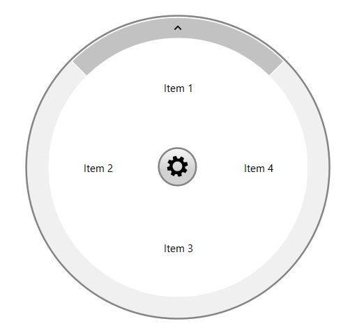
Figure 2: RadRadialMenu with more than 8 Autosized Items
Change the size of the RadialMenu
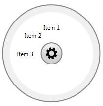
The size of RadRadialMenu is set through MinWidth and MinHeight properties. Both should be set to the same value which refers to the diameter of the circle representing the menu.
Example 3: Setting MinWidth and MinHeight properties
<telerik:RadRadialMenu IsOpen="True" MinWidth="200" MinHeight="200">
    <telerik:RadRadialMenuItem Header="Item 1" />
    <telerik:RadRadialMenuItem Header="Item 2" />
    <telerik:RadRadialMenuItem Header="Item 3" />
</telerik:RadRadialMenu>
Figure 3: Setting MinWidth and MinHeight properties
Change the StartAngle property
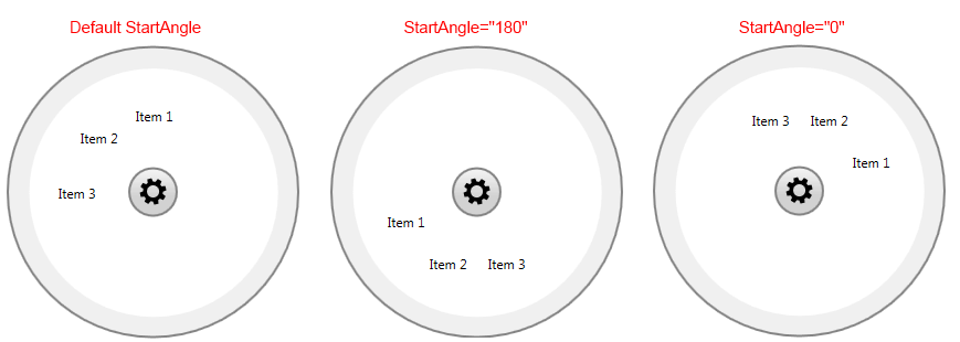
StartAngle property is used to set the angle at which the first RadRadialMenuItem will be positioned.
Example 4: Setting StartAngle property
<telerik:RadRadialMenu IsOpen="True" StartAngle="180" >
    <telerik:RadRadialMenuItem Header="Item 1" />
    <telerik:RadRadialMenuItem Header="Item 2" />
    <telerik:RadRadialMenuItem Header="Item 3" />
</telerik:RadRadialMenu>
Figure 4: Setting StartAngle property
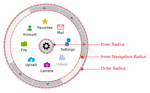
Change the Radius properties
RadRadialMenu provides the following Radius properties:
InnerRadiusFactor - defines the inner radius of the panel holding all RadRadialMenuItems as a fraction of the size of RadRadialMenu control. The value should be between 0 and 1. If the passed value lies outside this range, it is automatically set to the nearest boundary value.
InnerNavigationRadiusFactor - defines the inner radius of the panel holding the NavigationItemButton items as a fraction of the size of RadRadialMenu control. The value should be between 0 and 1. If the passed value lies outside this range, it is automatically set to the nearest boundary value.
OuterRadiusFactor - defines the outer radius of the panel holding the NavigationItemButton items as a fraction of the size of RadRadialMenu control. The value should be between 0 and 1. If the passed value lies outside this range, it is automatically set to the nearest boundary value.
Figure 5: Radius Properties
Change the AnimationSpeedFactor property
RadRadialMenu provides a static double property that will help you to adjust the speed of the animations as required. The default value of the AnimationSpeedFactor property is 1.5d and the minimum possible value is 0.1d. The property can be set as shown below:
Example 5: Setting AnimationSpeedFactor property
RadRadialMenu.AnimationSpeedFactor = 1.2d;